


Wall paint color
Cait
10 years ago


Featured Answer
Sort by:Oldest
Comments (60)

Cait
10 years ago PRO
PROLuxe Property Staging
10 years agoRelated Professionals
Oak Hill Architects & Building Designers · Winchester Architects & Building Designers · Ocala Kitchen & Bathroom Designers · Peru Kitchen & Bathroom Designers · Plymouth Kitchen & Bathroom Designers · Charleston Furniture & Accessories · Easton Furniture & Accessories · Glenview Furniture & Accessories · Mahwah Furniture & Accessories · Fort Pierce General Contractors · Havelock General Contractors · Milton General Contractors · Parkersburg General Contractors · Riverside General Contractors · Wheeling General Contractors
User
10 years ago- PRO
Luxe Property Staging
10 years ago Cait
10 years agoCait
10 years agoCait
10 years ago
Denita
10 years ago PRO
PROThos. Baker
10 years agofozzie55
10 years agoarnickels
10 years agoCait
10 years agoCait
10 years agohappynons
10 years agolast modified: 10 years agohappynons
10 years agoCait
10 years agoDenita
10 years agolast modified: 10 years agoUser
10 years agolast modified: 10 years ago- PRO
Thos. Baker
10 years agolast modified: 10 years ago arnickels
10 years ago PRO
PROkaren paul interiors
10 years agolast modified: 10 years agokathleen MK
10 years ago
bubbasgma
10 years ago- PRO
Thos. Baker
10 years agolast modified: 10 years ago bubbasgma
10 years ago- PRO
karen paul interiors
10 years ago  PRO
PROShearer Painting
10 years agoCait
10 years agobubbasgma
10 years ago- PRO
karen paul interiors
10 years ago - PRO
Thos. Baker
10 years ago - PRO
Thos. Baker
10 years ago Cait
10 years agoCait
10 years agoCait
10 years agojturner2urf
10 years ago- PRO
Luxe Property Staging
10 years ago Cait
10 years ago- PRO
Luxe Property Staging
10 years ago Cait
10 years agobubbasgma
10 years ago- PRO
Luxe Property Staging
10 years ago User
10 years agoCait
10 years agoUser
10 years agoUser
10 years agosnikalfritz
10 years agoCait
10 years ago


Related Stories

COLOR12 Tried-and-True Paint Colors for Your Walls
Discover one pro designer's time-tested favorite paint colors for kitchens, baths, bedrooms and more
Full Story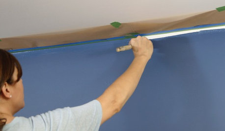
PAINTINGHouzz TV: How to Paint a Wall Faster
Should you roll your paint first or ‘cut in’ the edges with a brush first? This expert’s preference can save a lot of time
Full Story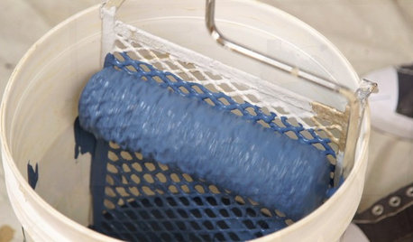
DIY PROJECTSHouzz TV: How to Paint a Wall Like a Pro
See the tools you need and steps you should follow to get the best coverage and finish for your walls
Full Story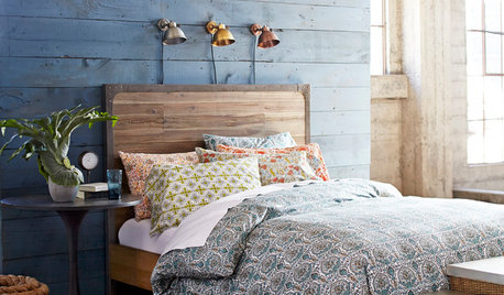
BEDROOMSHouzz Quiz: What Color Should You Paint Your Bedroom Walls?
Cool and soothing, or warm and spicy? Answer these questions and learn what hue is right for you
Full Story
WHITEWhat to Know Before You Paint Your Walls White
A coat of white paint can do wonders in one room and wreak havoc in another. Here are tips for using the popular hue
Full Story
WALL TREATMENTS7 Alternatives to the Painted Accent Wall
Create a focal point in a room without having to bust out the painting supplies
Full Story
DECORATING GUIDESHow to Paint Perfect Wall Stripes
Draw the line on lackluster walls with crisply painted stripes. Here's the secret to getting them right
Full Story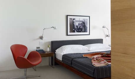
DECORATING GUIDESFrom the Pros: How to Paint Interior Walls
A slapdash approach can lower a room's entire look, so open your eyes to this wise advice before you open a single paint can
Full Story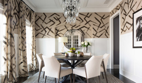
DINING ROOMSRoom of the Day: Hand-Painted Walls Set This Dining Room Apart
A bold design and small accents make this square room the perfect place to have fun
Full Story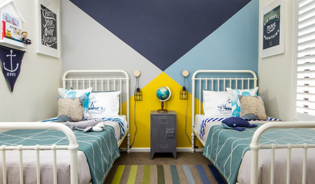
COLORWhy You Should Paint Your Walls More Than One Color
Using multiple colors can define zones, highlight features or just add that special something
Full StoryMore Discussions

Denita