Shop Products
Houzz Logo Print
hanks

What kind of granite and backsplash ideas for white painted cabinets?

hanks
11 years ago
last modified: 11 years ago
We have white painted cabinets. Will have a lighter hardwood laminate floor. I don't want dark granite, and have my mind set on light blue or light green subway tile backsplash. This is for a shore home, so I like the idea of light and airy...just don't want it to be too much white..any recommendations for granite counter colors (we have a pretty big island in our plans) and for backsplash?

Comments (54)

  • hanks
    Original Author
    11 years ago
    I do like Bianco Romano and Bianco suave for granite. Going to try to look at the gray/brown quartz as well.
  • hanks
    Original Author
    11 years ago
    Any thoughts on those options I just mentioned with this combination?
  • PRO
    Designer's Choice Interiors
    11 years ago
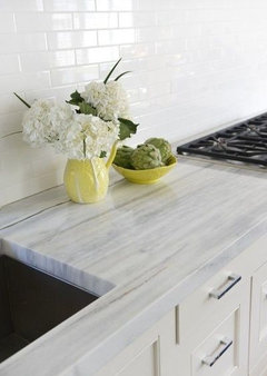
    I think the movement/patterned aspect of the granite looks best with solid color glass tile, like pictured. It just adds that organic element.
  • PRO
    sixteen fourteen
    11 years ago
    We have a quartzite called "White Fantasy" (terrible name). It looks like marble but is harder.
  • PRO
    Marble Expo
    11 years ago
    There is a granite called Juparana Delicatus, the back ground of it is off white / cream it also has some very cool crystal sections and silver sparcle in some batches of it! Also a light green like Costa esmeralda always looks great with white cabinets with a carrera white back splash and island or verde calacata!
  • hanks
    Original Author
    11 years ago
    @designers choice interiors. Based on that opinion, do you think my granite options (Bianco romano and Bianco suave) are good options then with light blue glass subway tile backsplash, white modern cabs and a lighter wood laminate floor. Thanks in advance as I want to make the best choice and appreciate others opinions! Anyone can respond to this...
  • PRO
    Designer's Choice Interiors
    11 years ago
    last modified: 11 years ago
    I worry that the Bianco Romano may have too much purple or red mixed in with the neutral. Bianco Cashmere White (Cashmire White, Cashmere White, Kashmere white) could be another alternative.
  • PRO
    Designer's Choice Interiors
    11 years ago
    Another could be River White (Valley White, White Springs), the sweeping pattern of this could be really nice with your light blue tile.
  • PRO
    Designer's Choice Interiors
    11 years ago
    Is Jasper Blue 3 x 6 subway tile what you are going with on the tile? If so, it is a grayish blue and you will want to take a sample of it when you go to look at slabs. You are looking for some version of that color in the gray tones you are seeing. Take someone who is good at seeing the subtleties of color, if you're not that discerning. You will know when you spot the right slab.
  • PRO
    Designer's Choice Interiors
    11 years ago
    last modified: 11 years ago
    Definitely check out the Bianco Romano slabs though. Sometimes you luck out with primarily white, cream and gray. It may be necessary to visit more than one granite source to find your perfect slab. Unfortunately, I am unfamiliar with Bianco Suave - I'm wondering if that is Bianco Taupe (which could work if there is enough white and some gray tones minus any purple or pink undertones). The names for granites can vary. I would stay away from any that have too much black speckling, yellow splotches or green undertones. Hope this helps! Keep me posted on your progress.
  • PRO
    Designer's Choice Interiors
    11 years ago
    last modified: 11 years ago
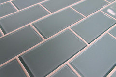
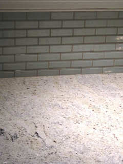
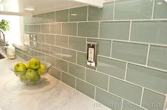
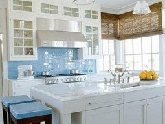
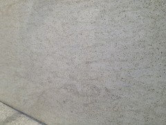
    Did a little searching on the internet to help you visualize the idea of a light countertop with blue tile backsplash, as I'm not as big a fan of the gray/taupe. The first one (close up photo) looks like Bianco Romano to me. The others look like either Carrera Marble (not a good choice because it too porous for a kitchen) and Zodiac Misty Carrera which is a quartz (could be another option for you). Bianco Quartzite, which I mentioned earlier, is another Carrera alternative (horizontal veining aspects). I'll see if I can find a pic of Bianco Quartzite next.
  • PRO
    Designer's Choice Interiors
    11 years ago
    Notice that the grout in the Bianco Romano pic is a taupe/gray tone vs. white. It added a slight green cast. Grout color can greatly affect the outcome of your glass tile because of it's transparency and is sometimes chosen to connect better with the color elements in granite or other tile you are working with. This white has a very clean and contemporary look and I love the idea of the woven wood roman window shade in the bottom pics. It would add texture and would connect with your maple hardwood floor. This is the idea though for a more airy, shore inspired look.
  • PRO
    Designer's Choice Interiors
    11 years ago
    Bianco Quartzite
  • PRO
    Designer's Choice Interiors
    11 years ago
    If I were taking you, as a client, I would ask to see all truly white granite, quartz and quartzite with gray veining. Armed with your accent tile, the information I've given you and your personal preference for pattern, you'll rule out several options right away. Get it down to 2-3 options at one supplier, then head to another supplier asking to see those same 2-3. Have your favorites tagged at both locations, and if possible ask if they can give you a small sample. Take pictures of the slab and note the vein pattern. When you get home, compare to the pics here and try to visualize it in your kitchen. I know you'll make the right choice for you!
  • hanks
    Original Author
    11 years ago
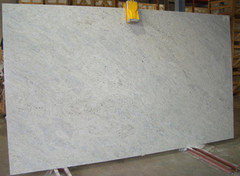
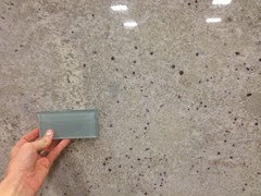
    This is a Kashmir white slab I found. It's hard to come by these days due to an issue with India who supplies it.
  • hanks
    Original Author
    11 years ago
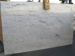
    This is Bianco Romano. It's taken indoors as opposed to the Kashmir white one which is taken indoors. Both seem to have many garnet speckles...I am worried that the subway tile won't work well. Any thoughts?
  • hanks
    Original Author
    11 years ago
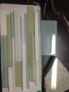
    The subway tile I am holding is a more green than what I want. I just haven't been able to take the samples with me.
  • PRO
    Designer's Choice Interiors
    11 years ago
    Do the specks read really red in both? Or, is one slab reading less red and more dark mahogany? In the photo, the tile looks great with the Bianco Romano. I can see the greyish blue tone in both slabs. Although, as we know, computer images don't always pick up on the nuances of color. I made sure to point out this characteristic and hoped you would find a slab that would not get too red. They look very close to the above photo, showing a close-up and taupe grout.
  • PRO
    Designer's Choice Interiors
    11 years ago
    last modified: 11 years ago
    I think the tile looks beautiful with the granite. It looks very taupe and sandy, with mottled neutral tones. I would hate to have it be that you were unhappy with result because you dislike the garnet aspects in it, though. You will definately need that sample of your more blue tile. Were you able to look at any of the quartzite slabs or river white granite?
  • hanks
    Original Author
    11 years ago
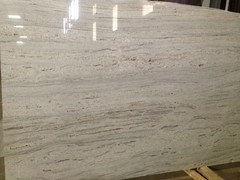
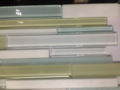
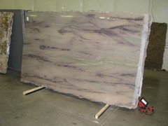
    Ok, I have since found a slab I love!! It's river white. It has great movement and I think it's perfect for the shore. The only bad thing is that I forgot my tile...there are two different slabs. The first one I love and the second one I love except the top left corner of garnet. What Do you think? I so appreciate your help and opinion. The bottom is the tile I love and possibly a blend of tile that I may try to use as a design element somewhere in the backsplash. (ignore the granite sample I that photo as its Kashmir white)
  • PRO
    Designer's Choice Interiors
    11 years ago
    Love, love, love!!!!! Good work.......love the tile, too! Beautiful, can't wait to see the end result!
  • PRO
    Stoneshop
    11 years ago
    Beautiful! River White is such a wonderful stone. If you do not like that top left corner, ask your fabrication shop if they can avoid that area for you. Also, after template, see if you can view the layout of your kitchen on the slab just to be sure that that corner will not end up in your space.

    I'm sure that everything will look great! Please post photos once it's finished!
  • hanks
    Original Author
    11 years ago
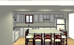
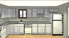
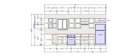
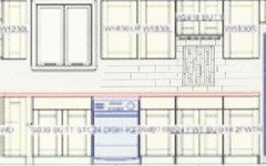
    Glad you guys like where I am heading. Thank you for the insights and advice! I do wonder about how to incorporate the blend smaller glass tile with the subway tile without a designer's eye. I want mostly blue subway tile with blend being a subtle accent/design feature. I do have two places I could imagine incorporating the blend...

    1. in a frame (per se...with bull nose) in between microwave and oven

    2. or in a section where I have a shorter glass door cabinets with a wine glass holder feature underneath. Any thoughts on this? My layout is attached.
  • hanks
    Original Author
    11 years ago
    Another image.
  • PRO
    Designer's Choice Interiors
    11 years ago
    Not knowing the orientation of the kitchen, it's difficult to know whether or not the range area would be visible enough to make it a feature. Due to the short space between the microwave and range and that being a shorter wall, I am more inclined to recommend that you do something under the glass cabinet. I'll see if I can't come up with something for you. Because the subway tile is running on a horizontal plain, I'm thinking it could be nice to run the accent tile on the vertical in that area. I'll try to send something through to you this evening.
  • hanks
    Original Author
    11 years ago
    Another image.
  • PRO
    Designer's Choice Interiors
    11 years ago
    Sorry so blurry, this would be the idea of a framed section. You could probably use the narrow blue tiles from the linear accent tile to create the border of the frame, if you like this idea. In this instance, I would definitely run the accent tile vertically.
  • PRO
    Designer's Choice Interiors
    11 years ago
    last modified: 11 years ago
    Another idea would be to run a 3-4" band of accent tile, with the lower edge two tiles above the counter top, all along the backsplash. Accent tile would then run horizontally. Then in the area of the raised cabinet, add a second band. with the top edge of the band two subway tiles below the cabinet bottom (band width the same as below). Hopefully this all makes sense. Let me know what you think.
  • hanks
    Original Author
    11 years ago
    Thanks so much! I do think it looks nice but I prefer the accent tiles not run vertically. Your second idea sounds awesome! I am wondering what this tile is called? I can't find the exact one online anywhere...without the make/name. Tks.
  • PRO
    Designer's Choice Interiors
    11 years ago
    My thought when I first saw it, was that it was a Walker Zanger tile. Could be from the skyline collection? Where did you get the sample from?
  • PRO
    Designer's Choice Interiors
    11 years ago
    last modified: 11 years ago
    Remember, if you are looking online at images of grouted tile, the tile color could appear differently. Even white grout distorts color slightly in these transparent tiles.
  • PRO
    Designer's Choice Interiors
    11 years ago
    Hi Hanks! Just wondering how you made out - did you find your tile? Hope your project is moving along.
  • hanks
    Original Author
    11 years ago
    Had a little snag with our cabinetry and appliances. Will keep you posted. Thanks.
  • hanks
    Original Author
    10 years ago
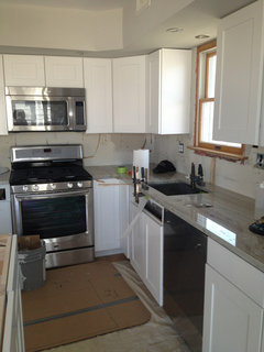
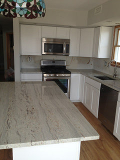
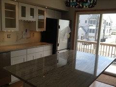
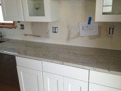
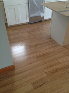
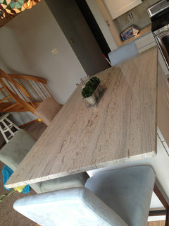
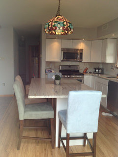
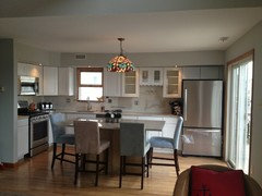
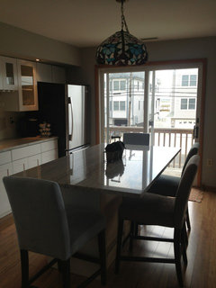
    Hi all. We've made a lot of progress lately. Cabs, appliances, new floors, and granite all in as of today.

    Now up, backsplash and bar stools. I did choose James Young pendants and one arrived today and I think they will work. It's clear bubbly glass--very beachy.

    Here's where I am...

    I am rethinking the blue subway bc this light ocean green is jumping out at me in the granite? Was thinking on a lift gray green instead of light blue.

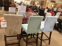
    Also, any thoughts on barstools?

    Hardware?

    Any thoughts or suggestions appreciated and welcomed. Thanks!
  • hanks
    Original Author
    10 years ago
    Few more...
  • PRO
    Stoneshop
    10 years ago
    It's looking great, hanks! Thanks for the pictures.

    Something like this would look wonderful for your backsplash:
    [houzz=
    KitchenLab · More Info
    ]
  • hanks
    Original Author
    10 years ago
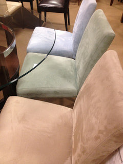
    Barstools we chose. Good for beach--two in each color. Microfiber good for kids spills. Thoughts?
  • hanks
    Original Author
    10 years ago
    Thanks @Stoneshop. I love those tiles!
  • PRO
    Designer's Choice Interiors
    10 years ago
    So nice to see your progress! Thanks for the update and love the barstools!! Gray is on trend right now but just loving the neutral backsplash stone shop recommended - timeless. Color in your accents is going to be fun and add so much interest! Great job, Tracey
  • User
    10 years ago
    last modified: 10 years ago
    I love your kitchen, so I feel compelled to be the Debbie downer on the bar stools! I am sorry but I think you can do better. The microfiber reminds me of something that is more suited to a very casual family room and not really beachy.
    I like some of the modern choices in this ideabook and you can find much less expensive versions at places like west elm or crate and barrel. Restoration hardware has been having a lot of sales on their bar stools as well.
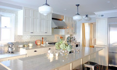
    https://www.houzz.com/magazine/20-favorite-modern-bar-and-counter-stools-stsetivw-vs~969749
  • PRO
    Designer's Choice Interiors
    10 years ago
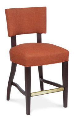
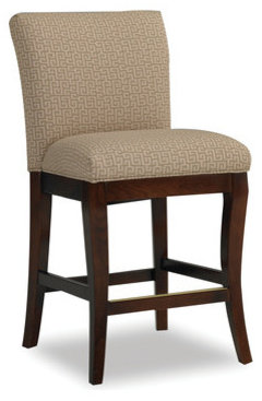
    Comfort, affordability and functionality - all qualities the stools you selected probably represent. The microfiber suede fabric is very practical and the colors are beachy. The mix of colors you chose, do give the overall look some personality. If budget were no object, it might be nice to take this same idea to another level and find a comfortable parson-style stool of longterm quality, that can be custom upholstered in sunbrella fabric or a 100% poly linen. I find many of the modern and minimal designs out there just don't measure up on the comfort scale, especially when this will be a highly frequented dining area. Perhaps, purchase the one you are liking and plan to upgrade, as it very likely these won't hold up over time. Typically, you need to spend $200+ for something more durable. Here's a few examples of a great counter stool that can be custom upholstered and the finish can be customized, as well. Fairfied Chair and Sam Moore ($400+)
  • PRO
    Granite Surfaces
    10 years ago
    wild sea would be perfect for a beach house
  • hanks
    Original Author
    10 years ago
    Thanks for all the suggestions, even the constructive ones! I appreciate it and love some of the more modern stools! Cost was definitely a factor, but not the deciding factor. Our kids are very small, so we definitely want backs and we want something that's easy to clean and comfortable. These had all those characteristics. I am picking them up tomorrow, so hope I love them in the room. (This whole kitchen was not really a planned renovation, so I'd rather keep the expense on this aspect low as possible, especially with the recent storm and "here today, gone tomorrow" frame of mind down here. $400 a stool would be too stressful. I would have the kids eating on the floor, lol...:)
  • hanks
    Original Author
    10 years ago
    Wild sea granite has the right name. Reminds me of the ocean!
  • hanks
    Original Author
    10 years ago
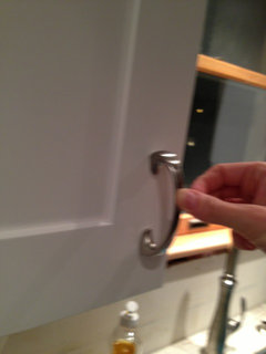
    Some pics of the most recent renovations. Thanks for all the insight. Also included a pic of our hardware.
  • hanks
    Original Author
    10 years ago
    Few more.
  • pstaples1975
    10 years ago
    I am doing a kitchen renovation and love how yours is coming along. I actually love the bar stools you picked out. I think I'm going to do the same for my bar. It looks very comfortable and I have two small children as well - so good call!!
  • hanks
    Original Author
    10 years ago
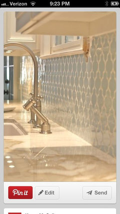
    This is Ann sacks arabesque. Was thinking about getting this fort kitchen backsplash in the color azure. This may be the color or slightly different--either way, azure is a blue similar to this. Thoughts? Will this date? Is it the right choice?
  • pupu4u
    10 years ago
    thanks for sending me the link to this thread, now I am definitely thinking more blue-greens for my paint and I wish I had found the arabesque tile you posted earlier. I absolutely love it!! Would have used that over subway tile in an instant. The arabesque shape seems pretty timeless to me, it has that Moroccan feel
  • PRO
    CMM Custom Homes
    7 years ago

    Have you ever tried fired granite? It adds a beautiful dimension without adding too much color. Here is an example. You can zoom in on the counter top.

Sponsored
Custom Home Works
Average rating: 4.6 out of 5 stars10 Reviews
Franklin County's Award-Winning Design, Build and Remodeling Expert