


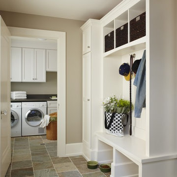
Search results for "Ads aren't" in Home Design Ideas
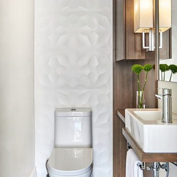
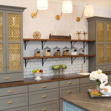
A small space deserves just as much attention as a large space. This powder room is long and narrow. We didn't have the luxury of adding a vanity under the sink which also wouldn't have provided much storage since the plumbing would have taken up most of it. Using our creativity we devised a way to introduce corner/upper storage while adding a counter surface to this small space through custom millwork. We added visual interest behind the toilet by stacking three dimensional white porcelain tile.
Photographer: Stephani Buchman
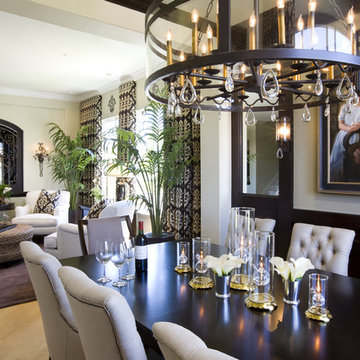
Wainscot on one wall of this Dining room added the architectural balance needed for this otherwise ho-hum plain-jane room attached to the formal Living room. Robeson design added the perfect mix of urban iron and rounded glass, teardrop crystals and architectural chain making this the perfect hanging light fixture over the Dining table from Restoration Hardware with tufted upholstered chairs with nail heads. Perhaps the star of the room is the commissioned painting of the clients 2 young daughters by artist David Darrow!
Click the link above for video of YouTube’s most watched Interior Design channel with Designer Rebecca Robeson as she shares the beauty of her remarkable remodel transformations.
*Tell us your favorite thing about this project before you put it into your Ideabook.
Photos by David Hartig
It started with vision. Then arrived fresh sight, seeing what was absent, seeing what was possible. Followed quickly by desire and creativity and know-how and communication and collaboration.
When the Ramsowers first called Exterior Worlds, all they had in mind was an outdoor fountain. About working with the Ramsowers, Jeff Halper, owner of Exterior Worlds says, “The Ramsowers had great vision. While they didn’t know exactly what they wanted, they did push us to create something special for them. I get inspired by my clients who are engaged and focused on design like they were. When you get that kind of inspiration and dialogue, you end up with a project like this one.”
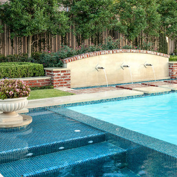
For Exterior Worlds, our design process addressed two main features of the original space—the blank surface of the yard surrounded by looming architecture and plain fencing. With the yard, we dug out the center of it to create a one-foot drop in elevation in which to build a sunken pool. At one end, we installed a spa, lining it with a contrasting darker blue glass tile. Pedestals topped with urns anchor the pool and provide a place for spot color. Jets of water emerge from these pedestals. This moving water becomes a shield to block out urban noises and makes the scene lively. (And the children think it’s great fun to play in them.) On the side of the pool, another fountain, an illuminated basin built of limestone, brick and stainless steel, feeds the pool through three slots.
The pool is counterbalanced by a large plot of grass. What is inventive about this grassy area is its sub-structure. Before putting down the grass, we installed a French drain using grid pavers that pulls water away, an action that keeps the soil from compacting and the grass from suffocating. The entire sunken area is finished off with a border of ground cover that transitions the eye to the limestone walkway and the retaining wall, where we used the same reclaimed bricks found in architectural features of the house.
In the outer border along the fence line, we planted small trees that give the space scale and also hide some unsightly utility infrastructure. Boxwood and limestone gravel were embroidered into a parterre design to underscore the formal shape of the pool. Additionally, we planted a rose garden around the illuminated basin and a color garden for seasonal color at the far end of the yard across from the covered terrace.
To address the issue of the house’s prominence, we added a pergola to the main wing of the house. The pergola is made of solid aluminum, chosen for its durability, and painted black. The Ramsowers had used reclaimed ornamental iron around their front yard and so we replicated its pattern in the pergola’s design. “In making this design choice and also by using the reclaimed brick in the pool area, we wanted to honor the architecture of the house,” says Halper.
We continued the ornamental pattern by building an aluminum arbor and pool security fence along the covered terrace. The arbor’s supports gently curve out and away from the house. It, plus the pergola, extends the structural aspect of the house into the landscape. At the same time, it softens the hard edges of the house and unifies it with the yard. The softening effect is further enhanced by the wisteria vine that will eventually cover both the arbor and the pergola. From a practical standpoint, the pergola and arbor provide shade, especially when the vine becomes mature, a definite plus for the west-facing main house.
This newly-created space is an updated vision for a traditional garden that combines classic lines with the modern sensibility of innovative materials. The family is able to sit in the house or on the covered terrace and look out over the landscaping. To enjoy its pleasing form and practical function. To appreciate its cool, soothing palette, the blues of the water flowing into the greens of the garden with a judicious use of color. And accept its invitation to step out, step down, jump in, enjoy.
Find the right local pro for your project
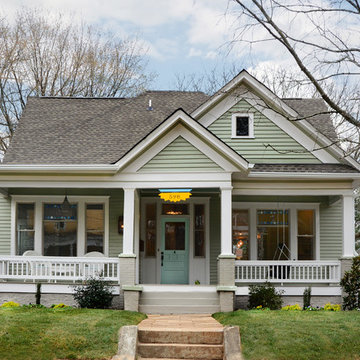
The bungalow after renovation. You can see two of the upper gables that were added but still fit the size and feel of the home. Soft green siding color with gray sash allows the blue of the door to pop.
Photography by Josh Vick
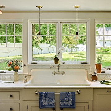
This salvaged kitchen sink was found awhile ago by the client who new she wanted to use it if ever she renovated. Integrated beautifully into the Danby marble countertop and backsplash with new fixtures it is a real joy to clean up.
This kitchen was formerly a dark paneled, cluttered, divided space with little natural light. By eliminating partitions and creating an open floorplan, as well as adding modern windows with traditional detailing, providing lovingly detailed built-ins for the clients extensive collection of beautiful dishes, and lightening up the color palette we were able to create a rather miraculous transformation.
Renovation/Addition. Rob Karosis Photography
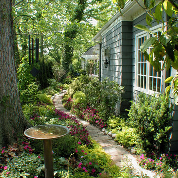
This garden path was created next to the new master bedroom addition we designed as part of the Orr Residence renovation. The curving limestone paver path is defined by the plantings. RDM and the client selected plantings that are very happy in the shade as this part of the yard gets very little direct sunlight. Check out the rest of the Orr Residence photos as this project was all about outdoor living!
This photo was one of the most popular "Design" images on Houzz in 2012 - http://www.houzz.com/ideabooks/1435436/thumbs/pt=fdc1686efe3dfb19657036963f01ae47/Houzz--Best-of-Remodeling-2012---Landscapes - and added to over 11,000 Ideabooks
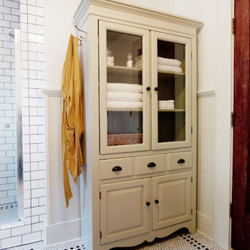
A pedestal sink means lack of storage. Solution? A linen cabinet! We bought a TV armoir at a thrift store for $100, cut out the center of the doors and added glass. We added crown molding similar to our wainscoting on the top and gave it a few coats of paint.
Sponsored
Columbus, OH
Dave Fox Design Build Remodelers
Columbus Area's Luxury Design Build Firm | 17x Best of Houzz Winner!
The unique design challenge in this early 20th century Georgian Colonial was the complete disconnect of the kitchen to the rest of the home. In order to enter the kitchen, you were required to walk through a formal space. The homeowners wanted to connect the kitchen and garage through an informal area, which resulted in building an addition off the rear of the garage. This new space integrated a laundry room, mudroom and informal entry into the re-designed kitchen. Additionally, 25” was taken out of the oversized formal dining room and added to the kitchen. This gave the extra room necessary to make significant changes to the layout and traffic pattern in the kitchen.
Beth Singer Photography
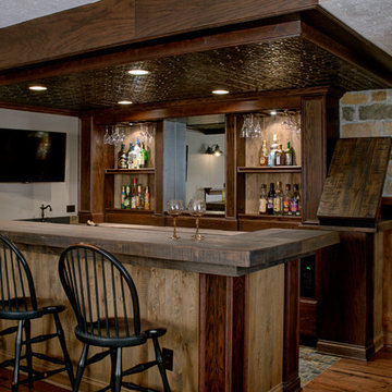
Finished Basement - If you’ve recently made an addition to your family, but aren’t ready to add an addition to your home, why not start by redesigning the space you already have? This charming living space began as a blank, unfinished basement. With the help of our expert design team, this Brighton, MI family turned their once boring basement into a deluxe playroom for the kids and grown-ups alike. The Egress windows brighten the room in a cost-effective and eco-friendly manner while broad arches throughout the basement create a European style feel. For the kids, we added a game room and playroom with open shelving for toy storage. For the adults, the media room and deluxe wet bar – complete with new maple cabinetry, Pergo floors and choice granite countertops - are must have features for the family that entertains.
a bathroom was added between the existing garage and home. A window couldn't be added, so a skylight brings needed sunlight into the space.
WoodStone Inc, General Contractor
Home Interiors, Cortney McDougal, Interior Design
Draper White Photography
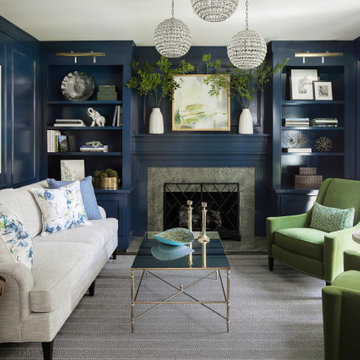
Previously used as an office, this space had an awkwardly placed window to the left of the fireplace. By removing the window and building a bookcase to match the existing, the room feels balanced and symmetrical. Panel molding was added (by the homeowner!) and the walls were lacquered a deep navy. Bold modern green lounge chairs and a trio of crystal pendants make this cozy lounge next level. A console with upholstered ottomans keeps cocktails at the ready while adding two additional seats.
When this suburban family decided to renovate their kitchen, they knew that they wanted a little more space. Advance Design worked together with the homeowner to design a kitchen that would work for a large family who loved to gather regularly and always ended up in the kitchen! So the project began with extending out an exterior wall to accommodate a larger island and more moving-around space between the island and the perimeter cabinetry.
Style was important to the cook, who began collecting accessories and photos of the look she loved for months prior to the project design. She was drawn to the brightness of whites and grays, and the design accentuated this color palette brilliantly with the incorporation of a warm shade of brown woods that originated from a dining room table that was a family favorite. Classic gray and white cabinetry from Dura Supreme hits the mark creating a perfect balance between bright and subdued. Hints of gray appear in the bead board detail peeking just behind glass doors, and in the application of the handsome floating wood shelves between cabinets. White subway tile is made extra interesting with the application of dark gray grout lines causing it to be a subtle but noticeable detail worthy of attention.
Suede quartz Silestone graces the countertops with a soft matte hint of color that contrasts nicely with the presence of white painted cabinetry finished smartly with the brightness of a milky white farm sink. Old melds nicely with new, as antique bronze accents are sprinkled throughout hardware and fixtures, and work together unassumingly with the sleekness of stainless steel appliances.
The grace and timelessness of this sparkling new kitchen maintains the charm and character of a space that has seen generations past. And now this family will enjoy this new space for many more generations to come in the future with the help of the team at Advance Design Studio.
Photographer: Joe Nowak
Dura Supreme Cabinetry
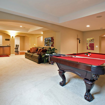
Finished Basement - If you’ve recently made an addition to your family, but aren’t ready to add an addition to your home, why not start by redesigning the space you already have? This charming living space began as a blank, unfinished basement. With the help of our expert design team, this family turned their once boring basement into a deluxe playroom for the kids and grown-ups alike. The Egress windows brighten the room in a cost-effective and eco-friendly manner while broad arches throughout the basement create a European style feel. For the kids, we added a game room and playroom with open shelving for toy storage. For the adults, the media room and deluxe wet bar – complete with new maple cabinetry, Pergo floors and choice granite countertops - are must have features for the family that entertains.
Sponsored
Columbus, OH
Dave Fox Design Build Remodelers
Columbus Area's Luxury Design Build Firm | 17x Best of Houzz Winner!
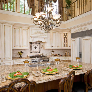
This beautiful 2 story kitchen remodel was created by removing an unwanted bedroom. The increased ceiling height was conceived by adding some structural columns and a triple barrel arch, creating a usable balcony that connects to the original back stairwell and overlooks the Kitchen as well as the Greatroom. This dramatic renovation took place without disturbing the original 100yr. old stone exterior and maintaining the original french doors above the balcony.
This was a fascinating project for incredible clients. To optimize costs and timelines, our Montecito studio took the existing Craftsman style of the kitchen and transformed it into a more contemporary one. We reused the perimeter cabinets, repainted for a fresh look, and added new walnut cabinets for the island and the appliances wall. The solitary pendant for the kitchen island was the focal point of our design, leaving our clients with a beautiful and everlasting kitchen remodel.
---
Project designed by Montecito interior designer Margarita Bravo. She serves Montecito as well as surrounding areas such as Hope Ranch, Summerland, Santa Barbara, Isla Vista, Mission Canyon, Carpinteria, Goleta, Ojai, Los Olivos, and Solvang.
---
For more about MARGARITA BRAVO, click here: https://www.margaritabravo.com/
To learn more about this project, click here:
https://www.margaritabravo.com/portfolio/contemporary-craftsman-style-denver-kitchen/
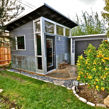
10x12 Studio Shed home office - Lifestyle Interior plus our added height option. The standard height of most models is 8'6" but you can choose to add 1 or even 2 extra feet of ceiling height. Our small kit "Pinyon" sits perpendicular to the office, holding garden tools and other supplies in a 4x8 footprint. The concrete pad, which extends to serve as the interior floor as well, was poured and stained by the home owner once the design phase of his project was complete.
Download our free ebook, Creating the Ideal Kitchen. DOWNLOAD NOW
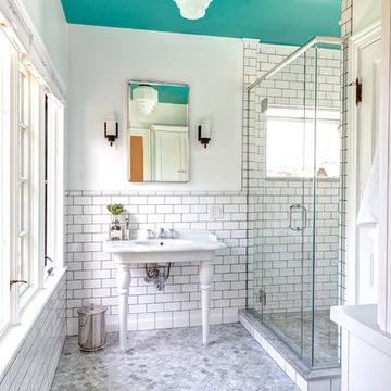
This master bath remodel is the cat's meow for more than one reason! The materials in the room are soothing and give a nice vintage vibe in keeping with the rest of the home. We completed a kitchen remodel for this client a few years’ ago and were delighted when she contacted us for help with her master bath!
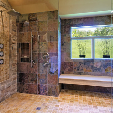
The bathroom was fine but was lacking in interesting design elements, and the shower was very small. We started by eliminating the shower curb which allowed us to enlarge the footprint of the shower all the way to the edge of the bathtub, creating a modified wet room. The shower is pitched toward a linear drain so the water stays in the shower. A glass divider allows for the light from the window to expand into the room, while a freestanding tub adds a spa like feel.
The radiator was removed and both heated flooring and a towel warmer were added to provide heat. Since the unit is on the top floor in a multi-unit building it shares some of the heat from the floors below, so this was a great solution for the space.
The custom vanity includes a spot for storing styling tools and a new built in linen cabinet provides plenty of the storage. The doors at the top of the linen cabinet open to stow away towels and other personal care products, and are lighted to ensure everything is easy to find. The doors below are false doors that disguise a hidden storage area. The hidden storage area features a custom litterbox pull out for the homeowner’s cat! Her kitty enters through the cutout, and the pull out drawer allows for easy clean ups.
The materials in the room – white and gray marble, charcoal blue cabinetry and gold accents – have a vintage vibe in keeping with the rest of the home. Polished nickel fixtures and hardware add sparkle, while colorful artwork adds some life to the space.
Showing Results for "Ads Aren't"
Sponsored
Columbus, OH
Dave Fox Design Build Remodelers
Columbus Area's Luxury Design Build Firm | 17x Best of Houzz Winner!
Jennifer and Dan have lived in their Deer Park Illinois home for 15 years, slowly making minor fixes like painting and decorating; but they had a new plan for their kitchen the entire time. An awkwardly placed garage door, and an island cooktop with a terrible downdraft made a full-scale kitchen remodel an absolute must. Jennifer had many ideas in mind and wanted to work with a company that could provide high-end work, while partnering with a designer that would tailor the kitchen to her ideas.
She was intrigued by the phrase “Common Sense Remodeling” in Advance Design’s feature she discovered while perusing an issue of the community’s Quintessential Barrington Magazine. Doing further research on the company’s website, as she looked through project profiles and read about Advance Design’s “Common Sense Remodeling” philosophy, she promptly scheduled an appointment to see if the people and ideas she read about were truly who they said they were. The more she read, the more she knew that the “Common Sense” approach to remodeling they described was exactly the type of company she was looking for.
The partnership was sealed after an initial consultation with Owner Todd Jurs and Project Designer Michelle Lecinski. They displayed a combination of friendliness, professionalism and respect that was unmatched by any of the other companies Jennifer talked to. She knew that with Advance Design, she would be able to retain the vision that she had in mind with high-quality craftsmanship.
“I reached out to Advance Design because of the ‘Common Sense Remodeling’ tagline,” Jennifer said. “That’s what lingered for me”. “Advance Design was the most respectful- of the house and of my design ideas, and the most professional of the handful of companies that looked at my project”.
Soon after the meeting Jennifer began working with Michelle on the project design. They quickly developed chemistry. Jennifer loved how Michelle researched and located every detail that Jennifer wanted for the kitchen. Between the two of them, every concept and idea was worked through and perfected. “Jennifer had definite ideas about what she wanted the new kitchen to look like, she just didn’t know how to bring it all together. We worked together really well to make her ideas into the practical reality necessary for a well-functioning kitchen, with the look and feel that she had envisioned”, says Michelle.
“Michelle was wonderful in using the CAD system she would show me new drawings every time we changed the layout while working through the design,” Jennifer said. “She was a really wonderful partner in execution, she made sure everything happened quickly and easily.”
The finished design drew out elements of Jennifer’s style and personality. The pair call the look “sophisticated farmhouse” to describe the kitchen renovation to family and friends. The result was a beautifully crafted, authentic-feeling space that satisfied Jennifer’s dreams 15 years in the making. The whole project consisted of a kitchen remodel, mudroom upgrade with powder room, and garage entry relocation. “The projects I personally like the best, are the ones that put the client’s dreams on display,” Project Designer Michelle said. “And this is one of those projects.”
The main focal point of the kitchen is custom zinc and brass ventilation hood with a vintage sheen, which was hand made to order by a small company in Indiana named Vogler Metalworking. “It’s like sculpture, a true work of art”, says Jennifer. Your eye is immediately drawn towards this elegant yet practical hood that eliminated the home’s downdraft problem and added a striking conversation piece at the same time. The carpenters had to use special gloves when transporting and installing it, so they didn’t smudge it with fingerprints. The beautiful hood centers proudly over the stunning black enamel and brass LaCornue Range. “I had a friend who had a LaCornue range and after learning how easy it was to cook perfect meals, I was convinced I wanted to have one”, says Jennifer. This unique, breathtaking combination anchors the entire kitchen and is apparent immediately as you walk into the great room the surrounds the space.
DuraSupreme Crestwood cabinets with a Kendall Panel add function and sophistication. A custom gray paint color paired with a storm blue was developed so that the new kitchen looked like it belonged to the existing space. Unlacquered brass faucets and hardware were important to Jennifer because she wanted the living finishes to age over time. Remarkable brass diamond mesh cabinet door inserts imported from the UK continue to add this one-of-a-kind kitchen renovation; giving it a “you won’t see this everywhere” quality. The use of old railcar flooring for the coffee bar countertop and reclaimed oak for the open shelving gives an authenticity to the space uncommon in kitchens today.
Jennifer and Michelle fell in love with the Limestone Grey Stone while they were investigating unique island countertop ideas. They liked the fact that the limestone as a living finish will age and change over time. Calcutta Miel Quartz countertops made for an excellent pairing around the perimeter, as it’s durable and perfect for cooking preparations. A textured white subway tile backsplash that runs to the ceiling keeps your eye moving towards the open shelving, and to the main focal point of the stunning range hood combination.
“The kitchen functions beautifully, and it’s gorgeous,” beams Jennifer as she gestures with both hands while smiling ear to ear. “The most important thing was I wanted a kitchen that had a wonderful flow, cooked beautiful meals and was a great gathering place for family and friends, and this space does that perfectly! Beauty wise, it turned out exactly how I had envisioned. I felt the function part was the hardest part, and that was nailed”!
Relocating the garage entry to the new mudroom was a huge priority and has finally separated the family’s arriving home functions from their kitchen. Now coats and shoes and bags have their own area for dropping once members arrive home. Matching gray DuraSupreme cabinetry helped create gorgeous, purposeful lockers for the family. A reclaimed vintage sink and custom wall paper were added to the tiny powder room to beautify the once previously only functional space. Advance Design was even able to create a custom space for their dog to sleep while the family is away.
“It was unbelievable that a project of this size was completed in such a short time, and I think that’s because of the large amount of planning and preparation that went into it,” Jennifer marveled, “When we started, we were ready, and everything was prepared”.
When it came to execution, Project Manager Justin Davis and his crew were quick, accessible, and organized. Projects like this kitchen are typically completed in as little as 8-10 weeks. Jennifer’s kitchen however despite the relocation of some challenging HVAC in a soffit and moving of an exterior door was completed remarkably fast in part because the team was working with an existing tile floor that ran throughout the first floor that the client really loved.
“You get to know these people really well because they’re living in your house while you’re living in your house. They were so fast and really good, it didn’t take as long as even planned” reported Jennifer. “I would text Justin and he always responded almost immediately. I got to know all the guys who were working in our house and they were all wonderful people”.
Details in a customized kitchen like this one require skill and care from the people who install it. “All the guys on the job were skilled at what the did. I wanted small details like little feet to look like furniture, that is where their carpentry skill came in to make these all perfect”, said Jennifer. “The tile guys were wonderful. They even let me determine how I wanted the texture with the grout to appear for a salt and pepper look; now that is a very skilled trade person making it custom”.
In Jennifer’s interview, she continued to reference Advance Design’s “Common Sense Remodeling”, so I took a minute to ask her exactly what that phrase meant to her and how it played out in her experience with her project and the Advance Design team. Here is what she said: “I was intrigued about Common Sense Remodeling and in my head that there would be clear costs and prices, great communication between the design team, the execution team and me”, said Jennifer. They did deliver on that, it was so clear about the cost breakdown, what I could expect from everyone who came to my house, and everything that we had ordered. That to me is the Common Sense”!
It’s great to see a client take literally our assertion that a well-planned remodeling project is simply “Common Sense”! She anticipated each step of the way would be clear, concise, and predictable, all the while protecting the outcome due to the careful upfront planning. “Advance Design delivered on their ‘Common Sense Remodeling’ promise,” Jennifer said. “From the design team, to the execution team - everything was straight forward like I imagined. The project turned out exactly how I envisioned, I enjoyed this process and absolutely would recommend Advance Design Studio to anyone.”
Download our free ebook, Creating the Ideal Kitchen. DOWNLOAD NOW
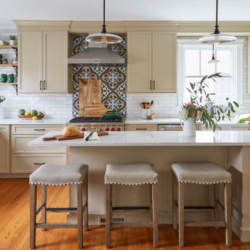
The homeowners came to us looking to update the kitchen in their historic 1897 home. The home had gone through an extensive renovation several years earlier that added a master bedroom suite and updates to the front façade. The kitchen however was not part of that update and a prior 1990’s update had left much to be desired. The client is an avid cook, and it was just not very functional for the family.
The original kitchen was very choppy and included a large eat in area that took up more than its fair share of the space. On the wish list was a place where the family could comfortably congregate, that was easy and to cook in, that feels lived in and in check with the rest of the home’s décor. They also wanted a space that was not cluttered and dark – a happy, light and airy room. A small powder room off the space also needed some attention so we set out to include that in the remodel as well.
See that arch in the neighboring dining room? The homeowner really wanted to make the opening to the dining room an arch to match, so we incorporated that into the design.
Another unfortunate eyesore was the state of the ceiling and soffits. Turns out it was just a series of shortcuts from the prior renovation, and we were surprised and delighted that we were easily able to flatten out almost the entire ceiling with a couple of little reworks.
Other changes we made were to add new windows that were appropriate to the new design, which included moving the sink window over slightly to give the work zone more breathing room. We also adjusted the height of the windows in what was previously the eat-in area that were too low for a countertop to work. We tried to keep an old island in the plan since it was a well-loved vintage find, but the tradeoff for the function of the new island was not worth it in the end. We hope the old found a new home, perhaps as a potting table.
Designed by: Susan Klimala, CKD, CBD
Photography by: Michael Kaskel
For more information on kitchen and bath design ideas go to: www.kitchenstudio-ge.com
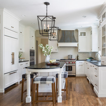
Cooking for Two
Location: Plymouth, MN, United States
When this couple’s last child graduated from college they began the process of looking for a new home. After a lengthy search they decided to stay with the neighborhood they loved, saving money by remodeling rather than starting over.
The top priorities on their wish list were adding character to their 1990’s era home with a classic white kitchen and a larger island while keeping within the existing footprint. With the intention of honing their cooking skills, they were also considering better appliances and two ovens.
Challenges and Solutions
Design a larger island with seating for at least two. The existing island was small and the area behind the seating was less than recommended clearances.
To solve this challenge, the seating area of the island was extended out into the open area of the kitchen. This created a larger island with seating for three, extra storage and a bookshelf across from the range.
The original kitchen had a range with microwave above, so adding another oven was a challenge with limited wall space.
Because the adjoining dining room is used infrequently, the homeowner was open to placing the second oven and microwave in the walkway. This made room for the small buffet between the built in refrigerator and ovens, creating one of her favorite areas.
The client requested a white painted kitchen but wanted to make sure it had warmth and character. To achieve this the following elements were chosen:
1) Cabinets painted with Benjamin Moore Capitol White, a luminous and warm shade of white.
2) The Range hood was painted with warm metallic shades to reflect the bronze of the Ashley Norton hardware.
3) Black Aqua Grantique granite was chosen for countertops because it looks like soapstone and adds contrast.
4) Walker Zanger Café tile in Latte was chosen for it’s handmade look with uneven edges.
5) The to-the-counter-cabinet with glass door shows off serving dishes and lends sophisticated charm.
The result is a welcoming classic kitchen, where this couple enjoys cooking more often and sharpening their skills with gourmet appliances.
Liz Schupanitz Designs
Photographed by: Andrea Rugg Photography
1