


Recommendations for paint colors to test needed
remodelfla
14 years ago
Sort by:Oldest
Comments (14)
Related Stories
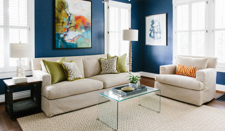
MOST POPULARThe Right Way to Test Paint Colors
Here are 5 key steps to take to ensure you're happy with your wall paint color
Full Story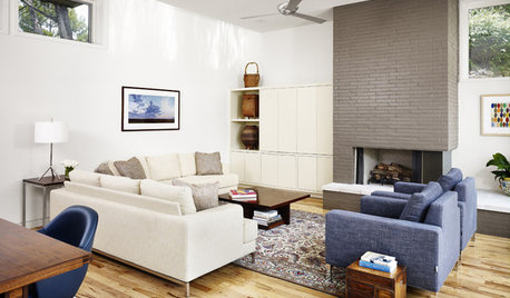
DECORATING GUIDESWhat You Need to Know Before Painting Brick
Sure, painted brick can be a great look. But you need to take some risks into account. Here's how to paint brick like a pro
Full Story
COLOR12 Tried-and-True Paint Colors for Your Walls
Discover one pro designer's time-tested favorite paint colors for kitchens, baths, bedrooms and more
Full Story
DECORATING GUIDESTest-Drive a Touch of Neon
It's electric! Learn how to embrace this season's sizzling colors without overcommitting
Full Story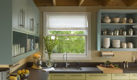
MOST POPULAR8 Great Kitchen Cabinet Color Palettes
Make your kitchen uniquely yours with painted cabinetry. Here's how (and what) to paint them
Full Story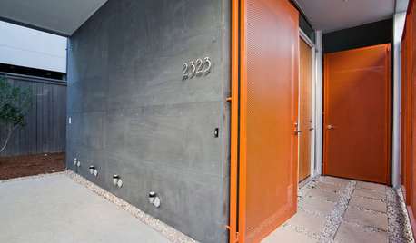
FRONT DOOR COLORSFront and Center Color: When to Paint Your Door Orange
Bring high energy and spirit to your home's entryway with a vibrant shade of orange on the front door
Full Story
CURB APPEALHow to Update a Traditional Exterior With Color
Keep those historic architectural details — a few gallons of paint may be all you need to give a traditional facade a stylish new twist
Full Story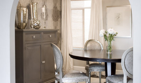
DINING ROOMSDesign Dilemma: I Need Ideas for a Gray Living/Dining Room!
See How to Have Your Gray and Fun Color, Too
Full Story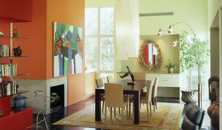
WORKING WITH PROSHow to Work With a House Painter
A professional house painter may be your best friend for refreshing rooms. Here's what you need to know to get the best result
Full Story
COLORColor of the Year: Off-White Is On Trend for 2016
See why four paint brands have chosen a shade of white as their hot hue for the new year
Full Story


riverspots
remodelflaOriginal Author
Related Professionals
Frankfort Kitchen & Bathroom Designers · Knoxville Kitchen & Bathroom Designers · Glade Hill Kitchen & Bathroom Remodelers · Elk Grove Kitchen & Bathroom Remodelers · Gardner Kitchen & Bathroom Remodelers · Kentwood Cabinets & Cabinetry · Little Chute Cabinets & Cabinetry · South Gate Cabinets & Cabinetry · South Riding Cabinets & Cabinetry · Watauga Cabinets & Cabinetry · Tabernacle Cabinets & Cabinetry · Ardmore Tile and Stone Contractors · Brentwood Tile and Stone Contractors · Mill Valley Tile and Stone Contractors · Turlock Tile and Stone Contractorsaltagirl
remodelflaOriginal Author
kitchen4champ
cawaps
bmorepanic
prill
wi-sailorgirl
chris11895
remodelflaOriginal Author
bmorepanic
remodelflaOriginal Author
macybaby