Shop Products
Houzz Logo Print
soshh

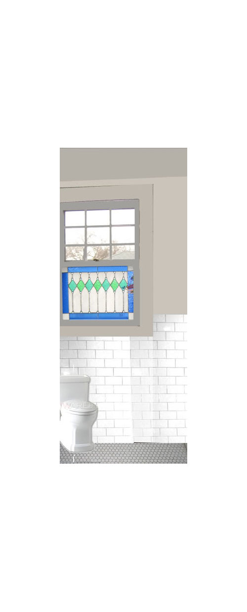
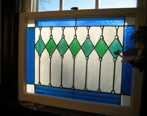
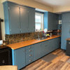
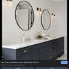
Pls. help with color, 'Soft gray' for bath cabinetry/trim?

soshh
16 years ago

Since no one is repsonding to my other thread I am trying again! Please help, suggestions wanted!

This is for a classic bath with subway & hex tiles (gray grout), all white fixtures, statuary marble vanity top. It's a hall bath and will mainly be used by my kids.

The one unusual element is a stained glass window.

The first image shows a photoshop mockup I did. I think it's probably too dark. I am thinking of a color like BM Edgecomb Gray or Revere Pewter, nothing too dark or heavy. More like a warm, creamy gray, so the tile and vanity top stand out slightly, but not too much contrast. (Think of the Farrow and Ball colors that look like old white but really have a lot of pigment in them.) My cabinet guy said his paint can be matched to BM colors, so I am trying to stick with that.

I don't think pulling in the blues or greens in wall color will work, and I don't want the cabinetry or trim to be pure white. The yellow based off-whites I have used in the past seem too yellow with all the other elements.


http://ths.gardenweb.com/forums/load/decor/msg0211021817753.html?4

Here is a link that might be useful: my other post that didn't get much response!

Comments (29)

  • amysrq
    16 years ago

    So, here's a question...are you not happy with the Revere Pewter or Edgecomb Gray? If so, what about those colors is not working for you?

    I think I would do the trim and cabs in the very darkest color in the marble so that it is strong enough to stand up to the very strong colors in the window. I am a bit worried that the window might overpower softer colors.

  • squirrelheaven
    16 years ago

    Your bathroom sounds wonderful, Soshh :)

    I'll just ask another question or two. What color is the flooring tile? I guess I thought you were saying it is white with gray grout, but the mockup looks gray. Also wondering -- are you looking for specific paint colors?

  • soshh
    Original Author
    16 years ago

    Amy,

    My concern is the Edgecomb might look too "pinky" against the white tiles, and though soft, maybe not enough of a contrast. I love how it's creamy though. I am leaning towards the Revere because I have used it on walls in the past, but I am a little concerned it might be too muddy looking against the white. I like how both colors have some warmth though.

    The window being so bright is a concern. I will probably do some colorful accents (towels, bathmat, etc.) so pick up those colors, but there's no way I can match them as this window is super bright in the morning with the sun coming up and deep later on (it's facing east pretty much). I also don't want to "cop out" and do everything too white because then I am afraid everything will look blah against the bold window!

    Squirrel, happy to see you here as always! The flooring is white also, but in photoshop I was getting it to be too white so I left it with the shadowy gray. (I was trying to do it quickly.) As you can see, the subway tile is not exactly true to color, I pulled it from someone else's bathroom and it was too shadowy also!

    I loved a kitchen done in all gray woodwork last year, I can't find it on the site anymore but did save some of the pics. It was inspired by Martha Stewart's kitchen but was way warmer (even with all the gray.) Squirrel, do you remember the one I am referring to? I think he used Colonnade gray by SW for some of his woodwork, but the main cabinet color was a slightly lighter SW color by Martha that no longer exists. It was sooo fabulous though. Maybe if I did some cobalt blue glasswear (lotion dispenser, etc) in there I could pull in more of the colors of the window.

    Thanks for helping with this!

  • amysrq
    16 years ago

    I really think you need more contrast/deeper color for trim and cabs.

    Take a look at the following:

    Rockport Gray
    Gray Horse (I just used this in a bathroom)
    Horizon Gray
    Gray Mirage (the warmest of the four)

    Don't get spooked by these colors being "green." They will say gray in the room. :-)
    Do you have marble samples?

  • soshh
    Original Author
    16 years ago

    Amy, I will look! I was looking at Gray horse. Do you have pics?

  • squirrelheaven
    16 years ago

    No, that kitchen doesn't ring a bell. If it was over on the KF, I never go over there so wouldn't have seen it. I do love MS's new gray kitchen though!

  • hoffman
    16 years ago

    soshh,

    I'm going to play Devil's Advocate here: I think you should do a light blue -- similar to the light blue circles in your window. Blue is a classic combination with your white subway tile and a paler shade (that looks like it's meant to complement the blue in the window rather than match it exactly) will make that beautiful window pop. Just a thought....

  • soshh
    Original Author
    16 years ago

    Squirrel & all,

    I found pics of the kitchen. I hope it's ok I post!


    Amy, I looked at those colors and love them but with this small room I think having the trim be so much darker it might be overwhelming. Then I had an "aha" moment. What if (similar to the island above) I did the base of the vanity the slightly deeper gray but kept the uppers (that sit on the marble) and the rest of the trim the lighter shade? But then I thought it might close in the room too much. What do you think? Like you suggested AMy, I would find a deep color in the marble and play off of that.

    Hoffman, thanks. I considered doing a very pale blue, but the truth is I really don't like such soft pastel colors. I have a bunch of RH's really light blues (lighter than silver sage and atmosphere blue) in there and when the sunlight comes in in the AM they get washed out, but by afternoon they just don't seem to feel right. I know that's what most people would do. I was thinking a bottle green, but it really doesn't look right. BTW, I saw you (I think, your wall mounted tv post) on the other web community I post on. I wonder if we're neighbors??? I love, love your bathrooms BTW!

  • budge1
    16 years ago

    We used Benjamin Moore's Moonshine in our bathroom with carrera and white subways. Another that I tried that looked great too was Titanium.

    I also got a grey from restoration hardware that was amazing but the sample didn't arrive until after I had the BM colour on the wall and I really didn't have the heart to repaint. It was the lightest colour in their silver sage collection.

    Here is a pic of our grey. I know it is hard to tell light colours on a monitor thogh

    I remember that kitchen and saved a pic of it somewhere. I'll see if I can find it.

  • soshh
    Original Author
    16 years ago

    Oooh, another AHA moment. What if I did the base cab. of the vanity the deeper gray as above, and also did the inside of the window the same darker color? I do think (as in my lame p'shop job) the darker gray makes the stained glass pop more. It would also tie in with the deeper gray of the grout.

    Thoughts?

  • soshh
    Original Author
    16 years ago


    Here I pasted in some marble, keeping the same light gray on walls & trim but doing the vanity (which is in an alcove to the right) in a deeper color. The towers on top of the vanity, which are about 13 inches wide, 13 inches deep on a 46 inch wide vanity, will stay the lighter color.

    Thoughts?

  • amysrq
    16 years ago

    Nice to see that kitchen picture. The color of the island is exactly what I was thinking of. Just figure out which deep gray works with the marble. This is a boys' bathroom, right? Remember darker colors will look better in the long run, what with fingerprints and all...

    Now, I am thinking you need three colors. Find the deepest gray for the lowers and the window trim. Then, go with a lighter version for the rest of the trim if you are afraid the darker color will be too much. Finally, the walls can be the lightest color, either the palest version of the original color (easiest way out) or a different pale color.

    As for what that third color might be...if you go with a deep gray from the marble, you might try a slightly warmer wall color keyed to the tan color in the marble. Not as easy but could look very sophisticated.

    Like Hoffman, I was going to suggest earlier that you do a pale blue, but somehow I figured you'd already ruled it out. That said, I am a fan of blue ceilings and I think that putting some blue in your ceiling paint would be subtle and very nice. Many of my ceilings are blue and it is hardly noticeable. You might find it is a good way to bring in some color, open up the space (blue ceilings do that!) and not have to put a pastel on the wall. ;-)

    Gray Horse and Horizon (that Budge suggested) are on the same strip and might work well as a lower + sash/upper + trim combo. Here's a pic of Gray Horse:

    It looks pretty light with the flash -- darker and more dramatic IRL. But not too dark in this very small bathroom. I think it would hold up well on the lowers and window sash since they won't be getting direct sunlight. Remember, whatever is in direct sun in the am will be washed out.

  • Kathleen McGuire
    16 years ago

    I haven't read through all the posts, but BM Edgecomb Gray is not gray at all. It is very creamy with a hint of yellow. I have it on the exterior of my house. I have seen it used on the interior, I think PB has used it in their catalog. Just didn't want you to think it was gray, it's not. Here's my house in BM EG.


    And here is my ispiration. Found this house here on GW, contacted the owner who told me the color was BM Edgewood Gray!

  • amrad
    16 years ago

    was just at the BM store looking at Gray's. Edgecomb Gray is a brown grown, formula is mostly Yellow Oxide, Red, and Black. I put some in my bathroom yesterday, and I hated it, guess to much gray for me.

    Some colors you might want to look at are Rodeo, Light Pewter (very light), Litchfield Gray, Elmira White, and 982 Cedar Key.

  • squirrelheaven
    16 years ago

    Following Amy's lead on standing up to the stained glass window, and your daughters' love of blue and green, I was doodling around a bit. With the cool window, I lean towards the cool grays, but threw some warm ones in there too. I like treating the window as a whole little jewel box so the window portion doesn't jump out all by itself with its darker values. Trying some green in the gray and blue in the gray also. With a pale blue or greenish-blue on the ceiling as well. I also like the grays varied -- cabinetry, trim, wall, even ceiling, all a different value.

    Maybe a little valance or something to carry the bright blue across the window?

    Probably totally not what you want -- but they're only virtuals! and thoughts.

  • Sueb20
    16 years ago

    I respectfully disagree with amysrq -- I had Gray Mirage in my dining room for a few years and it definitely read as green! a light, gray-green, but definitely green.

    You might take a look at Bunny Gray. We have that in a (dark, not well-lit) hallway and there, it looks like a pale clear gray.

  • amysrq
    16 years ago

    Sue, I think a lot depends on what is in the room and what the lighting is like. I have no doubt that Gray Mirage was green in your DR. It is certainly the greenest of the grays I suggested. However, I think that in a room with that bright green glass in the window it will tend to read gray by comparison.

    My Gray Horse bathroom looks green to my friend. It reads slightly blue to me. Color is subjective -- we all see things differently. Thank heavens the paint companies have now made it possible to sample paints in small doses before we buy!

  • soshh
    Original Author
    16 years ago

    Squirel, I do like the combo of grays, and the soft gray-blue on the ceiling. I think that would look great because it's a different plane (plain?) than the window.

    I don't know about the green sash though, that might be too much. Maybe green or blue glass knobs for the vanity? No valance needed. The window is so high up, they have privacy and the light coming in is really nice. Plus, you know how I like to keep window treatments/fabric/accessories simple!

    I picked up a few more variations of gray swatches so I can play around with mixing them.

  • chicoryflower
    16 years ago

    Have you seen BM Stingray or Early Morning Mist (1529 & 1528 respectively)?

    They're sort of in between Revere and Edgecomb.

  • hoffman
    16 years ago

    soshh,

    You caught me! I did indeed post duplicate tv messages here & on our local community Message Board. I came to the same realization (that you were the same person on both Boards) a while ago when you posted your kitchen design in both places (plus, your screen names are similar).

    If you are who I think you are, I owe you a huge debt of gratitude for introducing me to two things:

    1) Gardenweb! I've done 3 baths & a kitchen in a little over a year and this has been an invaluable resource. I'm pretty sure I first came here after you mentioned it on the other Board.

    2) Carolinachair.com -- I'm getting ready to order a sectional (to watch the above-mentioned tv) from them after thinking about it for literally 2 years -- wanted to finish all the renovations before tackling the living room.

    So, THANK YOU & good luck with the color selection! With that window, the bathroom will be stunning whatever you choose.

    p.s. I have also sampled the RH pale silver color Budge suggested & I think it would be great.

  • soshh
    Original Author
    16 years ago

    Hi Hoffman, yes, that is me! We have made two large purchases from Carolina Chair and are still happy with them (even with a move to a totally different type of house.) though they have not found their final resting spots yet in this house!

    I can't believe you've done all that in a year. I do love your kitchen, with the green subway tile.

    Thanks to all for the suggestions. My first step is to find the right gray for the vanity and I know I can go in so many directions with it. Once that's in place in the bath I can finalize all my other paint choices.

  • kaypeakay
    16 years ago

    I have BM Edgecomb Gray in a east facing guest bedroom and it's a great color in there. It's pretty pale, though, so if you are going for more contrast, it may not work for you. My BM EG doesn't look like a creamy yellow in my guest bedroom, though! It's gray, pale and warm, but definitely gray. I really like it and I think the revere pewter is a great color too!
    Good luck!

  • soshh
    Original Author
    16 years ago

    I think putting colors outside does that. They seem much lighter and yellower than when they are used inside, at least in my experience.

  • Kathleen McGuire
    16 years ago

    Another warm gray for you to look at is SW 6197 Aloof Gray. Even paler is SW 6196 Frosty White, one color above Aloof.

  • soshh
    Original Author
    16 years ago

    Thanks to all for the suggestions! I have been looking at swatches 'til my eyes were bloodshot!

    I read something in the Sept. 07 House Beautiful (I was rereading before I tossed, and found lots of inspiration!) that said Farrow & Ball down pipe is a traditional color used for trim and woodwork. So, I looked for something similar that gave me the smoky blue-green-gray tones and came up with BM Gray Pinstripe. Seeing it in the room with the light coming in, plus the reflection of the stained glass, I think it will work for the base cab. of the vanity and the window sash. I will stick with the Revere Pewter for wall, trim and the upper cabs that sit on the marble. I looked at all the other suggestions and while I loved many, I think the revere will still read as a creamy gray against the white of the tile and the marble. I think for the ceiling I might do the quiet moments.


    I hope you all like it! Hopefully we will start demo soon and within a few months I will post Real Life pics!

  • soshh
    Original Author
    16 years ago


  • squirrelheaven
    16 years ago

    Here's your lost post, Soshh. I never saw the final selections. Probably hit page 2! : ) I have no doubt it will be a gorgoeous and unique bath when you finish. Can't wait to see final pics, and glad to see it's not so far off either.

  • squirrelheaven
    16 years ago

    Sossh, some beautiful work with grays to note in the link. Noticed a lot of gray being used in this firm's work. Here's a link to one of the homes. Beautiful site to browse, generally, too : )

    Here is a link that might be useful: Architectural Firm

  • soshh
    Original Author
    16 years ago

    How weird is that Squirrel???

    I will check out that link, thanks.

    Unfortunately we have been delayed almost THREE months waiting for permits! I am SO frustrated, that's why I keep moving on the other spaces. At least I can design them virtually so when the hammers come out I'll be ready.