


picking B/S tiles tomorrow
Bunny
12 years ago

Sort by:Oldest
Comments (48)
Related Stories
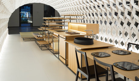
HOMES AROUND THE WORLDThe Kitchen of Tomorrow Is Already Here
A new Houzz survey reveals global kitchen trends with staying power
Full Story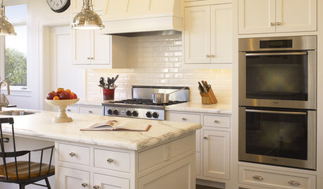
PRODUCT PICKSGuest Picks: Details for a Classic White Kitchen
Check out these white tiles, countertops and accessories, plus a few stainless steel touches, for a pristine-looking cooking space
Full Story
LANDSCAPE DESIGNHow to Pick the Right Floor for Your Garden Room
Crunch the facts on gravel, flagstone, brick, tile and more with our mini guide to outdoor flooring surfaces
Full Story
COLORPick-a-Paint Help: How to Create a Whole-House Color Palette
Don't be daunted. With these strategies, building a cohesive palette for your entire home is less difficult than it seems
Full Story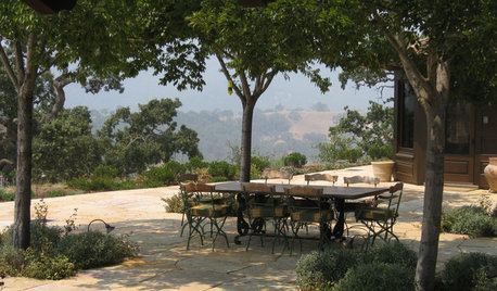
GARDENING AND LANDSCAPINGHow to Pick the Right Garden Ceiling
Canopy, umbrella, tree or sky — for the finishing touch in your garden, consider what's overhead
Full Story
WHITEHow to Pick the Right White Paint
White is white, right? Not quite. See 8 white paint picks for 8 very different effects
Full Story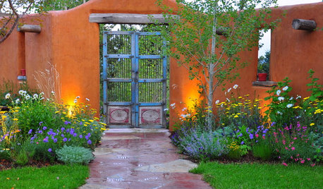
GARDENING AND LANDSCAPINGHow to Pick a Nice Wall for Your Garden Room
Made by hand, prefab or growing from the ground, garden walls are key landscaping elements. Here's what to think about for your yard
Full Story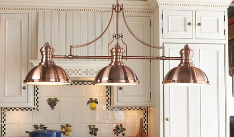
PRODUCT PICKSGuest Picks: Dashing Lighting for Over the Kitchen Island
These single-connection pendants and chandeliers will cover your island lighting needs no matter what your kitchen’s style
Full Story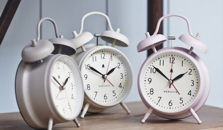
PRODUCT PICKSGuest Picks: Good Morning to You
Start the day with a smile, courtesy of 20 pieces from a retro radio to an au courant kettle
Full Story
GRAYChoosing Paint: How To Pick the Right Gray
Which Version of Today's 'It' Neutral Is For You?
Full Story
motherof3sons
breezygirl
Related Professionals
Arlington Kitchen & Bathroom Designers · Baltimore Kitchen & Bathroom Designers · Greensboro Kitchen & Bathroom Designers · Magna Kitchen & Bathroom Designers · Montebello Kitchen & Bathroom Designers · Pleasanton Kitchen & Bathroom Designers · Beaverton Kitchen & Bathroom Remodelers · Boca Raton Kitchen & Bathroom Remodelers · Creve Coeur Kitchen & Bathroom Remodelers · Hanover Township Kitchen & Bathroom Remodelers · Buena Park Cabinets & Cabinetry · Canton Cabinets & Cabinetry · Ham Lake Cabinets & Cabinetry · Lockport Cabinets & Cabinetry · Newcastle Cabinets & CabinetryBunnyOriginal Author
boxerpups
kellienoelle
remodelfla
BunnyOriginal Author
kellienoelle
BunnyOriginal Author
babs711
BunnyOriginal Author
senator13
BunnyOriginal Author
lavender_lass
BunnyOriginal Author
lavender_lass
BunnyOriginal Author
ellendi
lavender_lass
BunnyOriginal Author
hosenemesis
BunnyOriginal Author
lavender_lass
motherof3sons
BunnyOriginal Author
lavender_lass
breezygirl
Ann Scheley
senator13
BunnyOriginal Author
lisa616
ellendi
BunnyOriginal Author
ellendi
lavender_lass
BunnyOriginal Author
harrimann
BunnyOriginal Author
breezygirl
Ann Scheley
lavender_lass
senator13
BunnyOriginal Author
ellendi
BunnyOriginal Author
senator13
BunnyOriginal Author
ellendi