


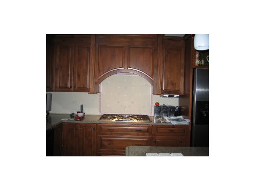
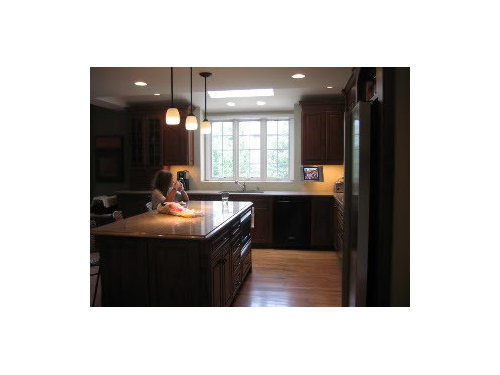
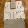
mock up backsplash feedback needed
lowjo1
15 years ago


Sort by:Oldest
Comments (8)
Related Stories
REMODELING GUIDESMust-See Mock-ups for Your Remodel
Avoid 'oops' and 'oh, no' with real-life tryouts of any design elements in question
Full Story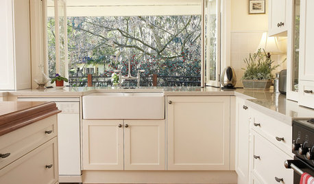
KITCHEN SINKSEverything You Need to Know About Farmhouse Sinks
They’re charming, homey, durable, elegant, functional and nostalgic. Those are just a few of the reasons they’re so popular
Full Story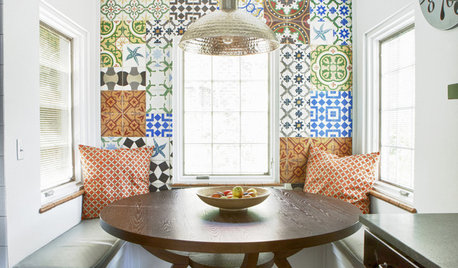
TILEPep Up With Patchwork Tiles
Don't call them crazy — quilt-style tile patterns are bringing energy and playfulness to walls, countertops and even floors
Full Story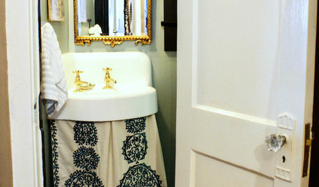
DECORATING GUIDES15 Creative Touches to Perk Up the Bathroom
Swap standard features for antiques and add other artful displays for a bathroom that’s worlds away from bland
Full Story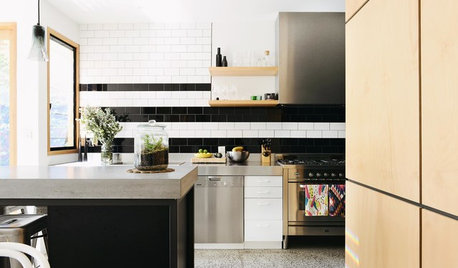
COLOR10 Pair-Ups for Black in the Kitchen
Combine black with other colors to add drama, polish and modernity. It also can make a kitchen look more spacious
Full Story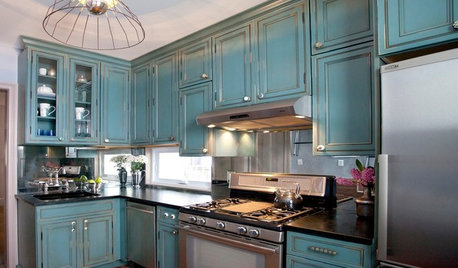
KITCHEN DESIGNKitchen of the Week: Turquoise Cabinets Snazz Up a Space-Savvy Eat-In
Color gives a row house kitchen panache, while a clever fold-up table offers flexibility
Full Story
DECORATING GUIDESBrush Up on Paintable Wallpaper for a Posh Look
Customize your wall treatments the affordable way, with richly textured wallpaper painted any color you like
Full Story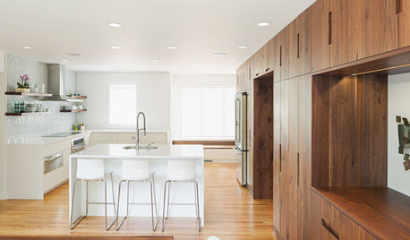
INSIDE HOUZZInside Houzz: A Walnut Wall of Storage Opens Up a Kitchen
A 30-foot wall of storage frees up cooking areas and counters for food prep and entertaining
Full Story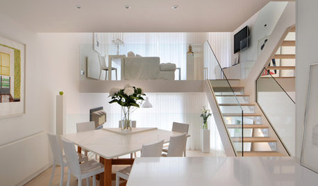
CONTEMPORARY HOMESHouzz Tour: A London Townhouse Lightens Up
A dramatic redesign of this multistory home transforms its dark 1970s-era interior into an all-white Scandinavian idyll
Full Story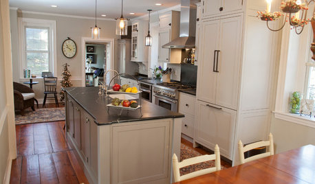
KITCHEN DESIGNNew and Old Mix It Up in a Historic Farmhouse Kitchen
A couple rethink the kitchen in their Pennsylvania farmhouse to restore authenticity while also creating a space for modern living
Full StoryMore Discussions
dkitchenreno
remodelfla
Related Professionals
College Park Kitchen & Bathroom Designers · Kalamazoo Kitchen & Bathroom Designers · Leicester Kitchen & Bathroom Designers · Holden Kitchen & Bathroom Remodelers · Cleveland Kitchen & Bathroom Remodelers · Hanover Township Kitchen & Bathroom Remodelers · Mesquite Kitchen & Bathroom Remodelers · Tempe Kitchen & Bathroom Remodelers · Avocado Heights Cabinets & Cabinetry · Graham Cabinets & Cabinetry · Reading Cabinets & Cabinetry · Short Hills Cabinets & Cabinetry · Mill Valley Tile and Stone Contractors · Roxbury Crossing Tile and Stone Contractors · Santa Rosa Tile and Stone Contractorsblondelle
lowjo1Original Author
kmgard
remodelfla
muscat
steff_1