


Color questions--vivid colors!
still_lynnski
13 years ago
Sort by:Oldest
Comments (12)
Related Stories
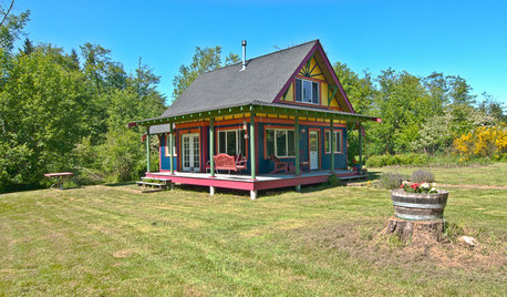
HOUZZ TOURSMy Houzz: Small, Vivid Island Home in Washington
A family guest home on Vashon Island becomes a primary dwelling with salvaged materials, efficient space planning and thoughtful details
Full Story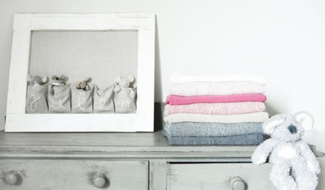
SHOP HOUZZShop Houzz: Vivid Kids’ Room Furniture and Decor
Bring joy and imagination into your child’s room with these whimsically colorful pieces
Full Story0
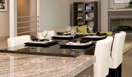
REMODELING GUIDES9 Hard Questions to Ask When Shopping for Stone
Learn all about stone sizes, cracks, color issues and more so problems don't chip away at your design happiness later
Full Story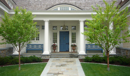
EXTERIORSCurb Appeal Feeling a Little Off? Some Questions to Consider
Color, scale, proportion, trim ... 14 things to think about if your exterior is bugging you
Full Story
COLORColors of the Year: Look Back and Ahead for New Color Inspiration
See which color trends from 2014 are sticking, which ones struck out and which colors we’ll be watching for next year
Full Story
5 Questions for Design Stars
Houzz Members Need Your Help With This Week's Design Dilemmas!
Full Story0

LIGHTING5 Questions to Ask for the Best Room Lighting
Get your overhead, task and accent lighting right for decorative beauty, less eyestrain and a focus exactly where you want
Full Story
GREEN BUILDINGConsidering Concrete Floors? 3 Green-Minded Questions to Ask
Learn what’s in your concrete and about sustainability to make a healthy choice for your home and the earth
Full StorySponsored
More Discussions


yborgal
dilly_dally
Related Professionals
Boise Interior Designers & Decorators · Boston Furniture & Accessories · Denver Furniture & Accessories · Fort Wayne Furniture & Accessories · Hastings Furniture & Accessories · Port Charlotte Furniture & Accessories · Richfield Furniture & Accessories · Clive Furniture & Accessories · Arlington Custom Artists · Summerville Custom Artists · Beech Grove Lighting · Green Bay Lighting · Tampa Lighting · Edmond Window Treatments · Mount Pleasant Window Treatmentsamysrq
forhgtv
still_lynnskiOriginal Author
larke
yayagal
forhgtv
User
yborgal
forhgtv
still_lynnskiOriginal Author