Comments (53)
DLM2000-GW
11 years agoI love your house. Just love the way things open and flow space to space. I get it about the color itch - no suggestions, because I look at your pictures and don't focus on the color but the space and general feel. I'll look again and see if something jumps out at me but hopefully some of the color experts will chime in.
Annie Deighnaugh
11 years agoI love the colors...so warm and cozy...except the first room which feels a tad cold by comparison....can you perhaps pick one of the colors already used and lighten it by several shades so it blends with the other spaces?
Related Professionals
East Patchogue Interior Designers & Decorators · Hagerstown Interior Designers & Decorators · Duluth Furniture & Accessories · Hastings Furniture & Accessories · Marietta Furniture & Accessories · Rock Hill Furniture & Accessories · Beverly Hills Furniture & Accessories · La Crescenta-Montrose Custom Artists · Seal Beach Custom Artists · Green Bay Lighting · Greenville Lighting · East Setauket Window Treatments · Mount Sinai Window Treatments · New Baltimore Window Treatments · Phoenix Window TreatmentsKristi
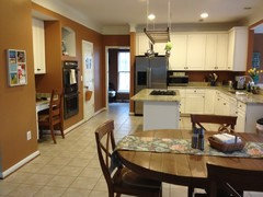
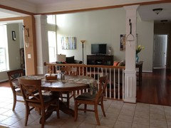
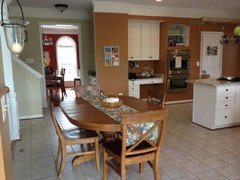
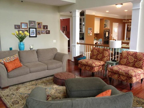
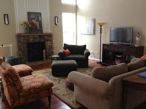
Original Author11 years agothanks, dlm2000, especially for helping me to remember that I love the overall vibe too, which I know is more important and speaks to our personalities, etc...its just that I've never been thrilled with the color of the great room walls (the color is benjamin moore abingdon putty and its also in the hall, stairway and foyer)...and see how all of the colors and surfaces crash into each other in the pic where the back steps and hall and kitchen and great room meet? The great room walls, the wood floor, the kitchen walls, the tile floor, the carpeted stairs, the trim and molding. It is very unpleasing to my eye. and I obsess about it. LOL. I need to fix it but I don't know how. I've been wanting to change the color of the great room at least, even if to go slightly warmer, darker, richer or something because I don't like the contrast between the abingdon putty and the benjamin moore etruscan (the color in the kitchen/morning room), but I'm worried I'd need to do the hall, stairway and foyer too because they are all connected...and thats a lot of repainting...the family room and foyer are two stories...the woman who helped me with the colors thought we needed to balance the colors based on the darker/lighter floors, and also the white cabinets and light granite in the kitchen in an effort to warm up that space which was cold, but I think she was wrong about the great room...I should have gone a little darker there and maybe extended the bm etruscan to that one portrait wall, not sure....I was very intimidated by painting this open floor plan house and I actually got some advice from people here which I did take into account, but I still ended up needing someone to walk the place with me in real life and help me decide...
Kristi
Original Author11 years agothanks, Annie....by the first room do you mean the lightest room? if so, thats the one thats bugging me and yes, I want to go slightly warmer or darker or something? anyone have ideas? maybe something in the BM affinity line because that kitchen color is an affinity color and maybe one of the other colors in that group would work? like thicket or elemental or are those still too light? too gray? too cool? I only know that I want to keep the same vibe and for that great room to have a warmer wall color....doesn't necessarily need to be as dark as the other room colors...
blfenton
11 years agoIn the great room - the light room - I don't think the colour is saturated enough. The mustard-goldy(?) colour, the plum and the red brick are very saturated colours and the lighter colour isn't holding it's own. If you want to stay in the "Taupey" colour maybe look at BM ranchwood cc-500 or stonehearth cc-490.
Can I just say that the colour that I find to be particularly jarring is the kitchen colour. The DR and LR colours are beautiful, saturated, sophisticated colours and the kitchen, for me, is not. (my 2c.)
Kristi
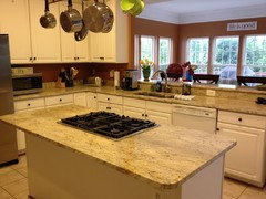
Original Author11 years agoThanks, blfenton and tinan. Can I ask you, blfenton, about the kitchen color (bm etruscan)? I would never have chosen that color myself, ever. It took the color consultant and I a really long time to find colors that worked with the granite and other surfaces in an effort to warm the place up, it was so cold. I will say that over the past 2 years I have come to really like it day to day, I'm not sure what it is, but I just really like the way it feels around me. Its the contrast between the 2 rooms, the etruscan and the abingdon putty that offend me. Having said that, I am open to changing the kitchen color along with the great room color as long as the kitchen is warm. So what are your thoughts about a color that would work in the kitchen given the light ceramic floors, the white cabinets and the granite, which I posted a close-up of so you could see then veins and all? Those things are NOT changing anytime soon, we just moved here a little less than 2 yrs ago and already replaced all of the hardwood and carpet, as well as painted the entire house. Also what would you do in the great room if the kitchen color were changed? Also, the furnishings are staying. Just curious....thank you!
blfenton
11 years agoI'm not sure you really want my immature take on colour but I'll give it to you anyway.
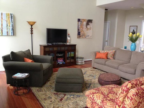
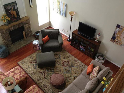
My theory is that colour, in some way, should transfer from room to room. You have done that with your blue accessories - a colour that you obviously like. You have blue in your art work in every room combined with vases, pillows and candlesticks and it works. It's almost like you started with the rug in your great room and took your colour cues from that with the blues.
The rug also looks like there is a bit of plum/burgundy which, although may not be the exact colour, flows into the colour of your living room. Now, your occasional chairs in the great room - they look great with the rug and it almost looks like the colour for the DR was drawn from those - there may not be an exact match but it's close enough that it flows.
When I looked at your first picture I was drawn to the colours in those occasional chairs - they are warm and they make a statement. But, for me they clash with the kitchen colour BUT they flow with everything else.
I might consider drawing inspiration from your occasional chairs. You DR and LR are great (I think) but I can understand where you are feeling a disconnect in the kitchen/great room. If you like the kitchen colour then maybe find a colour in your occasional chairs for the great room that would also work with your counter. Then the colour flows between both rooms.
Kristi
Original Author11 years agothank you again, blfenton...I am not so much looking for seasoned color experts LOL but more for feedback from people like you and me...although I will be grateful for experts to chime in also:) I'm not so interested in "rules", just getting it "right" in my eyes by figuring out what looks "good" whatever that means...
I realize the furnishings are not perfect matches here and there, but overall I think they work for the comfy vibe we are going for...we brought stuff from our old house and were lucky enough to get some random things from the previous owner of this house...and we painted before the furniture was moved in which I know is not optimal...
We are gonna be here a long time...this color thing is just one of several things I want to work on...
Definitely need to do something about he clash between the kitchen and great room...
Anyone have suggestions about a color for the great room if all other colors/furnishings stay the same (open to moving some of the furnishings around, but not buying anything new anytime soon!)
nosoccermom
11 years agoWell, BM suggests the following colors with Etruscan:
Englewood Cliffs (medium gray), https://www.houzz.com/magazine/50-shades-of-gray-stsetivw-vs~2901301-Shades-of-Gray
Yellow Freeze (light yellow), http://www.lifamilies.com/chat/topic-181377-1.html
Lion Yellow, (creamy yellow) http://lifeloomslarge.blogspot.com/2009/05/deeply-uncertain.html Lion Yellow
Brown Sugar (very dark brown)
On my screen, the colors on the BM web site look very different from other pictures (the yellows look very pink)Here is a link that might be useful: Colors with Etruscan
Annie Deighnaugh
11 years agoI would pick a gold tone for that room...you have it in the chairs, the painting over the fireplace and some of the stone in the fireplace.....
yayagal
11 years agoFor me the most perfect color choice for the "light room" would be a blue to compliment the orangy tones. You have the blue in the rug and could use that or a shade deeper. Orange and blue are a stunning combination and will add a richer feeling to the room which will then work well off your deeper colors.
Oakley
11 years agoI'm not good about paint color, but the main thing I noticed is the tablecloth. I'm very anal about tablecloths, lol, and I love them. But I think that's what clashes with the surrounding rooms.
I would use a bold patterned cloth. Look at the Provence tablecloths at Williams-Sonoma to give you an idea. You can bring the LR color into the kitchen by using some red from the chairs on the TC, and then use some matching accessories on your counters.
tinam61
11 years agoSince she asked us to ignore the tablecloth, I'm guessing it's not a permanent fixture.
KP - long time no see - love all your slipper chairs. We recently added one in front of fireplace.
tina
prairiemom61
11 years agoYes, she asked us to ignore the tablecloth, but there it is, soaking up and changing the light in the room. I would love to see the space without the tablecloth, with just the warm wood of the table. I think that would help us see the space more clearly.
Kristi
Original Author11 years agothanks everyone! I stayed up late into the night obsessing about it all...LOL...and one of the things I did was lose the kid proof vinyl table cloth and take a couple of new photos...will post when I have some more time later today...and will take a closer look at the rest of the comments, which I appreciate so much!
Oakley
11 years agoTina, thank you for pointing out the table cloth comment, I missed it. :)
However, I still would have pointed it out because a different tablecloth could bring both rooms together in a big way.
busybee3
11 years agothe family room walls almost read a minty/pastel color on my monitor---even in pics without the tablecloth...
i would choose a deeper and warmer color--- maybe a goldy color similar to BM crown point sand or oatstraw?? or maybe even something like elemental??
Kristi
Original Author11 years agook, here are more photos, specifically without that vinyl table cloth...and also revealing a return to the normal state of things i.e. toys all over the place
also, I went thru the BM Affinity colors and I think Elemental is a definite possibility, one of you nice people who commented noted it as a suggestion. Pulled several more from that group as well for the great room, as one color from the Classic collection that is darker than the existing color but in the same family. Lastly, ended up also pulling 2 Affinity colors that are slightly lighter than Etruscan, just in case I want to take it down a notch in the kitchen/morning room. Taping the samples to the wall just to get a better picture...will take a photo and post. I know I need to narrow it down and put big samples on the wall and live with them a few days to get the best idea of the reality of things...but I will be curious to see what you guys think...
and yes, I see the Abingdon Putty as minty too, which I did NOT want and the color consultant debated with me about it not being minty and I listened to her. The thing is that sometimes I really like it, it can look like a really neutral putty color with green undertones but sometimes it looks too yellow to me in an unpleasing way and sometimes it looks minty which I HATE
thanks!
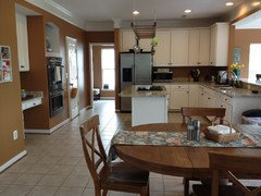
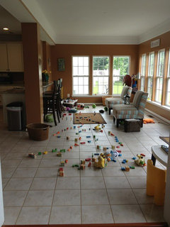
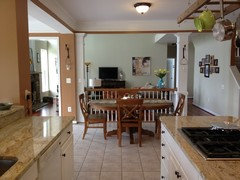
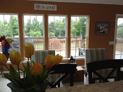
Kristi
Original Author11 years ago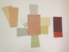
so, the bm etruscan is in the middle (its the current color in the kitchen/morning room) with several possibilities for the great room surrounding it, all bm affinity colors with the exception of the last one which is a bm classic color...clockwise from 12 o'clock they are elemental, anjou pear, wasabi, agave, thicket and baby turtle (the reason I picked the last one is because the color right above it on the chip is flowering herb and is almost identical to the existing color, abingdon putty, so in that scenario baby turtle is one level darker or whatever).
the two colors to the right are the colors in the front room of the house, sw spicy hue and bm fresh brew
the two colors to the left are also bm affinity colors, citrine and tumeric (left to right) and I was thinking I should at least consider going a little lighter in the kitchen if I am going to all of this trouble anyway?
so which color do you like for the great room, if any? and do you think I should go a little lighter in the kitchen, maybe the tumeric? and in that scenario which great room color would you choose?
any other color suggestions?
jessicaml
11 years agoGah! I made a list of colors I liked at work and forgot to bring the fandeck home with me.
From memory, I know I thought grasshopper, splendor, glacial till, elemental, anjou pear, and pashmina were worth consideration (all from the Affinity fandeck).
jessicaml
11 years agoAnd FWIW, I think you have a lovely, inviting home and that each room works really well on its own (my favorite is your living room); unfortunately, the abingdon putty does look a little washed out in comparison with your other colors.
It sounds like you're happy with the current gold and eggplant shades, so the easiest fix is to replace the putty with a deeper hue; the other option would be to keep the putty and instead replace the deeper colors, but if you start second-guessing everything, you'll drive yourself crazy! If you're not in love with the putty shade, I think you're on the right track to focus on that and the rest will fall into place.
jessicaml
11 years agoAlthough, after saying don't second-guess everything, I have to admit, I kind of like the idea of Citrine in your kitchen, since -in the picture, at least- I personally like the living room with the Abingdon Putty. You're the one who can judge the real feel and appearance of the colors, best, though.
Annie Deighnaugh
11 years agoAck! I love the kitchen just as it is....I would hate to see that beautiful nutmeg color change.
Just get a more saturated color than the putty....like wilmington tan or powell buff. You have that tan in the fireplace stone, the carpet, the chairs and your kitchen counters...it's neutral enough to blend with the other colors in the house and strong enough to stand on its own.
{{!gwi}}
1 Benjamin Moore HC-45 Shaker Beige
2 Benjamin Moore HC-34 Wilmington Tan
3 Benjamin Moore HC-44 Lenox Tan
4 Benjamin Moore HC-114 Saybrook Sage (not suggesting this one...it was in the picture i pasted)2nd choice would be a blue as you have it in the LR carpet and the table runner and it looks great with the other colors too....though it will make the space feel cooler than the gold/tan colorway. Unfortunately I don't have all the BM colors...on my deck it would be something between a jamestown blue and a covington blue ... similar to the blue in your table runner or the blue in your LR carpet.
natebear zone 10B
11 years agoA clarification-I like the tumeric best to replace the putty color in the family room. It's hard to tell, but it appears to be similar to the gold tone found in the FR chairs. The kitchen can stay the same color. I like it.
busybee3
11 years agoi like your current kitchen color... not saying the other 2 colors you're considering for the kitchen aren't nice, but i would be happy with your current kitchen color!!
out of the colors you show, i most like the elemental... to me the anjou pear and the wasabi are too yellowy-- if i were going to go with a gold, i'd go with a less yellow-green color and more of a subdued gold... more along the lines of the citrine- the left color of the 2 you show as possibles for the kitchen- but not that deep and not with an orange undertone... i don't know if the oatstraw would be too yellowy on the walls, but that's more of the tone i would look for...
Kristi
Original Author11 years agothanks everyone!
oh boy have I been driving my husband nuts with the excruciating detail of it all! he's being a good sport, though, and really trying to understand why I dislike the abingdon putty so much since its one of his favorite colors in the house.
this is why: 1) I hate when it gets minty sometimes and a weird yellow sometimes 2) I hate the contrast between that and the etruscan (my husband agrees with me there)
I've tried to like it for 2 years and I just don't, except for at night, but then only on its own, still don't like it in contrast with etruscan...all this even though I've changed around furnishings and accessories to try to balance things out.
so.
narrowed things down further today and I think elemental is the one that I like best on its own merits and also as a compliment to etruscan. my husband is open to that one. but is hoping maybe we would do only the great room and leave the hall/stairs/foyer abingdon putty. as a compromise I am open to that, and they seem ok together, BUT the color consultant from 2 yrs ago said that it was a big no-no to break up that line of sight from front to back since they are connected by a catwalk, meaning you can see thru, with two different colors. what do you guys think? to my untrained eye abingdon putty and elemental could be on a paint strip together...
We ruled all the other ones out and also decided that if/when we do something different someday with the kitchen, we can revisit that color then...but for now we like the etruscan in there. we worked hard to find the right color given the granite, floor, cabinets.
I'm not 100% completely sure elemental is right...I do like it a lot...I like the gray/green thing going on in elemental...it feels much warmer, calmer, richer, saturated, or something to me than abingdon putty...but not sure if there are other colors I should consider...what do you guys think about bm baby turtle? is it too yesterday? the chip looks good next to the etruscan, it has more yellow or something in it than elemental so its not as gray, it seems. interesting thing is that the chip right next to baby turtle is flowering herb which is nearly identical to abingdon putty.
I do not want anything blatantly blue...or green...or gray...or yellow...or gold...I am open to other neutrals but I hate when tan/beige colors go pink in some light so I am very very cautious about them. we painted our master bedroom beach house beige and I don't like it as well as I thought I would...maybe when we really decorate the room sometime and get the right furntiure, linens, art, etc in there that will change.
I took a few more pics, featuring a big sample of elemental, that I will post later....
julies_kitchen
11 years agoI have BM Fairway Oaks in my entry/living room and I think it would look fantastic with your other colors. In fact, my designer picked Satchel for another of our rooms, which reminds me a bit of the Etruscan. I can absolutely see the Fairway Oaks when I see your room to room views. It is a warm tan with no pink at all, at least at my house. I also think it would look fantastic with your art work and the printed chairs--they all seem to have the Fairway Oaks tan color in them. In fact, I looked into getting curtains made out of the fabric of your table runner (World Market, right?) in the kitchen and the Fairway Oaks looked awesome with it! Maybe it would work?
ingrid_vc so. CA zone 9
11 years agoYour space is indeed beautiful but I feel the difference in the colors in terms of hue makes for a disconnect. By that I mean that one area is very light and slightly cool and the other area is very dark and warm. I don't see how that could ever work and I'm surprised that an "expert" would give you this kind of advice. The dining room is very nice. it. The morning room is nice too but I wonder if a nice rug wouldn't soften the wall color a bit and warm the space.
Another thought is that the very light tile flooring with the rather dark walls is not harmonious.
I'm sorry to say that I feel the color in the kitchen doesn't do justice to your beautiful granite. It's just too dark and overpowering and makes the beautiful elements of the kitchen almost disappear. I would choose a color that picks up the yellowish color in the granite but make it very soft and subtle. Most people, unless they go for off-white, tend to choose wall colors that are too dark, when actually that color should be a fairly subdued background for your furnishings, rugs, drapes and art. There are always exceptions but I think in your case that is the problem. I like the idea of gray in the living room but the tone you have is a little bit too light and not warm enough. It lacks interest and needs just a bit more punch. I would definitely pick a warm gray, not much deeper than the one you have, just a little darker. If it's a warm color it won't clash with the color of the kitchen and room beyond it. Of your paint swatches, Anjou Pear comes closest to what I think the kitchen and adjoining room would look very nice in.
In one picture where I see the dining room and kitchen at the same time I think the kitchen color clashes rather badly with the dining room. The DR color is pretty; I would not change that.
If you didn't want to paint the living room also, you could for now leave it alone and paint over the very dark color in the kitchen and adjoining area. You could then assess what the living room needs to make a more harmonious picture. Good luck to you!
Kristi
Original Author11 years agoThis really helps me, all of these comments and thoughts, so thank you very much!
Ingrid, the 'expert" was a BM color consultant...they have them in some of their stores where you pay a fee that is much less than the going hourly rate for private color consultants, I guess the store subsidizes their fee and hopes that you will buy the paint at their store. I hired her to come for an hour or so because I had never painted a house that had an open floor plan....and the wood floors and light ceramic tile with white cabinets and light granite really presented a challenge to me. I chose the front room colors, that very dark brown (which I admit is flatter or something than I wish plus we don't have the furniture or anything really squared away in there yet because our hope is to put in a wall of built in bookshelves with lighting and all, someday), and the spicy hue in the DR, which I fought for. She wanted me to paint that room a terra cotta that I really felt would end up looking too pink, and I am glad I stuck with my gut.
I was at a total loss about the kitchen, connecting room (we call it the morning room) and the family room or great room. when we moved here, the kitchen was a very sunny yellow, the connecting room was a baby blue and the family room was a sage that was all wrong is pretty much all I knew.
I knew I wanted the kitchen and connecting room the same color and that I wanted the space there to be warmer, it was so cold. I was so stressed trying to figure it out that when she pulled out the bm etruscan and it brought out some of the nice color in the granite, I jumped all over it, even though I never would have chosen that myself. I was very taken aback the day it went on the walls, worried that it was too dark...and yet I have come to like it a lot...but as I said, I am open to changing it sometime.
The abingdon putty was a color I never felt good about. But not because I didnt try. She convinced me it would be a good way to balance the dark/light floors, etc...and there were times when I liked it, especially at night...and its very liveable...you know, as a neutral, it just fades away a lot of the time...but when it turns minty and yellow in different lights and then that contrast, I just have come now to hate it. And mostly I kick myself because I never felt good about it and we were on a painting deadline and all. Dumb.
So, you are saying anjou pear is a color you think would be good in the kitchen, and something slightly darker than elemental in the family room? which color exactly? do you have a recommendation?
Can anyone else speak to the whole light/dark floor thing? trying to make those two rooms hang together better? does anyone think that keeping the kitchen the existing color and changing the family room to elemental would help or is it not enough? any other specific recommendations/ideas of how to get these two areas in better balance?
ingrid_vc so. CA zone 9
11 years agoI've usually had to have the store do custom colors for me, i.e. I would buy a little container closest to the color I thought I might like and then would have them add a little bit of another color and try that out. I'd usually end up buying four or five of the little containers with different colors added until I finally came up with what I really wanted. I did that in three different rooms and am very happy with the results.
Yes, I was saying something like the anjou pear would be good in the kitchen and a slightly darker and warmer gray in the family room than what you have now. However, you'd have to try samples on the walls of course and customize the color to what you feel really pleases you. It's actually a fun and creative process. Naturally I can't tell from the small sample if that's really the right color but it's along the lines of what I was thinking. You have to be the final judge.
jessicaml
11 years agoI love Elemental (neutral greens are my favorite) but you also may want to check out Baffin Island, for a slightly lighter and less green option...it reminds me of Abingdon Putty, but deeper.
Kristi
Original Author11 years agofirst, I want to thank you all for responding to my request for help with this color thing...all of the comments and suggestions and ideas have been very helpful!
If its not too much to ask, would some of you be willing to look at these pics and give me your feedback? I'd appreciate it so much because I feel like I'm closing in on fixing this!
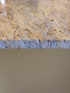
the big sample on top is BM Elemental. love it and my husband is happy with it too. the big sample below it is BM Citrine. I like it a lot and my husband likes it too. its approximately 2 chips away from the exisiting color which is BM Etruscan (which we both like but we have come to see that part of the balance issue is that it might be too dark and we are trying to find something similar, very warm, but lighter).
the small chips are exisitng colors, the etruscan of course, and also the colors in the front rooms, spicy hue and fresh brew. I took a close up of citrine with the granite too.
in terms of the family room'great room color, we looked at everything you all suggested and then some, and kept coming back to Elemental. in terms of the kitchen, although we think elemental looks nice with the Estruscan, the contrast still might be too much. we looked at Tumeric, which is only slightly lighter, and also Anjou pear, which is too green, not warm enough.
So. my question is having seen the earlier pics of our space, do you think changing the family rm/great rm to elemental and the kitchen area to citrine would make the space more balanced? or would you choose to only change the family room color and have elemental be next to the existing kitchen color, etruscan?
also, if you just think I'm totally off for whatever reason, I am open to hearing that too.....even if I have to start all over....but I hope not;)
thank you!

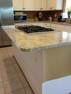
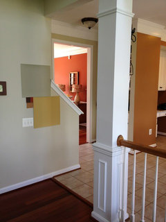
nanjean68
11 years agoI have "basically" the same BM color called Richmond Gold. It's an HC color. We have a greatroom so everything is in that color. For the dining room I chose Martha Stewart's (when it was in Sherwin Williams) Rubbed Sage which is similar to one you show only with a touch of gold. It's a magnificient color and I still have the formula that SW will make for me. I love it so much that we used it in the masterbedroom. People come in and just stare and then say how much they love the color combinations. Traditional Home Magazine also featured our color and used silver gray silk draperies in a diningroom along with pale grey lavender as accents. The other rooms were painted one of the other colors from the swatch of BM's Richmond Gold. I think you have too much going on with warm and cool and maybe consider painting the grey walls one of the compatible colors to your kitchen. The difference between your kitchen and mine is that I have all stainless and pecan brown colored cabinetry with black and terracotta quartz counter tops. I, too, use blue accents around. Hope this helped.
Annie Deighnaugh
11 years agoSorry but the elemental still leaves me cold...all your other colors are so warm that by comparison, I think it will still leave you dissatisfied.
elle3
11 years agoI'm not usually one to offer advice on paint colors, but I am a "serial" painter, lol. I paint and repaint because I often make mistakes with undertones (even though I have a ton of samples!) I have gotten better over the years :)
Your beautiful home is painted in all warm,(and cozy!) tones. Elemental, while beautiful, is so very different from all of your other colors. And even though it looks on the monitor like a great match to the granite (and it is), it's so very different from the warm tones in the kitchen and the rest of the house.
I liked the suggestions of fairway oaks, and wilmington tan. . May I also suggest BM palm desert tan--my sil has it in her family room and her kitchen is painted in a similar color to yours. It looks fabulous!
Your home is soo pretty. Good luck to you!Kristi
Original Author11 years agothank you everyone, again:)
just to be clear, the color that I photographed with the granite was citrine....did not translate well at all. its similar to the existing color, but lighter.
I am open to keeping the existing kitchen color, etruscan,i like it, i like how it feels around me, even though i worry its too dark
I see what you are saying about elemental...I got the chip of fairways oaks and I hated it in the store...maybe I need to pull that and a few others and bring them home....
I guess too I was hoping I could find some kind of warmish, neutral green/gray that would look good with everything else....its just a color that I like....but maybe its not meant to be...its more important for me to feel like everything is more balanced, hanging together...and i do not want to change everything...theres a lot i like....
so if I keep everything else the same....what are your suggestions for the family room? hopefully there are some that are not so light/cool like the current abingdon putty? in addition to fairway oaks, some of the other neutrals mentioned?
the dining room is sw spicy hue
the library is bm fresh brew
the kitchen area is bm estruscan
what would be a good NOT TOO LIGHT OR BEIGE color for the family room given our furnishings and all of the light that pours in there and how dark the kitchen can look, even with the white cabs and all.....????my head is spinning...ready to hang it up.........ugh
bananafana
11 years agoWhat a lovely home. I especially like your kitchen color....beautiful.
You mentioned several times that something seems off about how the different colors butt up against each other. I see that too. Like some of the planes of color don't seem to make sense or "collide", I think you said. I think you will for sure want to get that figured out if you paint the family room or it's still going to bug you.
I can see how hard it is to find the right place to end and stop colors in an open plan like you have. Just as an example: You know the horizontal plane above your sink where you have the hook and is currently white? I think that should be your russet kitchen color under there, and continue all the way over to your dining area where the white column starts. Know what I mean? It would look like the thick structural element it is.
A similar thing is happening over the desk area in the kitchen. I think the "ceiling" of that inset space should also be the dark color rather than white----again, it would thicken up the structure of that inset area and wouldn't cut it up like it is now.
There's definitely a collision of color when you look at the two columns by your kitchen table, and running over to the staircase, like you mentioned. What would you think if you used the white column color on the skinny bit of high-up vertical wall right there (started from the left side of the left column over to the staircase)? I think it would eliminate some of the choppiness and also would help define the columns/railing element as something in an of itself.
There might be some other odd intersections of colors to look at too. People here can definitely help sort that out.
bananafana
11 years ago(Sorry about double post.)
Anyhow, ps: Having those 2 hanging candles, one on the dark color and one on the right-hand white column is confusing the issue also. Could you live without the one on the white column?
amykath
11 years agoMy vote is to keep your kitchen color. What is funny is I do not tend to like that tone but it is gorgeous in your home! I would definitely keep it.
I also like elemental for your living room. The current living room color is certainly not bad it just seems washed out and I can see how it may look minty at certain times of the day.
I think the elemental has more of a richness and there will be no hint of mint.
Keep us posted!
Love your house!
Annie Deighnaugh
11 years agoI don't understand why you won't try the wilmington tan...it is very close to a color that appears in all 3 art pieces in the room, the slipper chairs and the carpet, and it reads warm like the rest of the rooms. If not wilmington tan, then perhaps a shade lighter. Pittsfield buff has a more greenish undertone and is a paler color. Or take a look at light khaki. If you want to stick with the affinity line (I can only see them on screen) I would look at the colorway of the safari, handmade or maybe amulet. It's hard to see on screen how yellow they might read in the space. Or if you really want green, did you try grasshopper?
Grasshopper
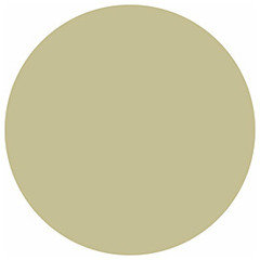
Amulet

The grayish greens start to read cool. Adding yellow to green to warm up the look starts to look olive....
Kristi
Original Author11 years agothank you for your ongoing help!
somehow I missed wilmington tan...I have the paint strip with just the little chip. I like it. and it does look nice with our art. but when I held it up to the kitchen etruscan chip on that family room wall it looked kind of pinkish? not sure.
I greatly appreciate the help re: trying to figure out which surfaces to paint what color...I want to fix that and I know its wrong now. the color lady and the painter debated about it over several days and I got tired and gave up...let the painter do what he thought....
I am going to take a day or so and NOT look at paint:) to clear my head....and then come back to it...
thanks everyone....and if you have any other thoughts/ideas please add!!!!
busybee3
11 years agoi agree that you have to be careful of tans and beiges to avoid pink undertones which would not look good at all in that room---
the elemental looks much nicer than what you currently have- but isn't a warm tone, if that's what you're interested in... i do think the elemental will look nice with your fam rm furnishings, etc.
the citrine is too deep and bold that it will fight abit with your other colors, imo...
though i think on the gold side is a nice way to go... i would look for something a little lighter and slightly browner--i think the citrine might cast orange undertones which will clash with your rug and sofa-- even though it might look ok with the chairs, you want the orangey color in there to be more of an accent, not a backdrop....julies_kitchen
11 years agoKP, I wasn't impressed with the little paint chip of Fairway Oaks either--just looked kind of blah. But when we put it up, it was great. It reminds me a lot of the tan on the outside of Pottery Barn stores. Nice, strong, warm tan. I found some old photos so you could see it IRL. I hope they're not too large--I tried to resize but not sure it worked...
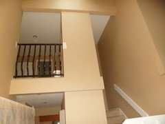
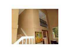
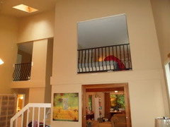
Regarding Annie's post above. Wilmington Tan was what I wanted, but it went butterscotch on me, so this is what we used, so I second a vote for that as well. Paint can be so different in each person's home...
Good luck!
julies_kitchen
11 years agoOK, I just noticed that the photos don't really look as warm as the paint looks in our house. I think they are washed out from the light. I just really encourage you to take a closer look at that one and Wilmington Tan too. You can look up pictures of Annie's Wilmington Tan, and Jan in Wisconsin's too, if you look in the Favorite yellow/golds post. They are tan, though...
nanjean68
11 years agoCheck out Angelo Surmelis on Facebook. He's a decorator who used your color in someone's home who won a contest to be made over. I think I would stay far away from boring beige or corporate beige as my decorator friend calls it - You are on the right track with gray but I would have used it as accessories or as in Surmelis' house on the floor and draperies.







Tmnca