


Growing pains with decorating light gray walls
Nannajoe
12 years ago
Sort by:Oldest
Comments (7)
Related Stories

DECORATING GUIDESColor of the Week: Decorating With Warm Gray
Tired of tan? Getting gloomy from cool gray? Make warm gray your new go-to neutral
Full Story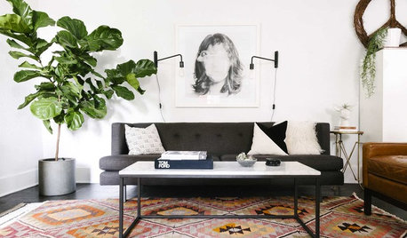
HOUSEPLANTS10 Top Plants to Grow Indoors
Brighten a room and clean the air with a houseplant that cascades artfully, stretches toward the ceiling or looks great on a wall
Full Story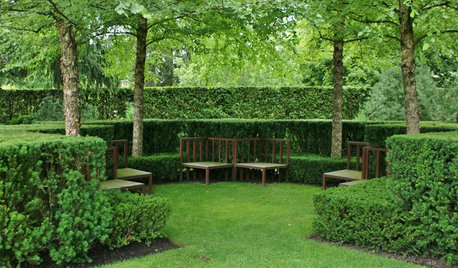
GARDENING GUIDESGrow Your Own Privacy: How to Screen With Plants and Trees
Use living walls to lower your home and garden's exposure while boosting natural beauty in your landscape
Full Story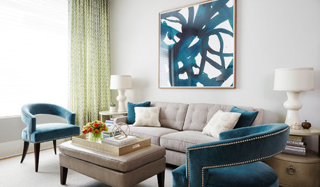
TRANSITIONAL STYLERoom of the Day: Multipurpose Space Grows Up for a Young Family
A designer revamps a New York living-dining room with light colors, flexible furnishings and sophisticated childproofing
Full Story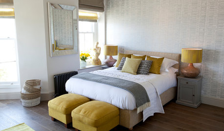
COLOR10 Pretty Ways to Refresh a Gray Palette
Energize your favorite gray shades with pick-me-up accents as fresh as a spring day
Full Story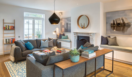
FURNITURE11 Reasons to Love a Gray Sofa
See how a sofa in this neutral shade can take on anything you mix with it, from soft to sharp and everything in between
Full Story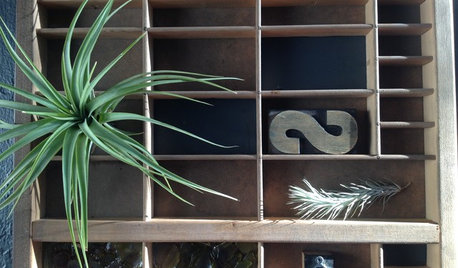
DIY PROJECTSReinvent It: Grow a Mini Vertical Garden in Printing Press Drawers
Make a living wall composition from vintage finds and greenery, for an artful indoor garden
Full Story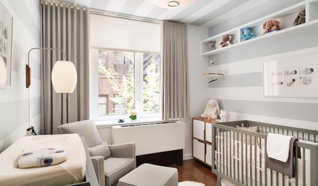
NURSERY IDEASHow to Decorate a Nursery to Grow With Your Baby
A neutral palette, convertible furniture and classic patterns mean you won't have to redecorate for the phases of childhood
Full Story
HOUZZ TOURSMy Houzz: A Grand Overhaul for a Growing Family
A suburban home's top-to-bottom remodel creates plenty of room for entertaining and for little ones
Full Story
MOST POPULAR50 Shades of Gray
Gray is hotter than ever, thanks to a hit novel full of risks and dark secrets. Tell us: Which paint shade possesses you?
Full StoryMore Discussions


dianalo
homeagain
Related Professionals
Boise Interior Designers & Decorators · Washington Interior Designers & Decorators · Athens Furniture & Accessories · Easton Furniture & Accessories · Mansfield Furniture & Accessories · Spartanburg Furniture & Accessories · Alpharetta Furniture & Accessories · Champlin Furniture & Accessories · Hilton Head Island Furniture & Accessories · North Hollywood Furniture & Accessories · La Crescenta-Montrose Custom Artists · Aurora Lighting · Spring Lighting · Mount Sinai Window Treatments · Brownsville Window Treatmentsjane__ny
cindyloo123
NannajoeOriginal Author
ttodd
alex9179