I Need Your Opinion Please!!
ideamom
14 years ago
Related Stories
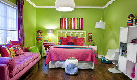
DECORATING GUIDESNo Neutral Ground? Why the Color Camps Are So Opinionated
Can't we all just get along when it comes to color versus neutrals?
Full Story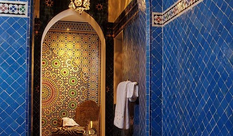
TILEMoor Tile, Please!
Add an exotic touch with Moroccan tiles in everything from intricate patterns and rich colors to subtle, luminous neutrals
Full Story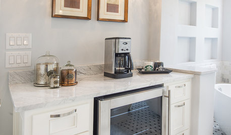
BATHROOM DESIGNUpload of the Day: A Mini Fridge in the Master Bathroom? Yes, Please!
Talk about convenience. Better yet, get it yourself after being inspired by this Texas bath
Full Story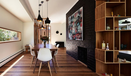
WALL TREATMENTSExpert Opinion: What’s Next for the Feature Wall?
Designers look beyond painted accent walls to wallpaper, layered artwork, paneling and more
Full Story
DECORATING GUIDESPlease Touch: Texture Makes Rooms Spring to Life
Great design stimulates all the senses, including touch. Check out these great uses of texture, then let your fingers do the walking
Full Story
HOUSEPLANTSMother-in-Law's Tongue: Surprisingly Easy to Please
This low-maintenance, high-impact houseplant fits in with any design and can clear the air, too
Full Story
Yes, Please: Parisian Hotel Flair
Bring on the Bling to Recreate the City of Romance at Home
Full Story
DECORATING GUIDES10 Bedroom Design Ideas to Please Him and Her
Blend colors and styles to create a harmonious sanctuary for two, using these examples and tips
Full Story
HOME OFFICESQuiet, Please! How to Cut Noise Pollution at Home
Leaf blowers, trucks or noisy neighbors driving you berserk? These sound-reduction strategies can help you hush things up
Full Story



erikanh
crescent50
Related Professionals
Hammond Kitchen & Bathroom Designers · King of Prussia Kitchen & Bathroom Designers · Montrose Kitchen & Bathroom Designers · Redmond Kitchen & Bathroom Designers · Biloxi Kitchen & Bathroom Remodelers · Oklahoma City Kitchen & Bathroom Remodelers · Pinellas Park Kitchen & Bathroom Remodelers · Phillipsburg Kitchen & Bathroom Remodelers · Aspen Hill Cabinets & Cabinetry · Graham Cabinets & Cabinetry · Newcastle Cabinets & Cabinetry · Wyckoff Cabinets & Cabinetry · Phelan Cabinets & Cabinetry · Gladstone Tile and Stone Contractors · Hermiston Tile and Stone Contractorsdfzmom
writersblock (9b/10a)
rubyfig
ebse
plllog
crazyhouse6
rhome410
Buehl
dkitchenreno
bevangel_i_h8_h0uzz
suzienj
lil_sister
needsometips08
mbarstow
sandsonik
palimpsest
debbie_123
pattyk_64
autumngal
lilyfreak
sailormann
wildcat22
susanlynn2012
boxerpups
lesmis
ideamomOriginal Author