


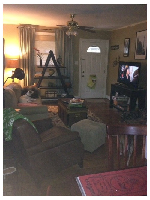
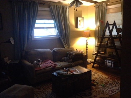
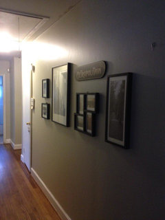
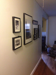
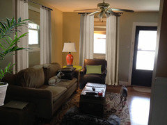
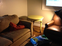
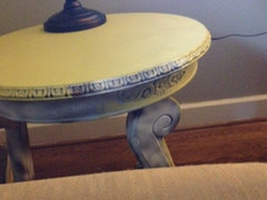
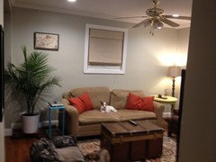
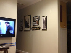
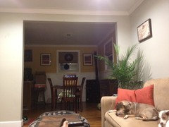
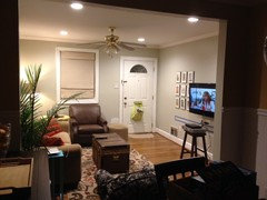
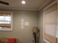
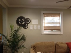
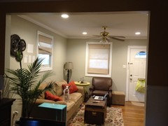
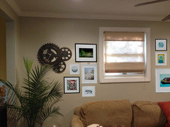
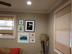
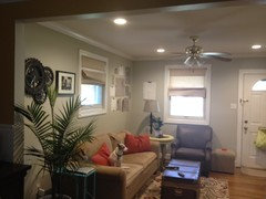
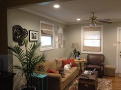
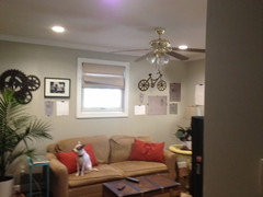
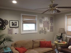
Living Room Refresh.
Steph F
8 years ago
last modified: 8 years ago
Featured Answer
Sort by:Oldest
Comments (80)

Steph F
8 years agoRelated Professionals
Rockland Interior Designers & Decorators · Clayton Architects & Building Designers · North Bergen Architects & Building Designers · Palos Verdes Estates Architects & Building Designers · Lenexa Kitchen & Bathroom Designers · Pleasanton Kitchen & Bathroom Designers · South Barrington Kitchen & Bathroom Designers · Woodstock Furniture & Accessories · Hoffman Estates Furniture & Accessories · Kansas City Furniture & Accessories · Annandale General Contractors · Bremerton General Contractors · Country Club Hills General Contractors · Easley General Contractors · Kemp Mill General ContractorsSteph F
8 years agoSteph F
8 years ago
susan2494
8 years agoSteph F
8 years ago
groveraxle
8 years agolast modified: 8 years agoSteph F
8 years agosusan2494
8 years agoSteph F
8 years agoSteph F
8 years agoSteph F
8 years agoSteph F
8 years agosusan2494
8 years agolast modified: 8 years agogroveraxle
8 years ago
Lila
8 years agoSteph F
8 years agoSteph F
8 years agoSteph F
8 years agolast modified: 8 years agosusan2494
8 years agoSteph F
8 years agogroveraxle
8 years agoSteph F
8 years agoSteph F
8 years agoSteph F
8 years agoSteph F
8 years agoSteph F
8 years agocolumbia93
8 years agoSteph F
8 years agosusan2494
8 years agogroveraxle
8 years agolast modified: 8 years agoSteph F
8 years agoSteph F
8 years agoSteph F
8 years agolast modified: 8 years agogroveraxle
8 years agogroveraxle
8 years agoSteph F
8 years agoSteph F
8 years agolast modified: 8 years agogroveraxle
8 years agoSteph F
8 years agoSteph F
8 years ago


Related Stories
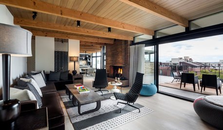
LIVING ROOMSRoom of the Day: Living Room Refresh Adds Style and Functionality
A Seattle midcentury modern space lightens up, opens up and gains zones for entertaining and reading
Full Story
RANCH HOMESRoom of the Day: Ranch House Refresh
An interior designer revamps a living room-family room
Full Story
COASTAL STYLERoom of the Day: Refreshing Coastal Hues in a Family-Friendly Space
A Massachusetts home's new open-plan area is perfect for games, movies, homework and reading by the fire
Full Story
SHOP HOUZZShop Houzz: Living Room Refresh Sale
Up to 65% off seating, rugs, lighting and more for a revamped space
Full Story0
HOUSEKEEPING10 Ideas for a Spring Home Refresh
Focus your energy on a few key spots to recharge your living space and your outlook
Full Story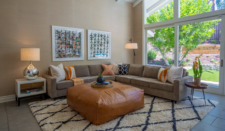
DECORATING GUIDESMidcentury-Modern Family Home Gets a Retro Refresh
A makeover of this home’s public spaces honors its original style and ties together its rooms
Full Story
SHOP HOUZZShop Houzz: Refresh the Kids’ Room for $99 or Less
Fun bedding, wall decals and other elements to make your young one’s space come alive
Full Story0

DECORATING GUIDESRefresh Your Room With Swimming Pool-Inspired Decor
Discover a dozen stylish spaces that take the plunge
Full Story
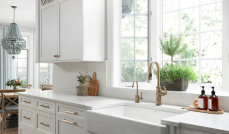
KITCHEN OF THE WEEKKitchen of the Week: Refacing Refreshes a Family Kitchen on a Budget
Two-tone cabinets, vibrant fabric and a frosty backsplash brighten this eat-in kitchen
Full Story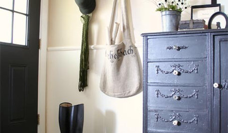
ENTRYWAYSRefresh Your Mudroom
Give clutter the boot with these tips for organizing and furnishing the mudroom, one of the hardest-working spaces in the home
Full Story

susan2494