


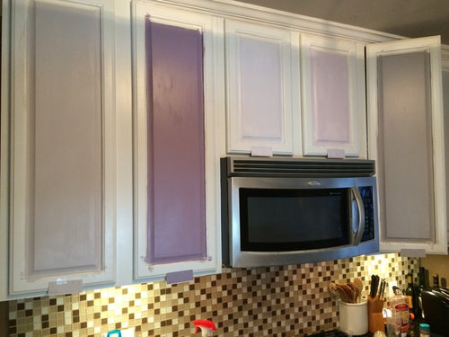
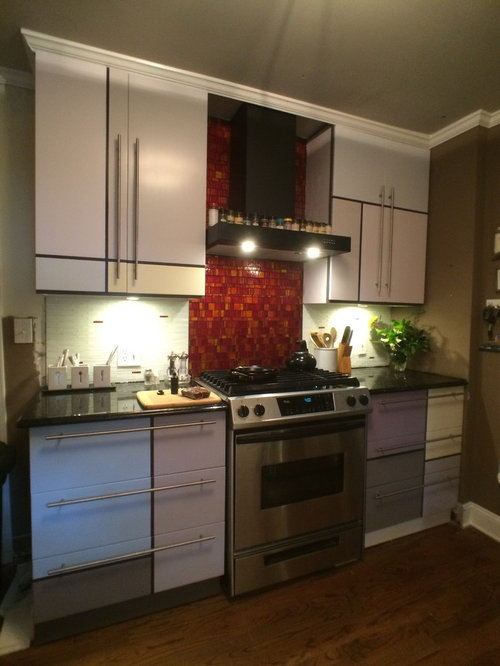
Kitchen redecorating
User
7 years ago
last modified: 7 years ago


Featured Answer
Sort by:Oldest
Comments (19)

Related Stories
BUDGET DECORATINGThe Single Easiest Trick for Serial Redecorators
Take the no-sweat approach to no-commitment decorating with this inexpensive, readily available solution
Full Story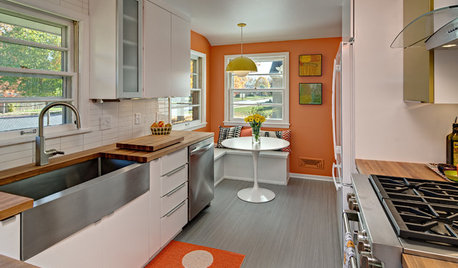
KITCHEN OF THE WEEKKitchen of the Week: Midcentury Meets Sweden in Minneapolis
A fun, retro-style makeover gives an aging galley kitchen a fresh look with a nod to the past
Full Story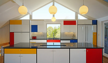
KITCHEN DESIGNKitchen of the Week: Modern Art Inspires a Color-Blocked Look
In a midcentury beach house on Martha’s Vineyard, a redesigned kitchen embraces the look of Mondrian
Full Story
BUDGET DECORATING9 Tricks to Boost Your Home’s Appeal for Less Than $400
Whether you’re redecorating or just doing a quick update, check out these ways to enhance your home on a budget
Full Story
MOST POPULARBudget Decorator: Shop Your Home for a New Look
Redecorate without spending a cent by casting a creative eye on the showroom called home
Full Story
ECLECTIC HOMESHouzz Tour: Playful Style Reinvents a Childhood Home
You really can go home again, especially when you redecorate with classic, modern and quirky pieces that suit your style
Full Story
HOUZZ TOURSHouzz Tour: Light and Lovely Home with a Special History
Trina McNeilly redecorates the house she grew up in for her family of 6
Full Story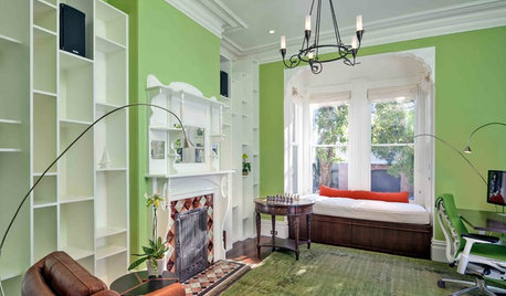
COLORHouzz Tour: A Colorful Victorian Gets a Through Line
Color, repetition and a 52-foot-long runner unify the rooms in this newly redecorated San Francisco home
Full Story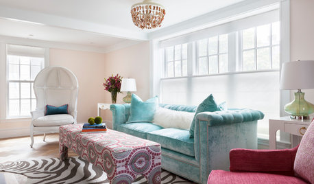
DECORATING GUIDESHouzz Tour: A Historic House Gets a Feng Shui Adjustment
In a Massachusetts seaside town, a traditional home is redecorated in a playful style and with attention to flow and balance
Full Story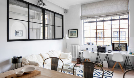
CONTEMPORARY HOMESHouzz Tour: Black, White and Scandinavian-Industrial All Over
A penthouse apartment in a converted schoolhouse gets reconfigured and redecorated to became a restful city sanctuary
Full StoryMore Discussions

gella81