


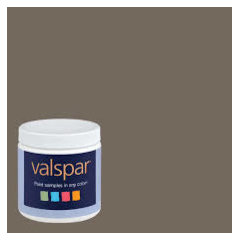
2017 Colour of the Year
Beyond Beige Interior Design Inc.
7 years ago

Yes, I love it
No
Featured Answer
Sort by:Oldest
Comments (27)
 PRO
PRO PRO
PROGerety Building and Restoration
7 years agoBeyond Beige Interior Design Inc. thanked Gerety Building and RestorationRelated Professionals
American Canyon General Contractors · Bay City General Contractors · Bellingham General Contractors · Beloit General Contractors · Enumclaw General Contractors · Fargo General Contractors · Montebello General Contractors · Rock Island General Contractors · Branford Flooring Contractors · Cedar Park Flooring Contractors · Greer Flooring Contractors · Kendall West Flooring Contractors · Kirkwood Flooring Contractors · Washington Flooring Contractors · Woodstock Flooring Contractors
tooky58
7 years ago PRO
PROSpenard Builders Supply - Eagle River
7 years ago PRO
PROSignature Home Services
7 years ago
minjeeah
7 years ago PRO
PROGarage Doors Unlimited
7 years agoBeyond Beige Interior Design Inc. thanked Garage Doors UnlimitedBailey R
7 years ago PRO
PROGarage Door Repair San Francisco
6 years agoRenee Terenzio
6 years agolast modified: 6 years agoBeyond Beige Interior Design Inc. thanked Renee Terenzio
Momof5x
6 years agoUser
6 years ago
Related Stories

COLORColors of the Year: Look Back and Ahead for New Color Inspiration
See which color trends from 2014 are sticking, which ones struck out and which colors we’ll be watching for next year
Full Story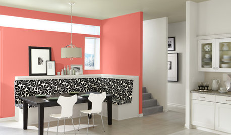
COLORBest Ways to Use This Coral Color of the Year
Sherwin-Williams goes for a preppy pop of color in its paint pick for 2015
Full Story
PINKHoneysuckle: Inspired by Pantone's Color of the Year
13 ways homes can wear this confident shade of pink, Pantone's color of 2011
Full Story
DECORATING GUIDESTangerine Tango: 4 Ways to Use Pantone's Color of the Year
Don't let this bold hue scare you — try warming up any room with this cheerful red-orange color of 2012
Full Story
COLORColor of the Year: Off-White Is On Trend for 2016
See why four paint brands have chosen a shade of white as their hot hue for the new year
Full Story
COLORPantone Unearths Emerald as Its 2013 Color of the Year
Whether you dig a natural version or go for one with polish, Pantone is predicting you'll treasure emerald green at home over the next year
Full Story
COLORHow to Use Marsala, Pantone’s 2015 Color of the Year
Pantone digs deep and goes earthy with its selection. Here are ways to make it work in your home
Full StoryCOLOR10 Great Places for Rich Fall Colors Year-Round
Use nature’s burgundies, golds and oranges in these select spots for a comforting feel no matter what the season
Full Story
COLOR4 New Neutrals for the New Year
So you're not resolved to go crazy with color in 2013. These refreshing on-trend neutrals can still broaden your rooms' color horizons
Full Story
COLOR PALETTESCrisp, Clean White Interiors to Start the New Year Right
Beginning with a blank-slate backdrop gives you infinite design freedom with accent colors, furniture styles and finishes
Full Story


Mountain MT Homes LLC