


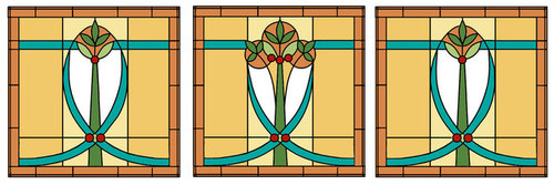
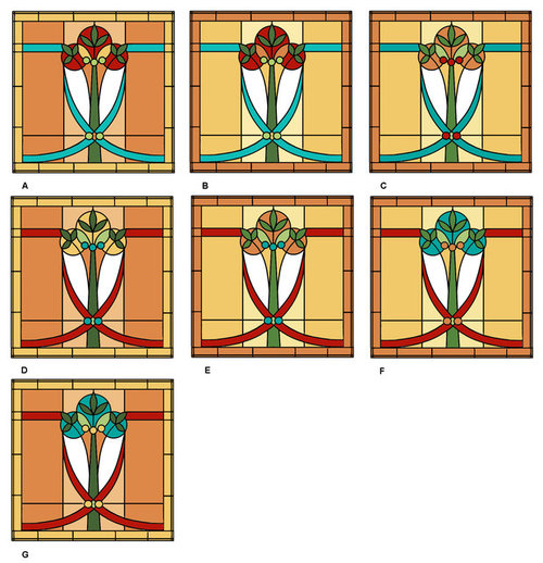
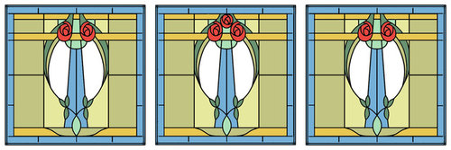
Color Placement for Stained Glass Windows
cpartist
6 years ago

Featured Answer
Sort by:Oldest
Comments (39)
Related Professionals
Syracuse Architects & Building Designers · Oak Hills Design-Build Firms · Odenton Home Builders · Annandale General Contractors · Avon Lake General Contractors · Converse General Contractors · Exeter General Contractors · Gary General Contractors · Jefferson Valley-Yorktown General Contractors · Merrimack General Contractors · Mishawaka General Contractors · Orangevale General Contractors · Red Wing General Contractors · Warren General Contractors · Joppatowne General Contractors
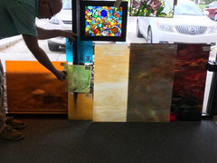
cpartist
6 years ago
dsnine
6 years agolast modified: 6 years agocpartist
6 years agocpartist
6 years agocpartist
6 years agocpartist
6 years agocpartist
6 years ago
amyktexas
6 years agocpartist
6 years ago
biondanonima (Zone 7a Hudson Valley)
6 years agocpartist thanked biondanonima (Zone 7a Hudson Valley)cpartist
6 years agocpartist
6 years agocpartist
6 years ago


Related Stories
WINDOWSFlying Colors: Stained Glass Through the Ages to Today
Ancient palaces sported it. Monks were distracted by it. But today's stained glass designs may be more glorious than ever
Full Story
DECORATING GUIDESColor Your Home's View With Stained Glass
Interiors get an enchanting perspective with stained glass windows, doors and fixtures that dapple the light
Full Story
Stained Glass for Every Style
Make your home glow with light and color from modern or traditional stained glass
Full Story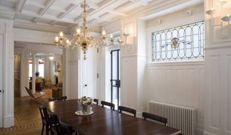
DOORSThe Art of the Window: 12 Ways to Cover Glass Doors
Learn how to use drapes, shutters, screens, shades and more to decorate French doors, sliding doors and Dutch doors
Full Story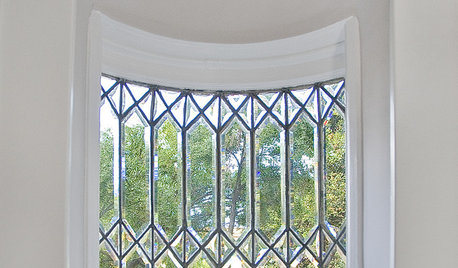
DESIGN DICTIONARYLeaded Glass
Window panes show their strong character with this patterned glass
Full Story
DECORATING GUIDESHow to Work With Awkward Windows
Use smart furniture placement and window coverings to balance that problem pane, and no one will be the wiser
Full Story
ARCHITECTUREThe Bay Window Goes Modern
Square tubes, cantilevered cubes, mixed glass ... new plays on bay windows are boldly branching out in modern architecture
Full Story
KITCHEN DESIGNPut Your Kitchen in a Good Light With a Window Backsplash
Get a view or just more sunshine while you're prepping and cooking, with a glass backsplash front and center
Full Story
WINDOWSTransom Windows: Why Use Them — and Where?
See How a Little Extra Glass Lets in Light, Air and Style
Full Story


One Devoted Dame