


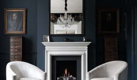
BM Super White next to Decorator’s White
EvaElizabeth
6 years ago
last modified: 6 years ago
Featured Answer
Sort by:Oldest
Comments (11)

EvaElizabeth
6 years agoRelated Professionals
Greenville Painters · Lakeside Painters · Brea Painters · SeaTac Painters · Avon Flooring Contractors · Memphis Furniture & Accessories · Zionsville Furniture & Accessories · Bell Window Treatments · Ronkonkoma Architects & Building Designers · Portage Furniture & Accessories · Carlsbad Furniture & Accessories · Golden Glades Furniture & Accessories · Los Gatos Furniture & Accessories · Champaign General Contractors · Sauk Village General ContractorsEvaElizabeth
6 years agoHeather
6 years agoortochini
5 years agoEvaElizabeth
5 years agoEvaElizabeth
5 years agoortochini
5 years agoEvaElizabeth
5 years agoortochini
5 years ago
Related Stories
COLORDiscover White’s Surprising Power to Energize Every Room
Using white in different ways gives you limitless options for light, color and creativity
Full Story
MOST POPULARMust-Try Color Combo: White With Warm Off-White
Avoid going too traditional and too clean by introducing an off-white palette that brings a touch of warmth and elegance
Full Story
KITCHEN DESIGNHow to Keep Your White Kitchen White
Sure, white kitchens are beautiful — when they’re sparkling clean. Here’s how to keep them that way
Full Story
HOMES AROUND THE WORLDHouzz Tour: A White-on-White Home Radiates Scandinavian Charm
Pale woods, black accents and an abundance of white shine in this Australian-Swedish family’s renovated row house
Full Story
HOUZZ TOURSMy Houzz: Color Hits the Spot in a White-on-White Scheme
Bright red furniture strikes a dramatic pose against snowy walls and floors in a Montreal loft
Full Story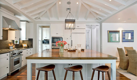
DECORATING GUIDESLiving Large: Take Your Big White Room to the Next Level
Large spaces can be a challenge to decorate. Here are 8 ways to keep yours cozy
Full Story
DECORATING GUIDESDecorating 101: How to Use White Right
If you’ve ever been in white-paint-swatch limbo, you know white can be tricky to work with. Here’s how to get the fresh look you’re after
Full Story
KITCHEN DESIGNSeeing Green: Some Kitchens Ditch White for Mother Nature’s Neutral
It’s typically the primary color in gardens. Now green is having a moment in the kitchen
Full Story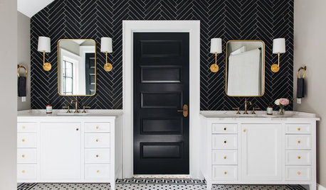
BATHROOM COLORHow to Decorate With Black and White in the Bathroom
This classic color combination makes for a chic and clean look in any style of bathroom
Full Story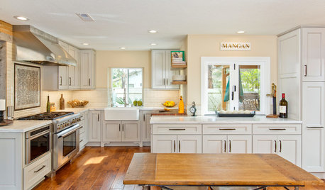
KITCHEN OF THE WEEKKitchen of the Week: White and Wood Perk Up a Chef’s Space
New cabinets, top-end appliances and a rustic-meets-classic style mark a sunny San Diego home
Full Story

JudyG Designs