


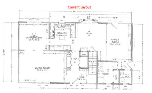
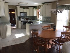
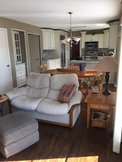
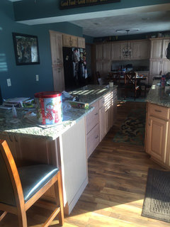
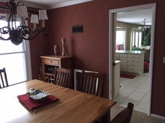
Help with Kitchen Layout
Blueostrich
6 years ago
Featured Answer
Sort by:Oldest
Comments (20)

Blueostrich
6 years agoBlueostrich
6 years agoRelated Professionals
Lomita Interior Designers & Decorators · Struthers Interior Designers & Decorators · Sweetwater Interior Designers & Decorators · Holtsville Architects & Building Designers · Ridgewood Kitchen & Bathroom Designers · Walnut Creek Furniture & Accessories · Carson City Furniture & Accessories · Fillmore Furniture & Accessories · Genova Furniture & Accessories · Arlington General Contractors · Dover General Contractors · Fort Pierce General Contractors · North Tustin General Contractors · Waldorf General Contractors · Westmont General Contractors PRO
PRORappArchitecture
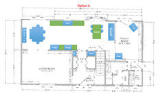
6 years agoBlueostrich
6 years agolast modified: 6 years ago
brinnie
6 years agoLauren Bomhof
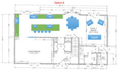
6 years agoBlueostrich
6 years agobrizcs
6 years agobrizcs
6 years agoBlueostrich
6 years ago PRO
PRODoug Walter Architect
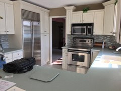
6 years agoBlueostrich
6 years ago PRO
PROIn Your Space Interior Design
6 years agoBlueostrich
6 years ago


Related Stories
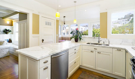
KITCHEN DESIGNKitchen Layouts: Ideas for U-Shaped Kitchens
U-shaped kitchens are great for cooks and guests. Is this one for you?
Full Story
MOST POPULAR7 Ways to Design Your Kitchen to Help You Lose Weight
In his new book, Slim by Design, eating-behavior expert Brian Wansink shows us how to get our kitchens working better
Full Story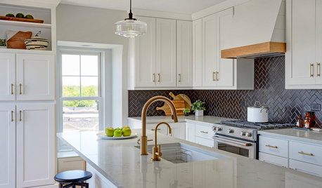
KITCHEN DESIGNWhite Kitchen Cabinets and an Open Layout
A designer helps a couple create an updated condo kitchen that takes advantage of the unit’s sunny top-floor location
Full Story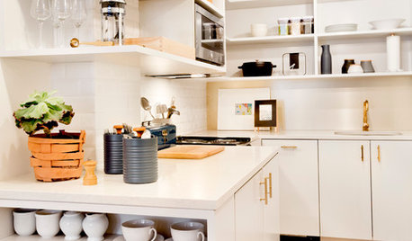
SMALL KITCHENSSmaller Appliances and a New Layout Open Up an 80-Square-Foot Kitchen
Scandinavian style also helps keep things light, bright and airy in this compact space in New York City
Full Story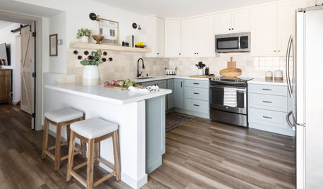
KITCHEN MAKEOVERSKitchen of the Week: Soft and Creamy Palette and a New Layout
A designer helps her cousin reconfigure a galley layout to create a spacious new kitchen with two-tone cabinets
Full Story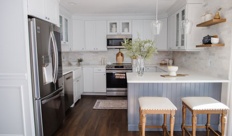
KITCHEN MAKEOVERSKitchen of the Week: New Layout and Lightness in 120 Square Feet
A designer helps a New York couple rethink their kitchen workflow and add more countertop surface and cabinet storage
Full Story
BEFORE AND AFTERSKitchen of the Week: Bungalow Kitchen’s Historic Charm Preserved
A new design adds function and modern conveniences and fits right in with the home’s period style
Full Story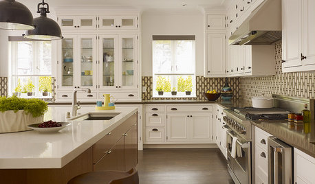
KITCHEN DESIGNHow to Plan Your Kitchen's Layout
Get your kitchen in shape to fit your appliances, cooking needs and lifestyle with these resources for choosing a layout style
Full Story
KITCHEN DESIGNKitchen of the Week: Barn Wood and a Better Layout in an 1800s Georgian
A detailed renovation creates a rustic and warm Pennsylvania kitchen with personality and great flow
Full Story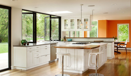
KITCHEN DESIGNDetermine the Right Appliance Layout for Your Kitchen
Kitchen work triangle got you running around in circles? Boiling over about where to put the range? This guide is for you
Full Story


In Your Space Interior Design