


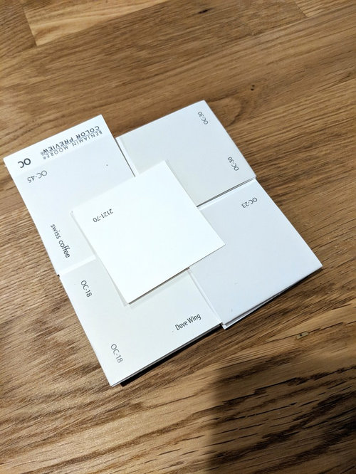
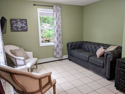
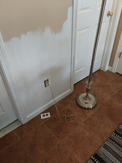
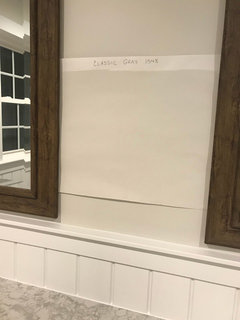
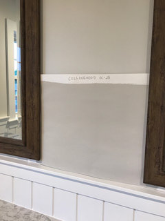
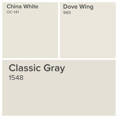
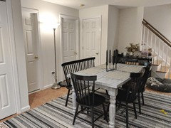
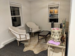
In neutral "color" selection hell
Elle
5 years ago


Featured Answer
Sort by:Oldest
Comments (98)

colbran
5 years ago
Elle
5 years agoRelated Professionals
Lafayette Architects & Building Designers · Schiller Park Architects & Building Designers · Coshocton General Contractors · Linton Hall General Contractors · West Palm Beach Furniture & Accessories · Stamford Furniture & Accessories · Antioch Window Treatments · Feasterville Trevose Window Treatments · Oakland Window Treatments · Canton Painters · Dumont Painters · Lakeway Painters · Sarasota Painters · Berkeley Heights Cabinets & Cabinetry · East Hemet Flooring Contractors
Sueb20
5 years agoElle
5 years ago
Laura Mac
5 years agolast modified: 5 years agoElle
5 years agoLaura Mac
5 years agoElle
5 years ago
anele_gw
5 years ago
cdisimone
5 years agocdisimone
5 years agohollybar
5 years agocdisimone
5 years agoElle
5 years agoElle
5 years agocdisimone
5 years agocdisimone
5 years agocdisimone
5 years agoElle
5 years agoElle
5 years agocdisimone
5 years agocdisimone
5 years agoElle
5 years agokrdpm
5 years agokrdpm
5 years agoElle
5 years agoElle
5 years agokrdpm
5 years agokrdpm
5 years agoElle
5 years agocdisimone
5 years agokrdpm
5 years agoElle
5 years agocdisimone
5 years agoElle
5 years agohollybar
5 years agoJ T
5 years agoLaura Mac
5 years agoElle
5 years agocdisimone
5 years agoElle
5 years agokrdpm
5 years agoElle
5 years agoElle
5 years agokrdpm
5 years agoLaura Mac
5 years agominiscule
5 years agoimhofan
5 years agoElle
5 years agovjwilkinson
3 years agolast modified: 3 years ago


Related Stories
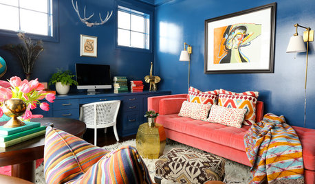
DECORATING GUIDESMove Over, Neutral Sofa — Here Comes Color
Sometimes it makes sense to ignore the conventional wisdom about furniture and make a bold, colorful statement
Full Story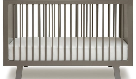
Guest Picks: A Gender-Neutral Nursery
This nursery design looks natural, relaxing — and perfect for a boy or girl
Full Story
MOST POPULARWhat’s Your Neutral: Beige or Gray?
A designer shares 10 tips for using the neutral shade that works best for you
Full Story
COLORBest Ways to Use the Neutral Green Color of 2015
Benjamin Moore’s Color of the Year is soft and natural
Full Story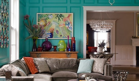
COLORSpeed-Dial Color Selection to Get the Best Result
You’ve belabored your color decisions and are still stuck. Here is how to evaluate your space and make choices that are right for you
Full Story
COLORWhite vs. Cream: Which Neutral Paint Color Is Right for You?
Do bright white rooms give you the chills? Are off-whites too drab and boring? Let’s see which is a better fit for you
Full Story
COLOR4 New Neutrals for the New Year
So you're not resolved to go crazy with color in 2013. These refreshing on-trend neutrals can still broaden your rooms' color horizons
Full Story
NEUTRAL COLORS10 Ways to Make Your Neutral Palette Shine
Wake up your beige and gray with a rich combination of texture, shape and pattern
Full Story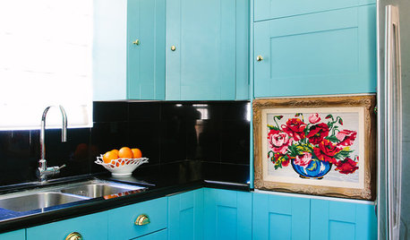
COLORFUL HOMESHouzz Tour: Nixing Neutrals to Create a Colorful Craftsman
L.A. homeowners toss beige and white to make way for vibrant blue, purplish gray and cheery peach
Full Story
DECORATING GUIDESNo Neutral Ground? Why the Color Camps Are So Opinionated
Can't we all just get along when it comes to color versus neutrals?
Full Story


Lori A. Sawaya