


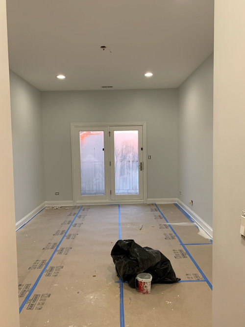
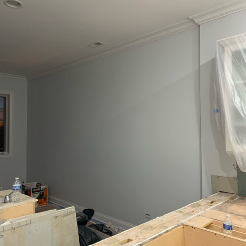
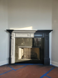
how do I make my paint look less blue !
Chi Condo
4 years ago

Featured Answer
Sort by:Oldest
Comments (22)

Chi Condo
4 years ago
Olychick
4 years agoRelated Professionals
Milford Painters · Sterling Painters · Jeffersontown Cabinets & Cabinetry · Dunedin Flooring Contractors · Federal Way Flooring Contractors · Laconia Flooring Contractors · Lakeway Flooring Contractors · Lakewood Flooring Contractors · Milford Flooring Contractors · Oro Valley Flooring Contractors · Santa Cruz Flooring Contractors · Wheat Ridge Flooring Contractors · Milwaukee Furniture & Accessories · Lake Magdalene Furniture & Accessories · Spring Lighting PRO
PROFlo Mangan
4 years agoChi Condo
4 years agoChi Condo
4 years ago- PRO
Flo Mangan
4 years ago Chi Condo
4 years ago- PRO
Flo Mangan
4 years ago - PRO
Flo Mangan
4 years ago Chi Condo
4 years ago- PRO
Flo Mangan
4 years ago - PRO
Flo Mangan
4 years ago - PRO
Flo Mangan
4 years ago - PRO
Flo Mangan
4 years ago 
cawaps
4 years ago
Jennifer Hogan
4 years ago- PRO
Flo Mangan
4 years ago mscole88
2 years agoJennifer Hogan
2 years ago
Shawna
2 years ago PRO
PROMary Signore
8 months ago

Related Stories
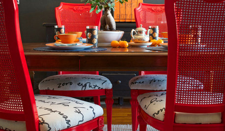
DIY PROJECTSDining Set Makeover: Paint and Tea-Tinted Fabric Make Old Chairs New
Reclaim dated dining chairs for far less than buying new, using spray paint, modern fabric and a handful of tea bags
Full Story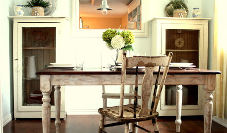
HOUZZ TOURSHouzz Tour: Making 'Normal' Beautiful for Less
Ingenuity, elbow grease and bargain hunting result in a light and lovely beach cottage style
Full Story
TURQUOISEHow to Pick the Right Blue Paint
Periwinkle, Turquoise, Midnight or Sky? Here's Help Choosing the Blue for You
Full Story
DOORSWhat Color Should I Paint My Front Door?
Extend a standout greeting with a memorable hue at your home’s entry
Full Story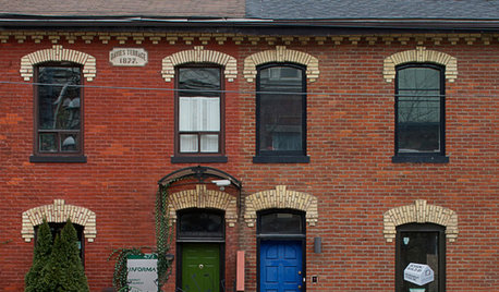
FRONT DOOR COLORSFront and Center Color: When to Paint Your Door Blue
Who knew having the blues could be so fun? These 8 exterior color palettes celebrate sunny-day skies to electric nights
Full Story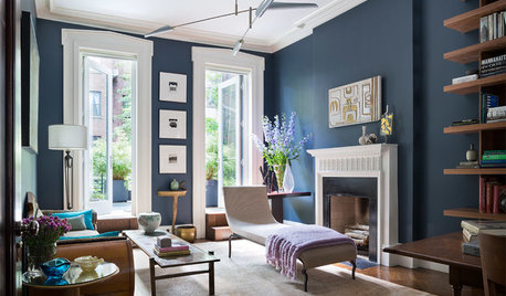
DECORATING GUIDESDesigner Picks: 9 Beautiful Saturated Blue Paints
Bold cobalt, inky indigo and moody midnight are just a few of the hues that can set a dramatic tone
Full Story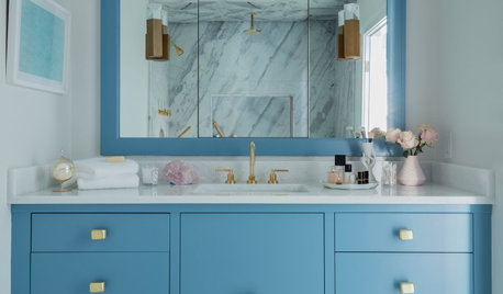
COLOR PALETTES7 Beautiful Blue Paint Colors for Bathrooms
Whether it’s soothing or sophisticated, you really can’t go wrong with a blue hue in the bath
Full Story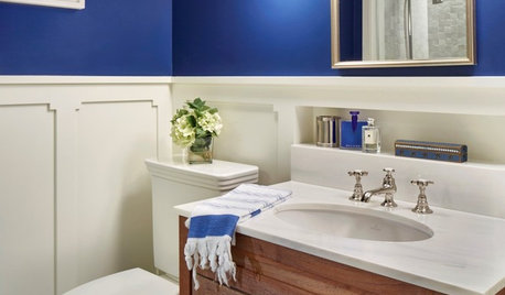
COLOR8 Small Spaces Where Paint Can Make a Big Impact
Don’t forget about these little areas in your home. The right paint color can inexpensively transform a space
Full Story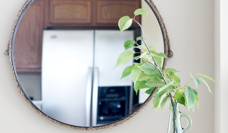
DIY PROJECTSMake a Custom Nautical Mirror for Less Than $30
Be a captain of style with a rope-bordered mirror you can fashion in an afternoon
Full Story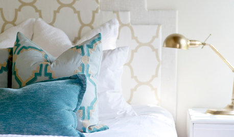
DIY PROJECTSHigh-End Look for Less: Make a Layered Headboard for $20
No sewing and sawing means no hemming and hawing; just gather some inexpensive materials and get going
Full Story


Jennifer Hogan