


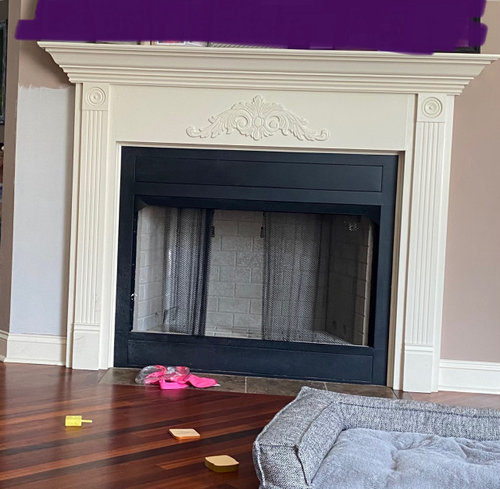
How to make Off-white creamy trim work for a fresh bright airy theme?
Steffen Billy
2 years ago
Sort by:Oldest
Comments (21)
Related Stories

BEFORE AND AFTERSHouzz Tour: Fresh White Update Makes a Bright Family Home
A Colorado couple move next door and lighten things up to create an inviting modern-day home that honors its past
Full Story
WHITE3 Easygoing Rooms With Creamy Off-White Walls
Look to this colorless color for warm, relaxed style with elegant undertones
Full Story
TRIMTrim Color Tips: Get Your White Trim Right
Set off wood tones, highlight architectural features, go minimalist ... white trim is anything but standard when you know how to use it
Full Story
MOST POPULARMust-Try Color Combo: White With Warm Off-White
Avoid going too traditional and too clean by introducing an off-white palette that brings a touch of warmth and elegance
Full Story
WHITE KITCHENSNew This Week: 3 Serene Kitchens With Creamy White Cabinets
Consider off-white kitchen cabinets for a bright and airy space with a calming vibe
Full Story
HOUZZ TV LIVEBright, White and Open Kitchen for a Michigan Family
Watch and read how a design-build couple knocked down walls and added fresh style to create a light and airy great room
Full Story
HOUZZ TOURSMy Houzz: Bright and Airy in Vancouver
Gallery-white walls, an open living plan and bright orange accents help this Canadian family’s home look fresh
Full Story
WHITEDesigner Secrets: 10 Pros Share Favorite Off-White Paints
From creamy white to barely beige, these hues will warm up your room
Full Story
KITCHEN DESIGNKitchen of the Week: Creamy White, Rustic Wood and Blue
For the most popular kitchen of spring 2021, a designer helped a Texas couple create a bright space full of character
Full Story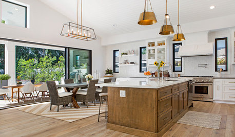
HOUZZ TVHouzz TV: 1960s Teardown Now a Bright and Airy Modern Farmhouse
A more thoughtful layout and fresh style create a new home filled with Southern California sunshine
Full Story


Mary Elizabeth
Yvonne Martin
Related Professionals
New Bern Painters · Trussville Painters · Hillcrest Heights Handyman · Spring Valley Cabinets & Cabinetry · Dublin Flooring Contractors · Garland Flooring Contractors · Greer Flooring Contractors · Kent Flooring Contractors · White Bear Lake Flooring Contractors · Lebanon Furniture & Accessories · Temple Terrace Furniture & Accessories · Dorchester Center General Contractors · Pinewood General Contractors · Rancho Santa Margarita General Contractors · River Forest General ContractorsMary Elizabeth
Mary Elizabeth
loobab
JAN MOYER
Jennifer Hogan
Patricia Colwell Consulting
Anna Devane
Steffen BillyOriginal Author
Steffen BillyOriginal Author
Jennifer Hogan
Nancy Cranmer
Jennifer Hogan
Mary Elizabeth
Steffen BillyOriginal Author
Steffen BillyOriginal Author
calidesign
JAN MOYER
Kathy Furt
mdefree