


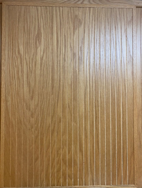
Need help working around our 80’s honey oak cabinets and black counter
Sunshine Anderson
2 years ago
last modified: 2 years ago


Featured Answer
Sort by:Oldest
Comments (37)
Related Professionals
Palmetto Estates Kitchen & Bathroom Designers · Annandale Furniture & Accessories · Temple Terrace Furniture & Accessories · El Monte General Contractors · Uniondale General Contractors · Overland Park Kitchen & Bathroom Remodelers · Calumet City Design-Build Firms · Anchorage General Contractors · Flint General Contractors · Jamestown General Contractors · Markham General Contractors · Rosemead General Contractors · Titusville General Contractors · Warrenville General Contractors · Essex Landscape Architects & Landscape Designers
Sunshine Anderson
2 years agolast modified: 2 years agoSunshine Anderson
2 years agolast modified: 2 years agoSunshine Anderson
2 years agoSunshine Anderson
2 years agolast modified: 2 years agoPort of Indecision
2 years agoSunshine Anderson
2 years ago PRO
PROCelery. Visualization, Rendering images
2 years agolast modified: 2 years agoSunshine Anderson thanked Celery. Visualization, Rendering imagescalidesign
2 years agoSunshine Anderson
2 years agoSunshine Anderson
2 years agocalidesign
2 years agoSunshine Anderson
2 years agolast modified: 2 years agoSunshine Anderson
2 years agolast modified: 2 years agoTBL from CT
2 years agoSunshine Anderson
2 years agolast modified: 2 years ago
Sandra
2 years agoSunshine Anderson
2 years agolast modified: 2 years agoK H
2 years agoK H
2 years agoSandra
2 years ago


Related Stories
SMALL HOMESMy Houzz: Black, White and Metal Shine in a 1930s Live-Work Apartment
Mindfully curated vintage and antique finds fill this creative couple’s 850-square-foot rental in Los Angeles
Full Story
KITCHEN DESIGNHow to Map Out Your Kitchen Remodel’s Scope of Work
Help prevent budget overruns by determining the extent of your project, and find pros to help you get the job done
Full Story
KITCHEN DESIGNA Butler’s Pantry Helps Serve Up Big Family Meals
High-gloss cabinets, hidden storage and warm wood make this kitchen beautiful and functional for entertaining
Full Story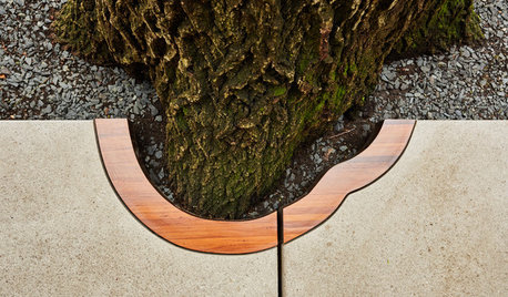
THE ART OF ARCHITECTUREDouble Take: What’s Happening Around That Tree?
Wood-trimmed concrete pavers highlight a stately oak at the entrance to an International Style home by Ralph Rapson
Full Story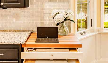
THE HARDWORKING HOMEA Hidden Charging Cabinet Corrals and Juices Family’s Electronics
The Hardworking Home: Laptops, phones and tablets now have a safe space in this kitchen, keeping the countertops uncluttered
Full Story
HOUZZ TOURSHouzz Tour: Black Cabinets, Trim and Doors Wow in This Victorian
A century-old home in Canada gets new life with a black-and-white color scheme and midcentury furnishings
Full Story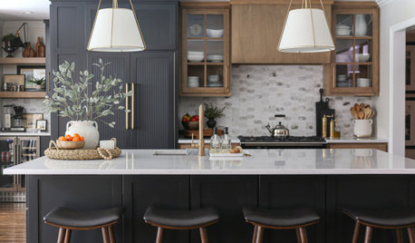
KITCHEN MAKEOVERSKitchen of the Week: Wood and Black Cabinets and Better Flow
A designer gives an empty-nest couple more storage, dressier style and improved circulation for entertaining
Full Story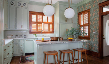
KITCHEN OF THE WEEKKitchen of the Week: Goodbye, Honey Oak — Hello, Minty Green
After more than 30 years, the Kloesels revamped their space to reflect their rural country town and Victorian-style home
Full Story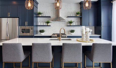
KITCHEN DESIGNWorking the Room: What’s Popular in Kitchens Now
We break down 9 kitchen design ideas that are making people happy — and show how to make them work for you
Full Story
DECORATING GUIDES10 Reasons to Work With (and Love) Black Marble
This high-drama stone works in any decor, and it doesn’t have to break the budget
Full Story
MizLizzie