


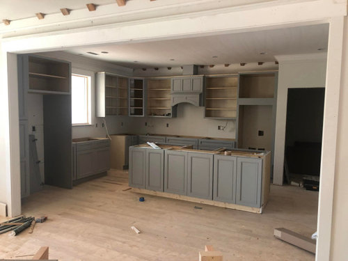
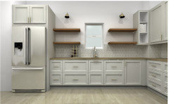
FUN! Help Me Choose a Backsplash! 3D Rendering Photo Poll
rehb
last year
last modified: last year

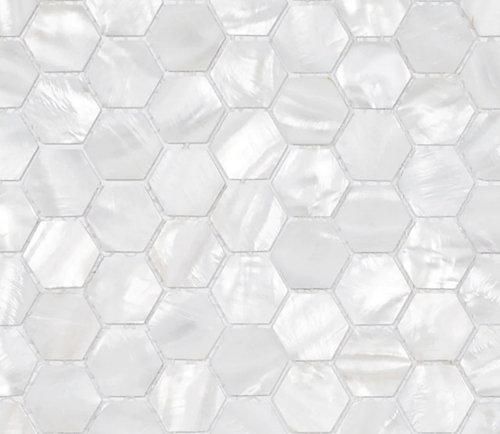


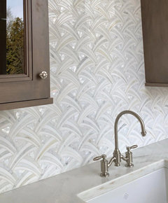
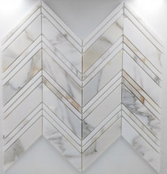
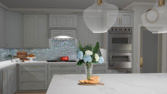
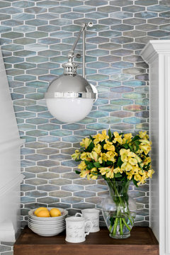
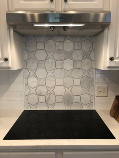
Fan Shaped carrara marble with mother of pearl hex range accent

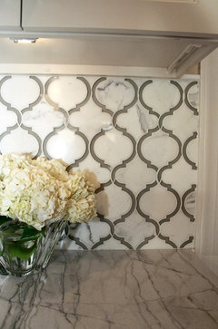
Triangle box illusion Marble with mother of pearl hex range accent

Triangle box illusion Marble with Large Format Porcelain Slab range accent

Fan Shaped carrara marble with Large Format Porcelain Slab range accent

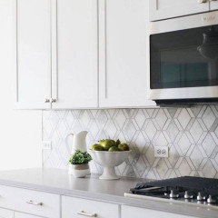
White Rhombus polished porcelain with Large Format Porcelain Slab range accent

White Rhombus polished porcelain with Fan Shaped carrara marble range accent

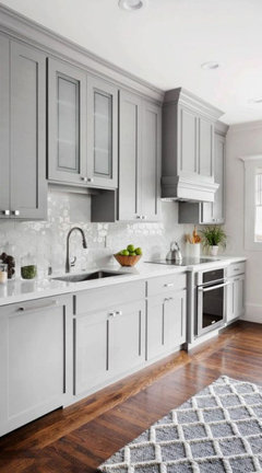
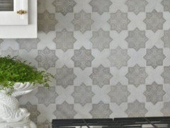
Go DARK or pick something gray or black or Blue!

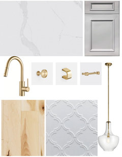
house selections for paint and trims.png
Featured Answer
Sort by:Oldest
Comments (35)

rehb
last yearRelated Professionals
Long Beach Furniture & Accessories · Augusta General Contractors · San Elizario General Contractors · Exeter General Contractors · Havelock General Contractors · Lincoln General Contractors · Richfield General Contractors · Davie Flooring Contractors · Orlando Flooring Contractors · Atascocita Flooring Contractors · Merritt Island Paint & Wall Coverings · Oceanside Kitchen & Bathroom Remodelers · Farmers Branch Cabinets & Cabinetry · Norfolk Cabinets & Cabinetry · Wyckoff Cabinets & Cabinetryrehb
last yearrehb
last yearrehb
last yearrehb
last year
rebunky
last yearanna_682
last year PRO
PRONorwood Architects
last year
la_la Girl
last year
Jennifer K
last year


Related Stories
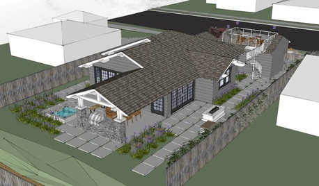
WORKING WITH AN ARCHITECTWho Needs 3D Design? 5 Reasons You Do
Whether you're remodeling or building new, 3D renderings can help you save money and get exactly what you want on your home project
Full Story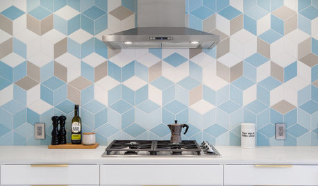
KITCHEN BACKSPLASHESNew This Week: 3 Style-Setting Kitchen Backsplashes
Bring a fun touch to your kitchen with a new material or a graphic pattern
Full Story
FUN HOUZZ3D Room Designs Inspired by 4 Chart-Topping Music Icons
Explore virtual rooms that capture the styles of Taylor Swift, Beyoncé, Chris Stapleton and Madonna
Full Story0
LATEST NEWS FOR PROFESSIONALS3D Room Designs Inspired by 4 Chart-Topping Music Icons
Explore virtual rooms that capture the styles of Taylor Swift, Beyoncé, Chris Stapleton and Madonna
Full Story0
ORGANIZINGHelp for Whittling Down the Photo Pile
Consider these 6 points your personal pare-down assistant, making organizing your photo collection easier
Full Story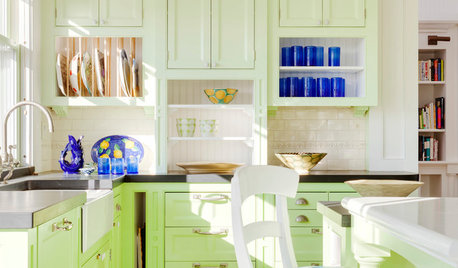
KITCHEN DESIGNNew This Week: 3 Ways to Fun Up Your Kitchen
Does your kitchen design lack a special focus? Features like these could give you something to smile about
Full Story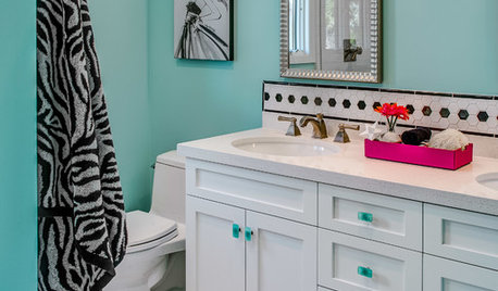
BATHROOM DESIGN3 Fresh and Fun Bathrooms Just Right for Teenage Girls
These new and remodeled spaces designed for pairs of sisters are brimming with personality and style
Full Story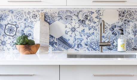
KITCHEN BACKSPLASHESNew This Week: 3 Wildly Patterned Kitchen Backsplashes
Looking to add a pop to your kitchen? Try introducing some bold color in a complex pattern
Full Story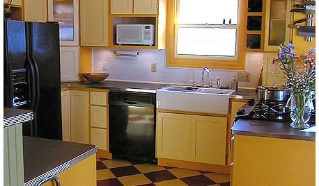
KITCHEN DESIGNKitchen Remodel Costs: 3 Budgets, 3 Kitchens
What you can expect from a kitchen remodel with a budget from $20,000 to $100,000
Full Story
WHITE KITCHENSNew This Week: 3 White Kitchens, 3 Different Styles
A few key accents can make one all-white kitchen look and feel completely distinct from another
Full Story

cupofkindnessgw