


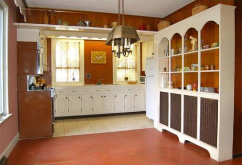
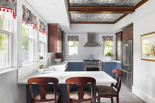
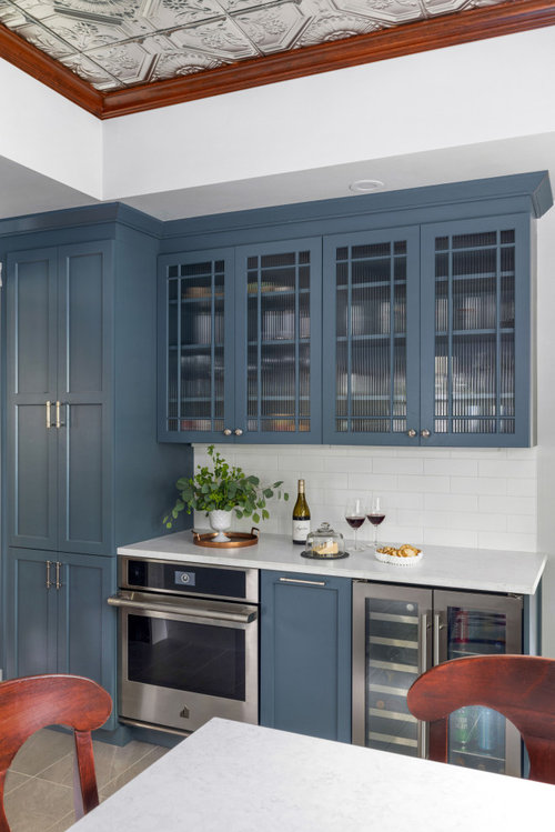
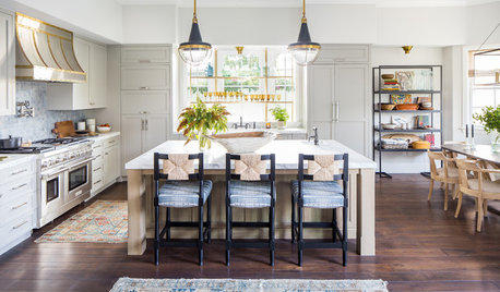
Before & After - New England Victorian Kitchen
McGuire + Co. Kitchen & Bath
last year


Featured Answer
Sort by:Oldest
Comments (17)
 PRO
PROMcGuire + Co. Kitchen & Bath
last year- PRO
McGuire + Co. Kitchen & Bath
last year 
arcy_gw
last yearlast modified: last yearKendrah
last year- PRO
McGuire + Co. Kitchen & Bath
last year artemis_ma
last year- PRO
McGuire + Co. Kitchen & Bath
last year anna_682
last year
Terri Clark
last year PRO
PRONorwood Architects
last year
Maureen
last year- PRO
McGuire + Co. Kitchen & Bath
last year - PRO
McGuire + Co. Kitchen & Bath
last year - PRO
McGuire + Co. Kitchen & Bath
last year
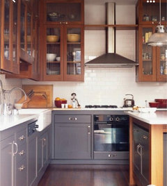
Related Stories
KITCHEN DESIGNBefore and After: 5 Open Kitchens That Work With Adjacent Spaces
Repeating colors, finishes and shapes helps these open-plan kitchens blend stylistically with the spaces nearby
Full Story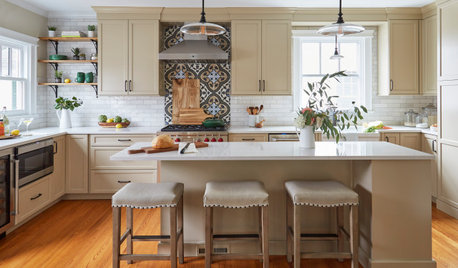
KITCHEN MAKEOVERSBefore and After: 3 Remodeled Kitchens With a Vintage Vibe
A hand-painted hood, a brick fireplace and patterned porcelain tiles add classic charm to these renovated kitchens
Full Story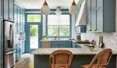
KITCHEN MAKEOVERSBefore and After: 3 Kitchen Remodels That Kept the Same Footprint
See how pros transformed these kitchens without changing their sizes or layouts
Full Story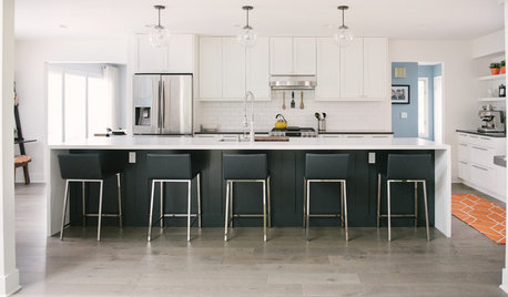
WHITE KITCHENSBefore and After: Modern Update Blasts a '70s Kitchen Out of the Past
A massive island and a neutral color palette turn a retro kitchen into a modern space full of function and storage
Full Story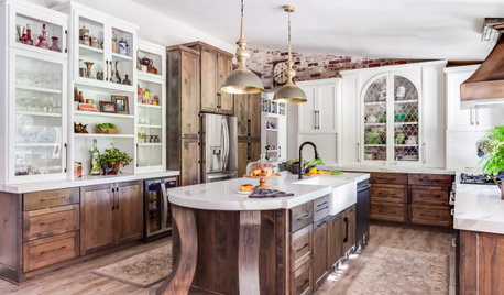
KITCHEN DESIGNBefore and After: 5 Kitchen Makeovers in 200 to 245 Square Feet
See how remodeling made these kitchens more beautiful and more functional for their owners
Full Story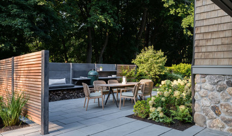
LANDSCAPE DESIGNBefore and After: 3 Side Yards Add Outdoor Kitchens and Seating
Designers turn underutilized outdoor spaces into places for cooking, lounging and more
Full Story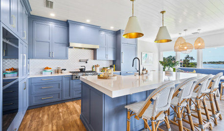
KITCHEN MAKEOVERSBefore and After: 3 Beautiful Blue-and-White Kitchen Makeovers
These remodels embrace open layouts, nature views, modern blues and warm white hues for better function, form and style
Full Story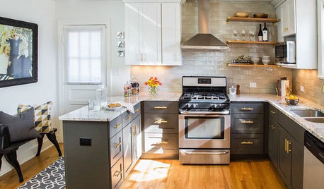
MOST POPULARBefore and After: 13 Dramatic Kitchen Transformations
See the wide range of ways in which homeowners are renovating their kitchens
Full Story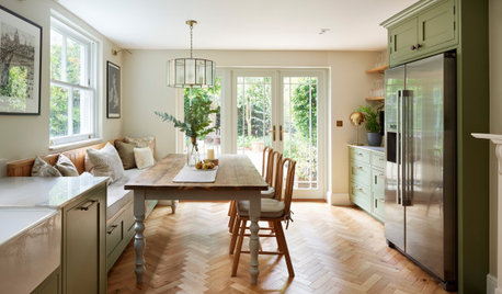
BEFORE AND AFTERSBefore and After: 5 Inviting Eat-In Kitchens
These kitchens achieve the best of both worlds by combining cooking and casual dining areas in a single room
Full Story
KITCHEN MAKEOVERSBefore and After: 4 Charming Vintage-Style Kitchens
Everything old is new again in this quartet of kitchens with decidedly different styles
Full Story

RedRyder