


Houzz Tour: A Robust Yet Elegant Family-friendly Home
This home is a masterclass in combining clean-lined, modern-rustic style with surfaces tough enough for four youngsters

This family’s ranch home in Dallas had a wonderful layout and was bathed in natural light, but the homeowners needed professional help to make it function comfortably for their active family of six. They searched Houzz, admired the work of local design firm Urbanology Designs, and contacted the company for assistance.
“They wanted things to be functional and comfortable for their family,” interior designer Ginger Curtis says. “They didn’t want fussy formality and they liked farmhouse and rustic elements. We found ways to incorporate these things in a fresh and modern way.”
“They wanted things to be functional and comfortable for their family,” interior designer Ginger Curtis says. “They didn’t want fussy formality and they liked farmhouse and rustic elements. We found ways to incorporate these things in a fresh and modern way.”
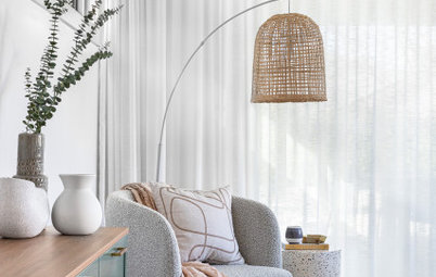
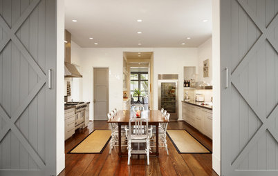
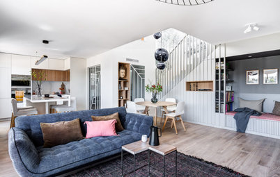
This photo shows more of the foyer and the dining room beyond. The foyer space is large, which made it challenging, as foyers are usually kept relatively clear of furnishings. “It was a big, awkward, empty space,” Ginger says. She brought it down to size with a soft rag rug, a tall plant, a ladder and a round table with a pendant over it (not seen in this photo).
The foyer opens directly into the dining and living room. Note the way the black on the bottom of the ladder in the hallway relates to the black timber panelling on the dining room wall. This creates a pleasing visual connection from room to room.
Walls throughout painted in Pure White, Sherwin-Williams.
“My clients did not want fluffy, fancy or formal in the dining room or anywhere else in the house,” Ginger says. “They wanted to use these spaces often and they wanted them to feel unfussy and laid-back.” Choosing a simple metal light fixture rather than an elaborate chandelier set a more casual tone.
Architecturally, the designer needed to address a curved wall at the far end of the dining room. The curve was lovely but made it difficult to place furniture there. Instead, she installed panelling topped with a picture rail that follows the curve. Painting the timber panelling black added contrast and anchored the artwork on top of it.
The table is hefty, which suits the owners’ penchant for rustic style, but its light wood and pleasing proportions make it sophisticated as well. The mixed pale wood and black wishbone-style chairs are also stylish yet casual.
Find renovation professionals in your area. Read reviews and look at project photos so you can hire with confidence.
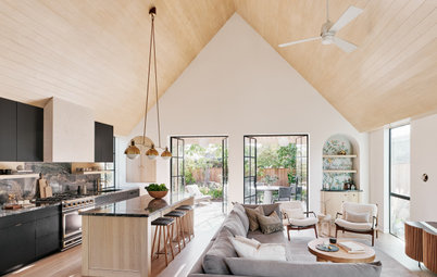
The foyer’s round table and large pendant light can be seen on the left behind this room. Though designed as a formal living room when the house was built, the busy family were looking for something more casual. Ginger designated this space “the first family room”. (There’s a more den-like space that serves as the second family room.)
The room had a high ceiling, lots of natural light and plenty of space. It also had a badly proportioned fireplace with a low brick surround and a TV mounted over the mantel. “They aren’t really a TV family,” Ginger says, so there was no need for one in this room.
The designers came up with a few fireplace makeover plans for the couple to pick from, and this version was the winner the moment they laid eyes on it. The lower surround is white, with a plaster finish that adds subtle movement and texture. The mantel is white oak, a material Ginger repeated throughout the home. And they added wood panelling painted black from mantel to ceiling. The contrast draws the eye to the fireplace, now a beautiful focal point.
Though pale upholstery might not be the first thing that comes to mind when thinking ‘child-friendly’, Ginger chose stain-proof fabrics that can be cleaned with ease. She custom designed the two sofas, which are squishy and comfortable. The armchairs add more lovely wood to the room with their midcentury-modern-inspired frames.
A large metal chandelier suits the husband’s love of more traditional rustic pieces, and a rattan-and-wood console adds texture. Everything in the room makes it comfy, right down to the rug. And the layout ensures an easy flow from space to space, essential with four young children in the house.
A large metal chandelier suits the husband’s love of more traditional rustic pieces, and a rattan-and-wood console adds texture. Everything in the room makes it comfy, right down to the rug. And the layout ensures an easy flow from space to space, essential with four young children in the house.
Between the first family room and the kitchen was another light-filled space, with large windows looking out to the garden and skylights in the sloping ceiling. Ginger dubbed this “the atrium” and gave her clients several functional options for it. They chose the sun-filled reading nook scheme.
The designer came up with one-of-a-kind shelving composed of white oak with a black accent. Its stepped composition nods to Japanese tansu cabinets.
The designer came up with one-of-a-kind shelving composed of white oak with a black accent. Its stepped composition nods to Japanese tansu cabinets.
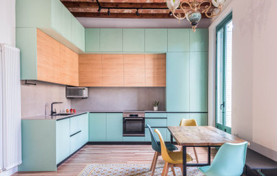
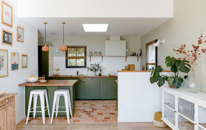
The atrium is open to the dining area of the kitchen. The kitchen was in good shape and didn’t require a down-to-the-studs revamp. “This is one of the biggest kitchens I’ve ever seen and it had too many cabinets – the number of them was overwhelming,” Ginger says. “It’s rare to take out storage space, but in this unique situation, it was necessary. We needed to edit and add a few new finishes to freshen it up.”
The scope of the kitchen refresh included removing some of the upper cabinets to create negative space, painting the remaining cabinets black, replacing an oversized, elaborate cooker hood with a simpler one, swapping in new quartz worktops and replacing the lighting.
The back wall seen here used to be a solid line of upper cabinets. The team replaced them with a worktop cabinet that meets the corner of the room, as well as open shelving. The new worktop quartz extends up the wall as a high splashback that meets the bottom of the long shelf. And new tongue-and-groove panelling adds character to the wall from the shelf up to the ceiling.
“My clients really like farmhouse style, but they trusted us to do it in a way that wouldn’t be too trendy,” Ginger says. “We wanted it to be more curated, warm and full of character.”
For example, instead of a rustic, reclaimed-wood cooker hood seen in many of today’s modern farmhouse kitchens, Ginger talked the couple into one with a plaster finish. “This range hood is pretty, but it recedes to let other elements shine. It’s beautiful in its simplicity,” Ginger says.
A new glass cabinet on the left keeps this wall light and brings in a few white oak details. “We gained some much-needed negative space on this wall,” Ginger says.
The existing three-sided kitchen island received a coat of black paint, a new quartz worktop and six new leather-and-metal bar stools – one for each member of the family. The paint colour is Sherwin-Williams’ Greenblack, a black with a subtle green undertone.
Ginger was careful to keep the lighting cohesive without it being too matchy-matchy. “The key is to keep them from being too similar,” she says. “They need to complement and contrast with one another. For example, you don’t want to use all cone or all globe shapes.”
The island pendant shades are white papier-mâché, the dining area fixture is metal and white glass, and the wall sconces over the open shelves have black metal shades.
This wall behind the island had also been filled with upper cabinets. The designer replaced them with white oak open shelves. The new hardware has wooden handles. This area can be used as a buffet or drink station that serves the dining area.
A deep sink turned this end of the island into an efficient prep station. Another detail worth noting is the white oak that wraps the top of the worktop cabinet.
A homeschool area has been created above the garage. “It has a private staircase, and when I walked up here I filled with excitement,” Ginger says. “It was bathed in light and had three alcoves where we could work in different functions.” The space also has a bathroom.
The homeowners had specific needs for this space. One was a large table for lessons and projects. Another was a large whiteboard with drawers for storing markers and erasers. There were also specific storage needs for books, notebooks, craft supplies and more.
A long table dominates the room, with space for the parents to join the children for lessons and projects. Ginger designed a whiteboard on wheels with three large drawers across the bottom. She added a vintage map to the front that rolls up with ease. The board can be moved around as needed. Ginger also designed the white oak shelving unit on the right, incorporating open and closed storage, bins and cubbyholes.
Even though the family isn’t big on TV, the couple wanted to incorporate a screen for watching documentaries and other educational programmes, as well as digital presentations and lessons. The large black doors conceal it when it’s not in use.
The homeowner also wanted a desk of her own close to the table, where she could keep organised, work on lesson plans and review work. It’s seen here on the right side of the room, with a glass calendar overhead.
The white oak desk is part of the adjacent built-in storage. This makes it easy to stash everything needed.
The white oak desk is part of the adjacent built-in storage. This makes it easy to stash everything needed.
Ginger designated this alcove as a quiet reading area. The built-in shelving unit includes a cosy bench with a light overhead.
The adjacent alcove is the technology station. The use of screens (such as laptops and tablets) is limited to this area, and headphones are required, so as not to distract others.
Tell us…
What do you like about this family home? Share your thoughts in the Comments.
Tell us…
What do you like about this family home? Share your thoughts in the Comments.
Who lives here? A couple and their four children
Location Dallas, USA
Interior designer Ginger Curtis of Urbanology Designs
Photos by Matti Gresham
The project involved makeovers of the public spaces, including a an area over the garage that Ginger transformed into a homework area. “Having clients read our reviews on Houzz is really powerful for us,” Ginger says. “These homeowners had a lot of trust in us from the start because they’d read our reviews. And because we had that trust, after we assessed their needs and what they liked, they gave us the freedom to really go for it.”
As for those needs, having four children of primary school age or younger meant the family needed a practical, functional, comfortable and indestructible design. The couple wanted beautiful pieces, but prioritised function over style. The design team helped them achieve both.
The house had great bones, a spacious and flexible floorplan, and white oak floors that were in such good shape they didn’t need refinishing. The aim of the project was to furnish the home comfortably; add functional, stylish built-in pieces and other architectural details, and make the spaces suit both the family’s lifestyle and personal taste.
A great example of function and form working together is this vignette near the front door. One set of grandparents lives directly across the street, so Ginger realised the family would be using the front door as much as the bootroom or garage entries.
She knew it would need a bench for family members to change shoes. The bench is sturdy and rugged, yet has a sculptural, geometric silhouette. A gallery wall and three modern sconces give the space a fresh, modern look.