


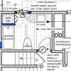
Benjamin Moore color assist for bathroom--
mjaye
14 years ago
Sort by:Oldest
Comments (22)
Related Stories

COLORBenjamin Moore Floats Breath of Fresh Air as Its Color of 2014
Touted as a new neutral, this baby blue can stand on its own or support bolder colors. Here's how to use it
Full Story
COLORBest Ways to Use the Neutral Green Color of 2015
Benjamin Moore’s Color of the Year is soft and natural
Full Story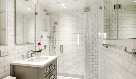
BATHROOM WORKBOOK5 Ways With a 5-by-8-Foot Bathroom
Look to these bathroom makeovers to learn about budgets, special features, splurges, bargains and more
Full Story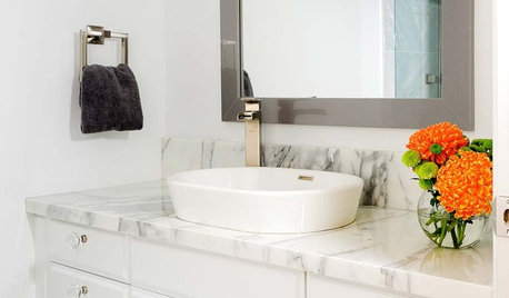
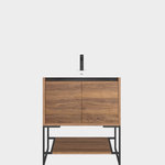
BATHROOM VANITIESAll the Details on 3 Single-Sink Vanities
Experts reveal what products, materials and paint colors went into and around these three lovely sink cabinets
Full Story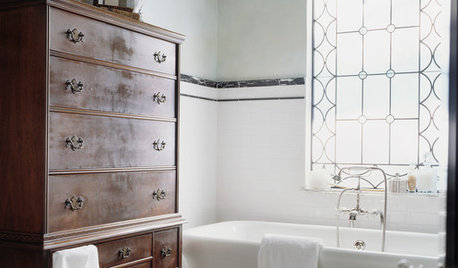
BATHROOM COLOR12 Gorgeous Black and White Bathrooms
Luxurious materials, vintage touches and thoughtful color splashes make these chic spaces worth borrowing ideas from
Full Story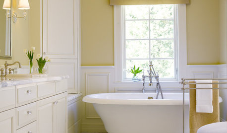
COLORBathed in Color: Favorite Yellows and Golds for the Bath
Get a golden glow for your bathroom with these expert paint picks and ideas for yellow walls
Full Story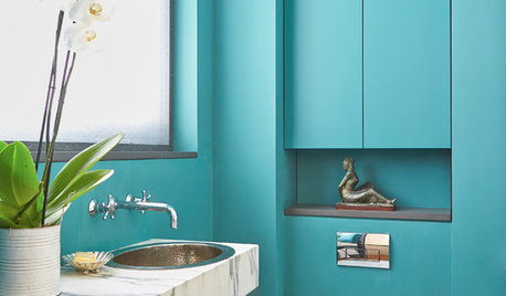
BLUE9 Beautiful Blues for Bathrooms
From soft sky to bold tropical aqua, see why this hue is making waves in bathrooms
Full Story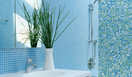
COLORBathed in Color: When to Use Blue in the Bath
Look skyward or to the waters in nature for a soothing, spa-like bathroom
Full Story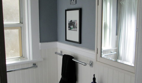
BATHROOM DESIGNMakeover Magic: Period Style for an All-New 1920s Bathroom
Leaky fixtures and water damage got the heave-ho, while the entire bathroom got a crisp new look in line with the home's style
Full Story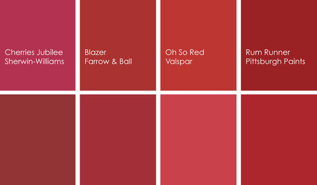
COLORBathed in Color: When to Use Red in the Bath
Rev up your space and flatter all skin tones with bold, beautiful red on bathroom walls, floors and fixtures
Full StoryMore Discussions

User
mjayeOriginal Author
Related Professionals
Hopewell Kitchen & Bathroom Remodelers · Lisle Kitchen & Bathroom Remodelers · Spokane Kitchen & Bathroom Remodelers · Fremont Glass & Shower Door Dealers · Miami Glass & Shower Door Dealers · Pearland Glass & Shower Door Dealers · Temple Terrace Glass & Shower Door Dealers · Tukwila Glass & Shower Door Dealers · Jeffersontown Cabinets & Cabinetry · Lindenhurst Cabinets & Cabinetry · Middletown Cabinets & Cabinetry · Mount Holly Cabinets & Cabinetry · Tooele Cabinets & Cabinetry · Cleveland Window Treatments · San Jose Window Treatmentspepperidge_farm
mjayeOriginal Author
User
mjayeOriginal Author
dfzmom
mjayeOriginal Author
tzmaryg
mjayeOriginal Author
User
mjayeOriginal Author
User
mjayeOriginal Author
tzmaryg
User
User
mjayeOriginal Author
User
hcw1103
mjayeOriginal Author
hcw1103