


Vote on backsplash choices please :)
piaa
14 years ago


Sort by:Oldest
Comments (45)
Related Stories
KITCHEN DESIGNKitchen Layouts: A Vote for the Good Old Galley
Less popular now, the galley kitchen is still a great layout for cooking
Full Story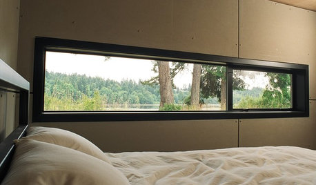
ARCHITECTUREDesign Workshop: Just a Sliver (of Window), Please
Set the right mood, focus a view or highlight architecture with long, narrow windows sited just so on a wall
Full Story
TILEMoor Tile, Please!
Add an exotic touch with Moroccan tiles in everything from intricate patterns and rich colors to subtle, luminous neutrals
Full Story
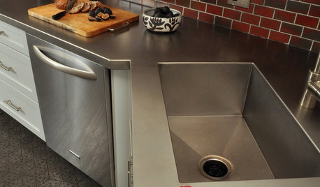
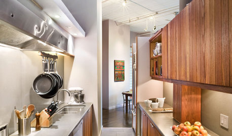
KITCHEN DESIGNKitchen Counters: Stainless Steel, the Chefs' Choice
Professional-grade strength and shining beauty unite in classic stainless steel countertops for the kitchen
Full Story
KITCHEN COUNTERTOPSKitchen Counters: Tile, the Choice for Affordable Durability
DIYers and budget-minded remodelers often look to this countertop material, which can last for decades with the right maintenance
Full Story
KITCHEN COUNTERTOPSKitchen Counters: Granite, Still a Go-to Surface Choice
Every slab of this natural stone is one of a kind — but there are things to watch for while you're admiring its unique beauty
Full Story
BATHROOM VANITIESShould You Have One Sink or Two in Your Primary Bathroom?
An architect discusses the pros and cons of double vs. solo sinks and offers advice for both
Full Story
MORE ROOMSReaders' Choice: The 20 Best Bedrooms of 2011
Hit the snooze button and snuggle up with the most popular bedrooms added to Houzz in 2011
Full Story
KITCHEN DESIGNReaders' Choice: The 10 Most Popular Kitchens of 2012
Citing savvy organizational solutions, gorgeous lighting and more, Houzzers saved these kitchen photos in droves
Full Story


johnorange
westchestermom
Related Professionals
Fresno Kitchen & Bathroom Designers · Northbrook Kitchen & Bathroom Designers · Piedmont Kitchen & Bathroom Designers · Sun City Kitchen & Bathroom Designers · Vineyard Kitchen & Bathroom Designers · East Tulare County Kitchen & Bathroom Remodelers · Oceanside Kitchen & Bathroom Remodelers · Oklahoma City Kitchen & Bathroom Remodelers · Superior Kitchen & Bathroom Remodelers · Fort Lauderdale Cabinets & Cabinetry · Los Altos Cabinets & Cabinetry · Hermosa Beach Tile and Stone Contractors · Rancho Cordova Tile and Stone Contractors · Wyomissing Tile and Stone Contractors · Calumet City Design-Build Firmssochi
gracesantacruz
aiallega
skoo
megpie77
prill
fleur222
redroze
User
plllog
Gena Hooper
cawfeegirl
chartma530
morton5
piaaOriginal Author
firstmmo
beekeeperswife
piaaOriginal Author
lightlystarched
ejbrymom
ejbrymom
kitchenconfidential2
piaaOriginal Author
plllog
prill
beekeeperswife
Jeane Gallo
km5tq
smiling
missmuffet
genie73
sweeby
seaduck
corgimum
squigs
susanlynn2012
piaaOriginal Author
kitchenconfidential2
petepie1
ejbrymom
riverspots
piaaOriginal Author
riverspots