


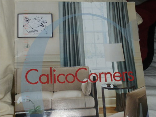
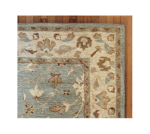
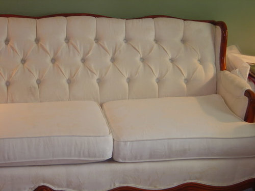
Please help me find the right color!
caramia
15 years ago

Sort by:Oldest
Comments (22)
Related Stories

WORKING WITH PROS5 Steps to Help You Hire the Right Contractor
Don't take chances on this all-important team member. Find the best general contractor for your remodel or new build by heeding this advice
Full Story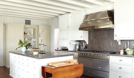
KITCHEN DESIGNHow to Find the Right Range for Your Kitchen
Range style is mostly a matter of personal taste. This full course of possibilities can help you find the right appliance to match yours
Full Story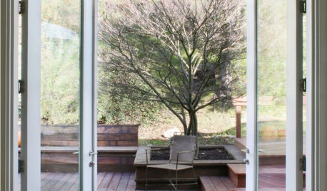
MOST POPULARFind the Right Glass Door for Your Patio
It’s more than just a patio door — it’s an architectural design element. Here’s help for finding the right one for your home and lifestyle
Full Story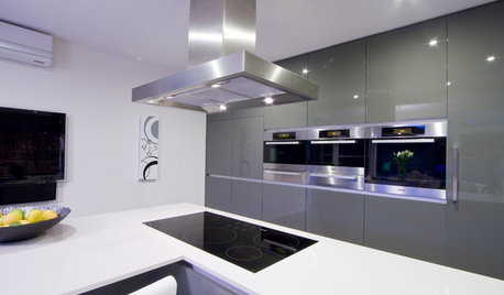
KITCHEN APPLIANCESFind the Right Cooktop for Your Kitchen
For a kitchen setup with sizzle, deciding between gas and electric is only the first hurdle. This guide can help
Full Story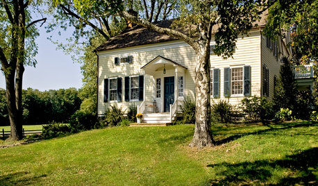
CURB APPEALClues to Finding the Right Color for Your House
Waffling over the rainbow of color options for your home's face? This advice from an architect can help
Full Story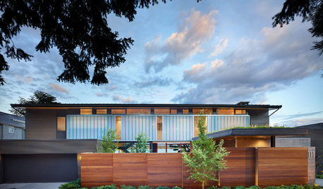
CURB APPEAL7 Questions to Help You Pick the Right Front-Yard Fence
Get over the hurdle of choosing a fence design by considering your needs, your home’s architecture and more
Full Story
GARDENING GUIDESHow to Find the Right Native Plants for Your Yard
Find plant maps, sale sites and guides that make going native in the garden easier than ever
Full Story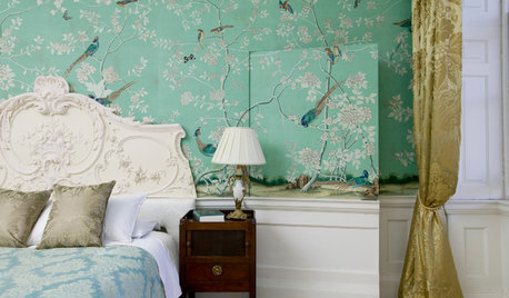
WALL TREATMENTSTempted to Try Wallpaper? 10 Tips for Finding the Right Pattern
Before you lay down a lot of cash, sit down with this advice for getting a wallpaper you’ll love for years
Full Story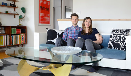
HOUZZ TOURSMy Houzz: Online Finds Help Outfit This Couple’s First Home
East Vancouver homeowners turn to Craigslist to update their 1960s bungalow
Full Story


pattiem93
mitchdesj
Related Professionals
Mount Vernon Interior Designers & Decorators · Boise Interior Designers & Decorators · Memphis Furniture & Accessories · Oshkosh Furniture & Accessories · Reston Furniture & Accessories · Tucson Furniture & Accessories · Washington Furniture & Accessories · Woodstock Furniture & Accessories · Eau Claire Furniture & Accessories · Dumont Furniture & Accessories · Fallbrook Furniture & Accessories · Temple Terrace Furniture & Accessories · Holliston Furniture & Accessories · New Hope Furniture & Accessories · Hastings Custom Artistsbronwynsmom
caramiaOriginal Author
caramiaOriginal Author
Kathleen McGuire
caramiaOriginal Author
Kathleen McGuire
jlc712
caramiaOriginal Author
User
enailes
bronwynsmom
bronwynsmom
abundantblessings
saltnpeppa
andrea5150
caramiaOriginal Author
bronwynsmom
Joe V
nosoccermom
Joe V