


Do any of these lamp shades work or should I keep looking?
Valerie Noronha
15 years ago
Sort by:Oldest
Comments (39)
Related Stories
DECORATING GUIDES10 Ways a Red Lamp Shade Can Sass Up a Room
Energize a neutral palette, refine a rustic look ... where a red shade goes, liveliness is sure to follow
Full Story
HOUSEKEEPINGHow to Keep Your White Spaces Looking Great
Brighten up your white walls, floors and furniture with these cleaning and maintenance tips
Full Story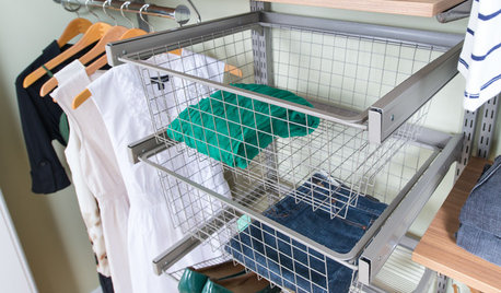
CLOSETSHow to Store Your Clothes to Keep Them Looking Good Longer
Here’s what clothes to fold, what to hang and how to stash your off-season stuff
Full Story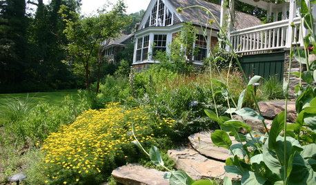
NATIVE PLANTS5 Ways to Keep Your Native Plant Garden Looking Good All Year
It’s all about planning ahead, using sustainable practices and accepting plants as living organisms
Full Story
KITCHEN CABINETSKeeping Cabinet Color on the Down Low
Give just base cabinets a colorful coat for a kitchen sporting character and a spacious look
Full Story
LANDSCAPE DESIGNHow to Look Good From Any Angle (the Garden Edition)
Does your garden pique interest from one vista but fall flat from another? These tips and case-study landscapes can help
Full Story
GREEN BUILDINGInsulation Basics: Designing for Temperature Extremes in Any Season
Stay comfy during unpredictable weather — and prevent unexpected bills — by efficiently insulating and shading your home
Full Story
FURNITUREThe Classic Slipper Chair: A Handy Accent for Any Room
14 great ideas for using this superbly versatile armless chair around the house
Full Story
LIGHTINGChange Up Your Bedroom’s Look With Pendant Lamps
When table lamps seem snoozy or you want to save space, bedside pendant lights are a bright idea
Full Story
DECORATING GUIDESDecorating Around the World: British Style Charms Any Home
Whether you want country home style or the look of a luxurious loft, something British might be just your cup of tea
Full Story


les917
mlraff53
Related Professionals
Middle Island Interior Designers & Decorators · Atlanta Furniture & Accessories · Camarillo Furniture & Accessories · Minneapolis Furniture & Accessories · Potomac Furniture & Accessories · Eau Claire Furniture & Accessories · Aventura Furniture & Accessories · Crofton Furniture & Accessories · Culver City Furniture & Accessories · Temple Terrace Furniture & Accessories · Cahokia Lighting · Lawrence Lighting · Sacramento Lighting · Spring Lighting · El Sobrante Window Treatmentssarschlos_remodeler
decorpas
robynpa
robynpa
IdaClaire
ttodd
redbazel
Valerie NoronhaOriginal Author
Valerie NoronhaOriginal Author
decorpas
Kathleen McGuire
cpccarolyn_2008
mlraff53
brutuses
cindyloowoo
les917
lynn_r_ct
Valerie NoronhaOriginal Author
sarschlos_remodeler
les917
Valerie NoronhaOriginal Author
squirrelheaven
squirrelheaven
Valerie NoronhaOriginal Author
squirrelheaven
squirrelheaven
squirrelheaven
gayle0000
marthaelena
Valerie NoronhaOriginal Author
Valerie NoronhaOriginal Author
Kathleen McGuire
Valerie NoronhaOriginal Author
squirrelheaven
Valerie NoronhaOriginal Author
squirrelheaven
sarschlos_remodeler