


Two Story Great Room Painting and Trim/Molding Questions
beaglesdoitbetter1
12 years ago


Sort by:Oldest
Comments (26)
Related Stories
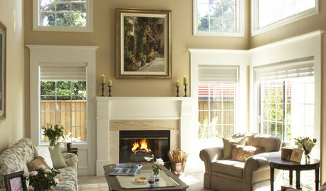
MORE ROOMSTall Tales: Ideas for Two-Story Great Rooms
Make a Great Room Grand With Windows, Balconies, Art and Dramatic Ceilings
Full Story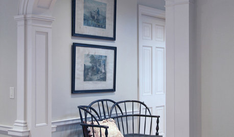
REMODELING GUIDESArchitect's Toolbox: Tell a Home's Story With Trim
Trim speaks worlds about your home's style. Make sure yours is speaking the right language by understanding the 5 basic styles
Full Story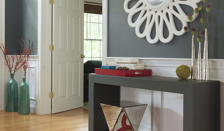
REMODELING GUIDESFrame Your Views With Great Moldings and Casings
How to Work With Trim to Give Your Space Depth and Interest
Full Story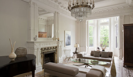
REMODELING GUIDESCrown Molding: Is It Right for Your Home?
See how to find the right trim for the height of your ceilings and style of your room
Full Story
INSIDE HOUZZTell Us Your Houzz Success Story
Have you used the site to connect with professionals, browse photos and more to make your project run smoother? We want to hear your story
Full Story
GREAT HOME PROJECTSHow to Bring Out Your Home’s Character With Trim
New project for a new year: Add moldings and baseboards to enhance architectural style and create visual interest
Full Story
COLORWhen Color Could Kill: Stories From the History of Paint
Delve into paint's storied past — what you learn about its history and modern incarnations may surprise you
Full Story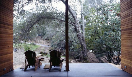
ARCHITECTURETell a Story With Design for a More Meaningful Home
Go beyond a home's bones to find the narrative at its heart, for a more rewarding experience
Full Story
REMODELING GUIDESMovin’ On Up: What to Consider With a Second-Story Addition
Learn how an extra story will change your house and its systems to avoid headaches and extra costs down the road
Full Story


palimpsest
beaglesdoitbetter1Original Author
Related Professionals
Barstow Interior Designers & Decorators · Fountain Hills Interior Designers & Decorators · Los Angeles Furniture & Accessories · Madison Furniture & Accessories · Memphis Furniture & Accessories · Wilmington Furniture & Accessories · Nixa Furniture & Accessories · Sahuarita Furniture & Accessories · Ridgewood Furniture & Accessories · Monrovia Lighting · Sarasota Lighting · Shorewood Lighting · Palm Beach Gardens Window Treatments · Salt Lake City Window Treatments · Bell Window Treatmentspalimpsest
magnaverde
beaglesdoitbetter1Original Author
beaglesdoitbetter1Original Author
palimpsest
beaglesdoitbetter1Original Author
palimpsest
beaglesdoitbetter1Original Author
palimpsest
beaglesdoitbetter1Original Author
beaglesdoitbetter1Original Author
palimpsest
beaglesdoitbetter1Original Author
leahcate
User
sloyder
beaglesdoitbetter1Original Author
beaglesdoitbetter1Original Author
palimpsest
beaglesdoitbetter1Original Author
zagyzebra
beaglesdoitbetter1Original Author
leahcate
beaglesdoitbetter1Original Author