


Adjoining rooms and deep, dark colors
awm03
14 years ago
Sort by:Oldest
Comments (36)
Related Stories
SHOP HOUZZShop Houzz: Deep Attraction to Dark Colors
Tap into your dark side and decorate with a dramatic palette
Full Story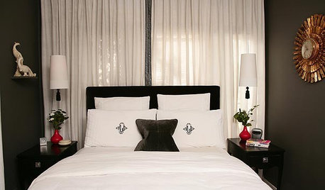
COLORRoom of the Day: Deep Blue Proves a Hot Hue
Navy takes a New Jersey living room from dull to dashing in the flick of a paintbrush
Full Story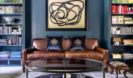
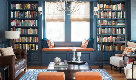
MORE ROOMSDeep Color Soothes in a Favorite Reading Room
A wood-burning fireplace, beloved collections and comfortable seating make this library a family favorite
Full Story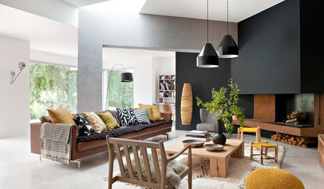
COLORDeep Wall Colors That Feel Extra Cozy in Fall
Wrap your rooms in richer or seasonal hues for a warm, comforting feeling this autumn
Full Story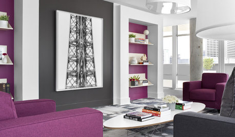
MORE ROOMSDeep Purple Dreams for Rooms
Plum-hued walls, furniture, bedding and even a ceiling show that purple colors can work in any room
Full Story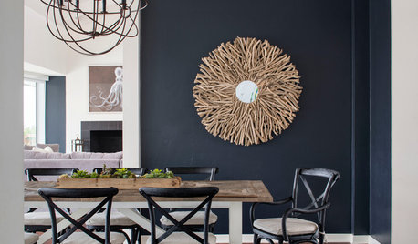
DECORATING GUIDESWhat Goes With Dark Walls?
Bring out the beauty of dark blue, charcoal and black walls with these decorative matchups
Full Story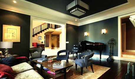
DECORATING GUIDES9 Ways to Use Rich, Dark Paint
See how deep colors — navy blue, charcoal, dark chocolate — can bring out your home's best details
Full Story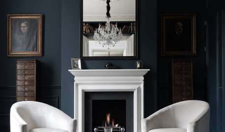
DECORATING GUIDESSo Your Style Is: Darkly Romantic
Envelop yourself in mysterious luxury with deep colors, rich textures and unexpected details
Full Story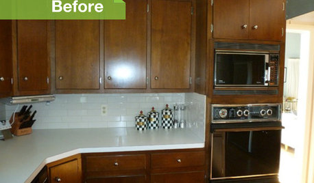
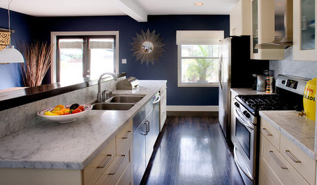
KITCHEN DESIGN3 Dark Kitchens, 6 Affordable Updates
Color advice: Three Houzzers get budget-friendly ideas to spruce up their kitchens with new paint, backsplashes and countertops
Full Story


redbazel
awm03Original Author
Related Professionals
Wareham Interior Designers & Decorators · Atlanta Furniture & Accessories · San Diego Furniture & Accessories · Scottsdale Furniture & Accessories · Skokie Furniture & Accessories · Spartanburg Furniture & Accessories · Golden Glades Furniture & Accessories · Kingsburg Furniture & Accessories · Clive Furniture & Accessories · Chapel Hill Custom Artists · Decatur Custom Artists · La Crescenta-Montrose Custom Artists · Jefferson Valley-Yorktown Lighting · Shorewood Lighting · New Baltimore Window Treatmentsmistybear11
awm03Original Author
awm03Original Author
User
User
awm03Original Author
awm03Original Author
Oakley
awm03Original Author
User
User
awm03Original Author
mistybear11
justgotabme
awm03Original Author
newdawn1895
User
Boopadaboo
bronwynsmom
awm03Original Author
awm03Original Author
awm03Original Author
awm03Original Author
dietcokejunkee
bronwynsmom
User
awm03Original Author
bronwynsmom
Boopadaboo
User
Boopadaboo
User
kendog2
ttodd