


please-in need of paint color opinions
massagerocks
9 years ago

Sort by:Oldest
Comments (28)
Related Stories

DECORATING GUIDESNo Neutral Ground? Why the Color Camps Are So Opinionated
Can't we all just get along when it comes to color versus neutrals?
Full Story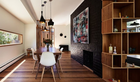
WALL TREATMENTSExpert Opinion: What’s Next for the Feature Wall?
Designers look beyond painted accent walls to wallpaper, layered artwork, paneling and more
Full Story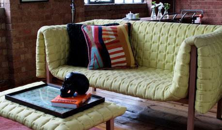
DECORATING GUIDESPlease Touch: Texture Makes Rooms Spring to Life
Great design stimulates all the senses, including touch. Check out these great uses of texture, then let your fingers do the walking
Full Story
BATHROOM DESIGNUpload of the Day: A Mini Fridge in the Master Bathroom? Yes, Please!
Talk about convenience. Better yet, get it yourself after being inspired by this Texas bath
Full Story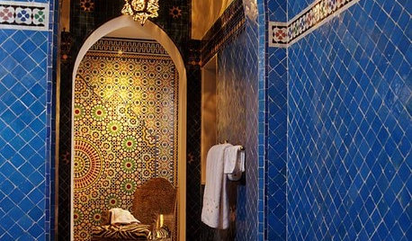
TILEMoor Tile, Please!
Add an exotic touch with Moroccan tiles in everything from intricate patterns and rich colors to subtle, luminous neutrals
Full Story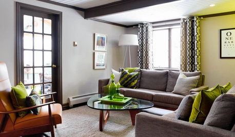
LIVING ROOMSCurtains, Please: See Our Contest Winner's Finished Dream Living Room
Check out the gorgeously designed and furnished new space now that the paint is dry and all the pieces are in place
Full Story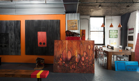
HOUZZ TOURSMy Houzz: Hold the (Freight) Elevator, Please!
Industrial style for this artist's live-work loft in Pittsburgh starts before you even walk through the door
Full Story
FLOORSChecks, Please! 13 Choices for Checkered Floors
Checkerboard Patterns Go From Casual to Ritzy, From Marble to Grass
Full Story

DECORATING GUIDES10 Bedroom Design Ideas to Please Him and Her
Blend colors and styles to create a harmonious sanctuary for two, using these examples and tips
Full Story


massagerocksOriginal Author
massagerocksOriginal Author
Related Professionals
Cusseta Interior Designers & Decorators · Westbury Interior Designers & Decorators · Carlsbad Furniture & Accessories · Charleston Furniture & Accessories · Charlotte Furniture & Accessories · Dallas Furniture & Accessories · Walnut Creek Furniture & Accessories · Mundelein Furniture & Accessories · Kingsburg Furniture & Accessories · Lawrence Lighting · Modesto Lighting · Shorewood Lighting · Ferndale Window Treatments · Oak Park Window Treatments · The Woodlands Window TreatmentsmassagerocksOriginal Author
massagerocksOriginal Author
tibbrix
amykath
patricianat
catkin
massagerocksOriginal Author
nutsaboutplants
User
persnicketydesign
persnicketydesign
Annie Deighnaugh
tibbrix
massagerocksOriginal Author
tibbrix
persnicketydesign
massagerocksOriginal Author
massagerocksOriginal Author
massagerocksOriginal Author
tibbrix
Catharine442
antmaril
cawaps
nosoccermom
massagerocksOriginal Author
tibbrix