


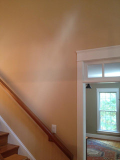
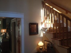
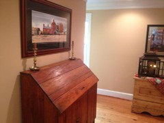
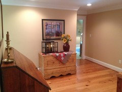
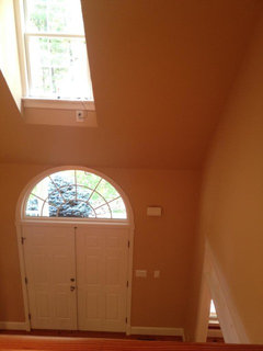
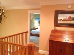
When choosing wall color to go with wood floors and antique piece
sis2two
9 years ago
Featured Answer
Sort by:Oldest
Comments (33)

voila
9 years ago
Annie Deighnaugh
9 years agoRelated Professionals
Bridgeport Furniture & Accessories · Fort Wayne Furniture & Accessories · Milwaukee Furniture & Accessories · Paramus Furniture & Accessories · Racine Furniture & Accessories · Culver City Furniture & Accessories · Carpinteria Furniture & Accessories · Danville Custom Artists · Springville Custom Artists · West University Place Lighting · Tampa Lighting · Fuquay Varina Lighting · Berkley Window Treatments · Gadsden Window Treatments · Rockledge Window Treatments
tibbrix
9 years ago
sis2two
9 years agotibbrix
9 years agosis2two
9 years agosis2two
9 years agotibbrix
9 years agosis2two
9 years agotibbrix
9 years agochispa
9 years ago PRO
PROLori A. Sawaya
9 years agotibbrix
9 years agosis2two
9 years agosis2two
9 years ago
oldbat2be
9 years ago- PRO
Lori A. Sawaya
9 years ago sis2two
9 years ago- PRO
Lori A. Sawaya
9 years ago sis2two
9 years agosis2two
9 years ago- PRO
Lori A. Sawaya
9 years ago sis2two
9 years ago- PRO
Lori A. Sawaya
9 years ago Annie Deighnaugh
9 years ago
Oakley
9 years agonosoccermom
9 years ago- PRO
Lori A. Sawaya
9 years ago 
Holly- Kay
9 years agosis2two
9 years agotibbrix
9 years agonosoccermom
9 years ago


Related Stories
GRAYGoing Greige: Tips for Choosing This All-Around Neutral
Here are some ways to highlight and complement your home with this elegant hybrid of gray and beige
Full Story
MATERIALSWhat to Ask Before Choosing a Hardwood Floor
We give you the details on cost, installation, wood varieties and more to help you pick the right hardwood flooring
Full Story
DECORATING STYLESWhen Your Style Evolves: Key Pieces for New Looks
Whether you're tired of traditional or meandering from modern, we help you make the decor transition smoothly
Full Story
DECORATING GUIDESA Designer’s 8 Go-to Decor Pieces
Classic designs such as a Saarinen table and a Chinese garden stool will lift just about any room
Full Story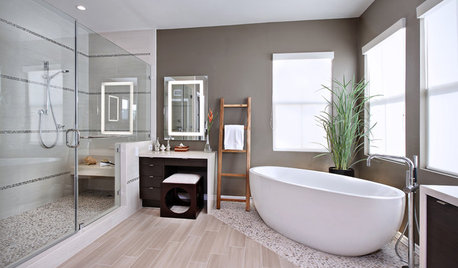
WORKING WITH PROSGo Beyond the Basics When Interviewing Architects
Before you invest all that money and time, make sure you and your architect are well matched beyond the obvious levels
Full Story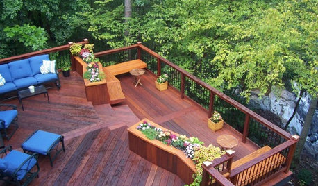
GARDENING AND LANDSCAPINGChoosing a Deck: Plastic or Wood?
Get the pros and cons of wood, plastic, composite and more decking materials, plus a basic price comparison
Full Story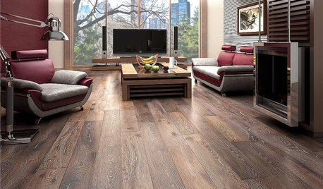
REMODELING GUIDESWhen to Use Engineered Wood Floors
See why an engineered wood floor could be your best choice (and no one will know but you)
Full Story
DECORATING GUIDESWorking With Pros: When to Choose Full Design Services
Whether you want a single room or a whole house done, the maximum service level means the least work for you
Full Story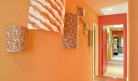
More Discussions


sis2twoOriginal Author