


Please teach me about off-white colors, how do I choose?
annab6
14 years ago
Sort by:Oldest
Comments (6)
Related Stories
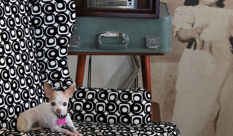
PETSWhat Chihuahuas Can Teach Us About Interior Design
Who knew these tiny dogs could be such a huge fount of design tips? Houzzers did
Full Story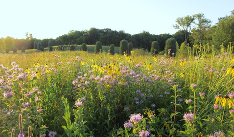
GARDENING GUIDESWhat Prairies Teach Us About Garden Design
Wild spaces offer lessons for home gardeners about plants, pollinators and the passage of time
Full Story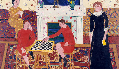
DECORATING GUIDESWhat Matisse Can Teach Us About Interior Design
Learn to pack a punch with decor inspired by one of the most influential artists of the 20th century
Full Story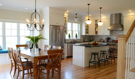
BUDGETING YOUR PROJECTHouzz Call: What Did Your Kitchen Renovation Teach You About Budgeting?
Cost is often the biggest shocker in a home renovation project. Share your wisdom to help your fellow Houzzers
Full Story
COLORColor of the Year: Off-White Is On Trend for 2016
See why four paint brands have chosen a shade of white as their hot hue for the new year
Full Story
MOST POPULARMust-Try Color Combo: White With Warm Off-White
Avoid going too traditional and too clean by introducing an off-white palette that brings a touch of warmth and elegance
Full Story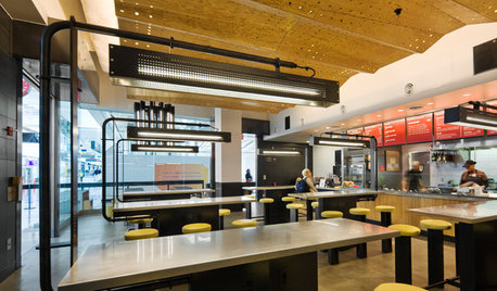
HOME TECHWhat Chipotle and Radiohead Can Teach Us About Sound Quality at Home
Contemporary designs filled with glass and concrete can be hostile environments for great sound quality. Here's how to fix that
Full Story
ARCHITECTURE4 Things a Hurricane Teaches You About Good Design
When the power goes out, a home's design can be as important as packaged food and a hand-crank radio. See how from a firsthand account
Full Story
COLORBye-Bye, Minimalist White — The New Nordic Style Is All About Color
The Scandinavian color palette is moving away from pale, cool shades with hot new hues on walls and floors
Full Story


beekeeperswife
User
Related Professionals
Crestview Interior Designers & Decorators · Mount Laurel Interior Designers & Decorators · Mount Sinai Interior Designers & Decorators · Athens Furniture & Accessories · Boston Furniture & Accessories · Manhattan Furniture & Accessories · Mansfield Furniture & Accessories · Midland Furniture & Accessories · San Francisco Furniture & Accessories · Sioux Falls Furniture & Accessories · Jacinto City Furniture & Accessories · Saint Petersburg Lighting · Los Angeles Window Treatments · Palm Beach Gardens Window Treatments · Brownsville Window TreatmentsUser
ttodd
redbazel
annab6Original Author