Shop Products
Houzz Logo Print
xclusive_gw

Please help with paint/decorating dining room

Xclusive
9 years ago

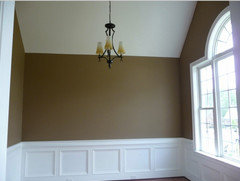
Hello, I wanted to get some help painting and decorating my dining room and was looking for some help. I am finally getting the dining room together that I wanted when we moved in two years ago but due to budget restraints didn�t :) I have done hardwood floors and just finished coffered ceiling and wainscot. The trim is painted SW Proclassic white and I need help with painting the walls from the wainscot to the ceiling. I saw three colors that I really liked in person at a Parade of Homes or online at Houzz.com but when I did paint samples on foam boards they didn't come out as I expected. The colors were BM Lenox Tan, SW Universal Khaki and SW Relaxed Khaki. Guess I can say I finally understand now when people say that colors take on different looks in different rooms and with different lighting. What I am basically looking for is a warm color that not to light or to dark but that will make the white on the trim pop (my wife doesn't want any grays). I will also take any other suggestions on decorating the room as well. The dining room opens up into the foyer and the main hallway and also opens up into the kitchen.

Things that I have left to do are 3 recessed lights (1 to light some type of art on the exterior wall), 2 ceiling speakers and 2 wall sconces on each side of the columns going into the kitchen. Ok enough talking on to the pictures:

Before PIcs

{{gwi:2137323}}

{{gwi:2137324}}

{{gwi:2137325}}

{{gwi:2137326}}

{{gwi:2137327}}

After Pics

{{gwi:2137328}}

{{gwi:2137329}}

{{gwi:2137330}}

{{gwi:2137331}}

{{gwi:2137332}}

{{gwi:2137333}}

These are the three colors I tested (from left to right SW Relaxed Khaki, SW Universal Khaki, and BM Lenox Tan)

Daytime

{{gwi:2137334}}

{{gwi:2137335}}

Relaxed Khaki

{{gwi:2137336}}

Universal Khaki (cheap foam board, don�t buy from Dollar Store) :)

{{gwi:2137337}}

Lenox Tan

{{gwi:2137338}}

Night time with shutters closed

{{gwi:2137339}}

Sorry for so many pics but just tried to give as much info as possible with visuals as well.

Thanks

Comments (44)

  • tibbrix
    9 years ago
    last modified: 9 years ago

    That ceiling is gorgeous.

    I think you need to go pretty bold and deep. That will really make that ceiling stand out and give the dining room a richness that is good for dining rooms Great lighting at night will make it luxurious and wonderful in which to dine.

    Some suggestions:

    BM Green Tea

    BM Everard Gold

    BM Mystic Gold

    BM Raleigh Sorrel

  • tibbrix
    9 years ago
    last modified: 9 years ago

    Mystic Gold

  • Annie Deighnaugh
    9 years ago
    last modified: 9 years ago

    You've done a really nice job so far. The ceiling is beautiful.

    You can go in any direction with the color...but I think, other than the Lenox Tan, the colors you've selected are too pale. I think a rich color would be nice in there, and then I would push the squares between the coffers even darker. Seeing as the colors are wide open, do you have artwork or dishes or seat cushions that can help steer you in one direction or another?

    Or select a design seed to help steer you. For example, if you liked something like this, you could put the slate blue on the wall and a shade of green or tan in the coffers.

    {{gwi:2137340}}

    Or something like this with the taupe on the wall and the burgundy or peach in the coffers.

    {{gwi:2137341}}

    We have a coffered ceiling in our enfilade, and it looked ho hum until I put the eggplant up there...then it really came to life...I also have the eggplant on an accent wall in my library that's open to one side and in the wall paper accents in the dining room on the other so it ties it all together.

  • Xclusive
    Original Author
    9 years ago
    last modified: 9 years ago

    Thanks for the suggestions. I haven't selected any pictures yet so I'm not able to go that route. I did look at the BM colors suggested:

    BM Raleigh Sorrel - I like this but it may be to dark

    BM Mystic Gold - I do like this and will get a sample

    As you can see I pretty much have a blank canvas so any and all suggestions would be gladly accepted.

    Thanks!

  • Annie Deighnaugh
    9 years ago
    last modified: 9 years ago

    Trust me, color selection would be a lot easier if you had a direction first...what's you're favorite color? Do you have china or a vase that you'd like to use in the space? Maybe start with some artwork...or will you want an area rug under the table? Will there be any fabric in the room...window treatment, chair seat?

    Or go to design-seeds.com and look for inspiration...

    Or go to houzz.com and look for inspiration.

    Once you pick a direction, the rest will fall into place quite easily.

  • tibbrix
    9 years ago
    last modified: 9 years ago

    Believe it or not, when it comes to paint color, "dark" has nothing to do with the paint and everything to do with the lighting in the room. Conversely, paint color has nothing to do with a room being "light" either.

    If the room has NO windows, like a basement room, yes, Raleigh Sorrel (as an example) would not be right because there is NO light to help its pigments. This is also why it's best to not use very light colors in north-facing rooms, because the lack of light to reflect off the light colors causes them to go gray and blechy, murky. People think hat, if they paint a dark room in a light color, that will make the room brighter and lighter. But that's not correct.

    In formal DRs, colors with more depth, IMO, are perfect because the room is used, generally, at night and for formal occasions. The deeper colors add an elegance and warmth and richness to a room that adds wonderfully to that ambience. Same reason I would NOT suggest a color like RS for, say, a breakfast room, where you want bright morning light, an airier more energetic ambience, so go with a color that reflects light in a room like that, i.e.: a lighter color.

    With the right lighting, decor on the walls, etc., a color like RS in a DR, with your wainscoting, can be absolutely stunning, i.e.: a deep color. But yes, it definitely has to have the other elements working with it, namely lighting. Artificial light, though, does better with deeper colors, like the Mystic Gold, RS, etc. And that is generally what a DR is using, artificial lighting, when the room is being used by people, i.e.: nighttime dining.

  • Xclusive
    Original Author
    9 years ago
    last modified: 9 years ago

    Thank you very much for the response, I felt like class was in sessions. Some very interesting points that I had never thought about. I have a few colors that I will be getting paint samples of today:

    BM Shaker Beige

    BM Raleigh Sorrel

    BM Mystic Gold

    SW Foothills

  • tibbrix
    9 years ago
    last modified: 9 years ago

    I like the depth of the SW Foothills, but it's got a lot of gray and red in it, so be aware of that. Raleigh Sorrel has the same depth but would be a much warmer color than the Foothills.

    But, with paint, you never, ever know until it's actually up on the wall. So here's another tip:

    Paint a LARGE swatch of each color on each wall, and paint each so that they go up to the crown moulding and, say, the trim around the window. Maybe even hang a small framed piece of decor on the swatch somewhere .

    Then, do that thing that movie directors do to frame out a scene. Put your thumbs together with your fingers up to make a box. Then frame a section of the wall that has JUST the color you're testing in the frame, where it meets the trim/moulding/ceilng in it, and the picture you've hung. Close one eye and look through your frame so that you can ONLY see what's in that frame no other wall colors. That will give you a very good idea as to how it will look if the whole room is painted in that color. You'll be surprised now different it looks in the frame than looking at it just standing in the room.

  • tibbrix
    9 years ago
    last modified: 9 years ago

    Btw, I would also try BM Danville Tan, which is somewhere between Shaker Beige, which is so light, and the depths of the the other three.

  • User
    9 years ago
    last modified: 9 years ago

    I don't think gold is a good color with your red toned floors. Red and gold reads Tuscan, which was overdone in the 90s. With your transitional dining set and light fixture, it seems to me you don't want a too warm color palette. With no furnishings in the photos, all we see are white, black, and red-brown. We could suggest any of the thousand of paint colors available. Paint should be the last selection. I'd do as Annie suggested and find a rug first.

  • kidrowlam
    9 years ago
    last modified: 9 years ago

    Rich colours for dining room can make dining experience enjoyable wiping out the dull look. Golden or rust coloured walls can make this happen. By the way your walls and ceilings are really beautiful.

  • Xclusive
    Original Author
    9 years ago
    last modified: 9 years ago

    Thank you for the compliments. I did do paint samples on the walls and honestly they all feel to dark for me(BM Raleigh sorrel, SW Foothills and mystic gold). I was leaning towards Mystic Gold but my wife wants it to be just a shade or two lighter. It doesn't appear that the historical colors are on paint strips so how would I go about staying in the same family but my be just a shade or two lighter?

    Left to right: foothills, Raleigh sorrel, mystic gold

    {{gwi:2137342}}

    SW Fiothills
    {{gwi:2137343}}

    BM Raleigh Sorrel & BM Mystic Gold

    {{gwi:2137344}}

  • tibbrix
    9 years ago
    last modified: 9 years ago

    Also try SW Baguette

  • msrose
    9 years ago
    last modified: 9 years ago

    I really like your original SW samples. I have Lenox Tan and I'm a little tired of it. The other two seem a little less in your face.

  • Xclusive
    Original Author
    9 years ago
    last modified: 9 years ago

    Went out and got SW baguette today

    {{gwi:2137345}}

    {{gwi:2137346}}

    Maybe Tinbrix is correct, just a little nervous about going with the dark color. I will say that having the SW paint chips and bringing those home really helped because they do look true to the chips(comparing the baguette I just purchased). I didn't have the BM paint chips and was just going by the color on the monitor which doesn't seem the same once it's on my walls. I will say this is getting exhausting , never knew picking paint colors was this hard!

  • tibbrix
    9 years ago
    last modified: 9 years ago

    Picking paint colors is a PITA

    I really like the depth of the Baguette. Is it showing a bit green just because of the monitor or camera? How does it look IRL compared to the pic?

    Also, I think maybe you missed my post about putting your thumbs together to frame out a section? It's on Jan. 9 at 11:26. That will REALLY help you get a really good idea as to how a color will look in the entire room.

    What do you think of something like this?

  • tibbrix
    9 years ago
    last modified: 9 years ago

    Above is SW Latte.

    This is one chip down from Latte, Hopsack

  • tibbrix
    9 years ago
    last modified: 9 years ago

    You know what? Let's start over for a second. Forget about color, per se, for a moment. Ask yourself how you want to FEEL when you're in the DR. Do you want it elegant? Cozy and warm? Etc.

    That's really the place to start

  • tibbrix
    9 years ago
    last modified: 9 years ago

    Oo la la! How about something like this, spicy, autumnal…

  • tibbrix
    9 years ago
    last modified: 9 years ago

    BM Cinnamon

  • User
    9 years ago
    last modified: 9 years ago

    Cinnamon walls to match the cinnamon floors?

    Xclusive, SW in my area offers an in-home paint consultation with a designer. I think it's $75 and you get a credit toward a can of paint. What you see in your lighting is reflective color. We only see transmitted color on a computer screen. Paint color advice given online is limited by that and the quality of your photos.

  • Xclusive
    Original Author
    9 years ago
    last modified: 9 years ago

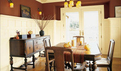
    Probably should have posted this to begin with but this was my inspiration photo to begin with although I will be painting instead of grasscloth.

    [{{gwi:2137347}}[(https://www.houzz.com/photos/seeley-dining-room-traditional-dining-room-chicago-phvw-vp~214110)

    [Traditional Dining Room[(https://www.houzz.com/photos/traditional-dining-room-ideas-phbr1-bp~t_722~s_2107) by Chicago Interior Designers & Decorators Michael Abrams Limited

    I did see a few more pics on Houzz with white trim, red floors and dark rich colors that I do like:

    [{{gwi:2137348}}[(https://www.houzz.com/photos/custom-home-draper-traditional-dining-room-salt-lake-city-phvw-vp~395936)

    [Traditional Dining Room[(https://www.houzz.com/photos/traditional-dining-room-ideas-phbr1-bp~t_722~s_2107) by South Jordan Home Builders Candlelight Homes

    Some other pics I like:

    [{{gwi:2137349}}[(https://www.houzz.com/photos/hardwood-floors-and-more-inc-traditional-dining-room-atlanta-phvw-vp~1147492)

    [Traditional Dining Room[(https://www.houzz.com/photos/traditional-dining-room-ideas-phbr1-bp~t_722~s_2107) by Evans Carpet & Flooring Hardwood Floors & More

    [{{gwi:2137350}}[(https://www.houzz.com/photos/shirley-corwin-traditional-dining-room-phvw-vp~51286)

    [Traditional Dining Room[(https://www.houzz.com/photos/traditional-dining-room-ideas-phbr1-bp~t_722~s_2107)

    [{{gwi:2137351}}[(https://www.houzz.com/photos/shirley-corwin-traditional-dining-room-phvw-vp~51289)

    [Traditional Dining Room[(https://www.houzz.com/photos/traditional-dining-room-ideas-phbr1-bp~t_722~s_2107)

    The picture you posted of the dining room I really like! Cinnamon the wife isn't liking at all :) Maybe that's my problem, I want something that is warm and cozy but elegant at the same time. Is that even possible? As far as the paint consultation, if I don't figure it this week that may be an option.

  • tibbrix
    9 years ago
    last modified: 9 years ago

    Ah-ha! BM Briarwood

    This post was edited by Tibbrix on Sun, Jan 11, 15 at 20:45

  • tibbrix
    9 years ago
    last modified: 9 years ago

    BM Briarwood

  • kris_zone6
    9 years ago
    last modified: 9 years ago

    I have white painted trim and used SW Kilim Beige in the family rooms and hall, but I went darker in the hall bathroom that has no windows. It is SW Latte. I love it, the white woodwork really stands out. I wouldn't change either color. Check these out because on my computer they look somewhat like the colors you like.

  • tibbrix
    9 years ago
    last modified: 9 years ago

    BM Brandon Beige

  • tibbrix
    9 years ago
    last modified: 9 years ago

    BM Cole Stone

  • tibbrix
    9 years ago
    last modified: 9 years ago

    BM Finnie Gray

  • tibbrix
    9 years ago
    last modified: 9 years ago

    BM Coriander Seed

  • pps7
    9 years ago
    last modified: 9 years ago

    It's a beautiful room! IMHO, you are going about this backwards. I would first pick a rug. The rooms needs one to anchor the table bc the table and floors are similar in color and right now everything blends together. Plus the room needs some softness. A pair of drapes would be great too. Then pick the paint color last.

    I used Lenox tan in my son's bedroom. It is a gorgeous color.

  • amykath
    9 years ago
    last modified: 9 years ago

    Pps has a very good point. So does Tibbrix. You should think of what you want the mood to be like. If you want cozy and moody go with a darker color. If you want iy to feel open and more airy then go with a light color.

    I am a fan of overstock.com for area rugs. I've always had great experiences with them. Just be sure to read the reviews. Sometimes they will tell what the colors are like irl if the monitor changes them to your eye.

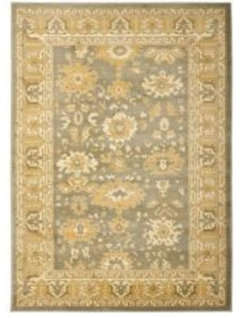
    With this rug, I'd go with the gray green and you could either go close in color, darker or lighter in airy. Or you could play with the gold or cream.
    Not sure it's your style, or the right colors but may spark some ideas.

  • rubyclaire
    9 years ago
    last modified: 9 years ago

    What a beautiful space you have created! As others have suggested, starting with "the feel" or the finding the perfect rug may make picking a color easier. Not that it won't still be a challenge but maybe will focus the direction. It seems you are well on your way to creating a simply gorgeous dining room!!

  • Annie Deighnaugh
    9 years ago
    last modified: 9 years ago

    I love your inspiration picture...very rich and classy. I think the other samples you have will be way too dark for your room, especially since the window has shutters which cuts down on so much light.

    I think you would be much happier with a color like BM adobe beige which has both warmth and brightness, yet enough body to stand up to the white trim.
    {{gwi:2137352}}

    [{{gwi:2137353}}[(https://www.houzz.com/photos/paradise-island-bahamas-tropical-living-room-san-francisco-phvw-vp~2080354)

    [Tropical Living Room[(https://www.houzz.com/photos/tropical-living-room-ideas-phbr1-bp~t_718~s_2108) by Sausalito Interior Designers & Decorators Linda Banks Interiors

  • Xclusive
    Original Author
    9 years ago
    last modified: 9 years ago

    Took another trip to Sherwin Williams store to look at colors. I must have been looking pitiful and frustrated because the sales rep there gave me paint chip deck to take home :). Probaly should have done this to begin with to see what the chips look like at my house with my lighting. Would have saved some money I'm sure!

    {{gwi:2137354}}

    Also on the advice of others went to TJ Maxx Homestore and Kirklands today to looks at pictures and rugs. Not trying to rush but would love to have my dining room done as soon as possible!

  • Xclusive
    Original Author
    9 years ago
    last modified: 9 years ago

    I went and got more paint samples and took pictures with natural light and no natural light. The colors from left to right: Raleigh sorrel, mystic gold, baguette, nomadic desert, latte, Kilim beige and Lennox tan.

    Natural light

    {{gwi:2137355}}

    Starting with baguette

    {{gwi:2137356}}

    All colors

    {{gwi:2137357}}

    {{gwi:2137358}}

    {{gwi:2137359}}

    No natural light

    {{gwi:2137360}}

    {{gwi:2137361}}

    Starting with baguette

    {{gwi:2137362}}

    More pics

    {{gwi:2137363}}

    {{gwi:2137364}}

    This is exhausting, I never knew picking a color could be so hard!! Wish I had a designer to just say paint it this color AND that I would love it!

  • tibbrix
    9 years ago
    last modified: 9 years ago

    I like the Latte best of the swatches, and I'd actually go one further down on the Latte strip and go with SW Hopsack, for a dining room, esp. with all that beautiful trim and moulding.

    Picking paint is very hard!

  • pps7
    9 years ago
    last modified: 9 years ago

    I like latte the best andlennox tan 2nd. It's going to look fantastic!

  • Annie Deighnaugh
    9 years ago
    last modified: 9 years ago

    I agree on the latte...very nice.

  • Xclusive
    Original Author
    9 years ago
    last modified: 9 years ago

    Ok I added the last paint sample today so it's time to make a decision. I'm going to live with these for a couple of days and them make a choice an live with it :). The colors from left to right:

    BM Raleigh Sorrel
    BM Mystic Gold
    SW Baguette
    SW Nomadic Desert
    SW Latte
    SW Kilim Beige
    SW Hopsack

    {{gwi:2137365}}

    {{gwi:2137366}}

    SW Baguette
    SW Nomadic Desert
    SW Latte
    SW Kilim Beige
    SW Hopsack

    {{gwi:2137367}}

    {{gwi:2137368}}

    Thanks for everyone's input and I'm taking any and all suggestions!

  • tibbrix
    9 years ago
    last modified: 9 years ago

    I like the hopsack! Rich, elegant, sophisticated…and it would make your woodwork REALLY pop and look fantastic.

    This post was edited by Tibbrix on Thu, Jan 15, 15 at 17:05

  • tibbrix
    9 years ago
    last modified: 9 years ago

    Hopsack on walls. Lovely. Notice how great the white woodwork looks due to the sharp contrast. Also notice the framed artwork on the wall. I'd put gold-framed or black framed artwork up on the Hopsack, though.

    Yup…Hopsack.

    This post was edited by Tibbrix on Thu, Jan 15, 15 at 19:31

  • kris_zone6
    9 years ago

    What color did you end up with?

  • tibbrix
    9 years ago

    He went with the Hopsack, and it's gorgeous. I'll bring his attention to this thread and have him put pics up.