


Best white to complement Revere Pewter and Chelsea Gray?
Rachel
8 years ago
Featured Answer
Sort by:Oldest
Comments (35)
 PRO
PROUser
8 years ago
Lindsay K
8 years agoRelated Professionals
Appleton Interior Designers & Decorators · Dayton Architects & Building Designers · Portsmouth Architects & Building Designers · South Elgin Architects & Building Designers · Beavercreek Kitchen & Bathroom Designers · Riviera Beach Kitchen & Bathroom Designers · Surprise Furniture & Accessories · Fallbrook Furniture & Accessories · Lake Arrowhead Furniture & Accessories · North Hollywood Furniture & Accessories · Temple Terrace Furniture & Accessories · Irving General Contractors · Panama City General Contractors · Saginaw General Contractors · Shaker Heights General Contractors
Rachel
8 years ago
juudean
8 years agoLindsay K
8 years agoRachel
8 years agoLindsay K
8 years agolast modified: 8 years agoRachel
8 years agoLindsay K
8 years agoRachel
8 years ago
percivalk
8 years agoLindsay K
8 years agoRachel
8 years agoRachel
8 years agospitaki10
8 years agospitaki10
8 years agoRachel
8 years agoroxannestill
7 years agolisantril
7 years agoRachel
7 years ago PRO
PRO
drdeb1234
7 years agojoviboys
7 years agoSteph
7 years agoRachel
7 years agojoviboys
7 years agoRachel
7 years agoSteph
7 years ago
Marta Sawon
7 years agoJuliet Sory
7 years ago
Gina Lanouette
7 years agoJuliet Sory
7 years ago


Related Stories

KITCHEN DESIGNNew This Week: 3 Stunning White-and-Gray Kitchens
See how the classic color palette works wonders in spaces in a variety of styles
Full Story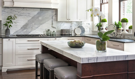
WHITE KITCHENSNew This Week: 3 Kitchens Rock a Gray-and-White Palette
White cabinets with gray walls or accents provide a soothing foundation with a lot of potential for elegance
Full Story
GRAYColor Guide: How to Work With Light Gray
The hottest new neutral can be cool or warm, formal or casual, and feminine or masculine. Talk about versatile
Full Story
DECORATING GUIDESColor Guide: How to Work With Charcoal Gray
The most modern neutral, charcoal gray looks great in dining rooms, living rooms and even nurseries. Here's how to use it best
Full Story
COLORDreaming in Color: 8 Gorgeous Gray Bedrooms
With this versatile hue, you can go dark and bold or slip into something more soothing
Full Story
GRAYChoosing Paint: How To Pick the Right Gray
Which Version of Today's 'It' Neutral Is For You?
Full Story

GRAYDesigners Share Their Favorite Light Gray Paints
These versatile neutrals can help create a range of moods in any room
Full Story
DECORATING GUIDESColor of the Week: Decorating With Warm Gray
Tired of tan? Getting gloomy from cool gray? Make warm gray your new go-to neutral
Full Story
MOST POPULARRethinking Beige in a World Gone Gray
Gray, the ‘it’ neutral of recent years, has left beige in the shade. But is it time to revisit this easy-on-the-eyes wall color?
Full Story


spitaki10