


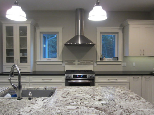
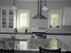
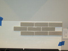
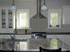
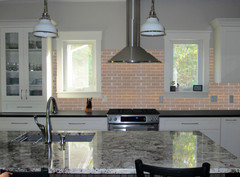
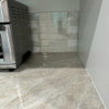
oldbat2b - I made my sample board - can you photo shop this please?
autumn.4
8 years ago
last modified: 8 years ago


Featured Answer
Sort by:Oldest
Comments (65)

autumn.4
8 years ago
akl_vdb
8 years agoRelated Professionals
Clarksburg Kitchen & Bathroom Designers · Ridgefield Kitchen & Bathroom Designers · Buffalo Grove Kitchen & Bathroom Remodelers · Centerville Kitchen & Bathroom Remodelers · Cleveland Kitchen & Bathroom Remodelers · Idaho Falls Kitchen & Bathroom Remodelers · Key Biscayne Kitchen & Bathroom Remodelers · League City Kitchen & Bathroom Remodelers · Oklahoma City Kitchen & Bathroom Remodelers · Overland Park Kitchen & Bathroom Remodelers · Port Angeles Kitchen & Bathroom Remodelers · Richland Kitchen & Bathroom Remodelers · Fort Lauderdale Cabinets & Cabinetry · Richardson Cabinets & Cabinetry · Milford Mill Cabinets & Cabinetry PRO
PROMDLN
8 years ago
oldbat2be
8 years agoautumn.4
8 years agoautumn.4
8 years agoautumn.4
8 years agoautumn.4
8 years agoautumn.4
8 years agoautumn.4
8 years agoautumn.4
8 years agoautumn.4
8 years agoautumn.4
8 years agoautumn.4
8 years agoautumn.4
8 years agoautumn.4
8 years agoautumn.4
8 years agoautumn.4
8 years ago- PRO
MDLN
8 years ago autumn.4
8 years ago
User
8 years agoautumn.4
8 years agoUser
8 years agolast modified: 8 years agoautumn.4
8 years agoautumn.4
8 years agolast modified: 8 years agoUser
8 years agolast modified: 8 years agooldbat2be
8 years agoUser
8 years ago


Related Stories
DECORATING GUIDESThe Dumbest Decorating Decisions I’ve Ever Made
Caution: Do not try these at home
Full Story
KITCHEN DESIGNTrending Now: 25 Kitchen Photos Houzzers Can’t Get Enough Of
Use the kitchens that have been added to the most ideabooks in the last few months to inspire your dream project
Full Story
HOME OFFICESQuiet, Please! How to Cut Noise Pollution at Home
Leaf blowers, trucks or noisy neighbors driving you berserk? These sound-reduction strategies can help you hush things up
Full Story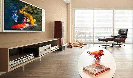
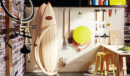
STORAGE18 Rooms Made Better With Pegboard
A grid of tiny holes punched in hardboard can be your versatile best friend in every room
Full Story
WORKING WITH PROSInside Houzz: What You Can Learn From a Houzz Photo
Get access to the designer's info, product names, other photos in the project and much more by clicking on a Houzz image
Full Story
LIFEThe Polite House: How Can I Kindly Get Party Guests to Use Coasters?
Here’s how to handle the age-old entertaining conundrum to protect your furniture — and friendships
Full Story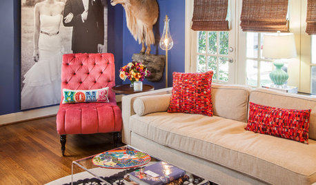
THE POLITE HOUSEThe Polite House: Can I Put a Remodel Project on Our Wedding Registry?
Find out how to ask guests for less traditional wedding gifts
Full Story
PRODUCT PICKSGuest Picks: Beautiful Things You Can Feel Good About Buying
Upcycled, ecofriendly or just made responsibly, these home accessories and furniture pieces will keep your conscience clear
Full Story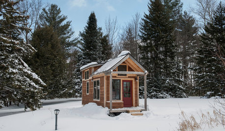
TINY HOUSESHouzz Tour: A Custom-Made Tiny House for Skiing and Hiking
Ethan Waldman quit his job, left his large house and spent $42,000 to build a 200-square-foot home that costs him $100 a month to live in
Full Story

User