


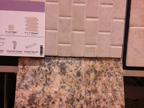
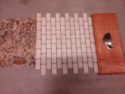
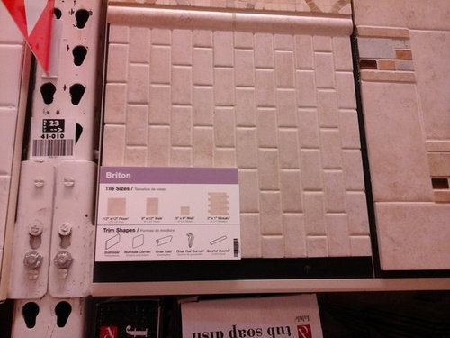
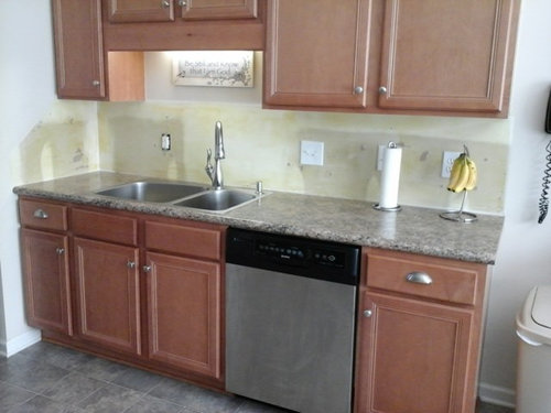
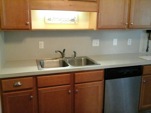
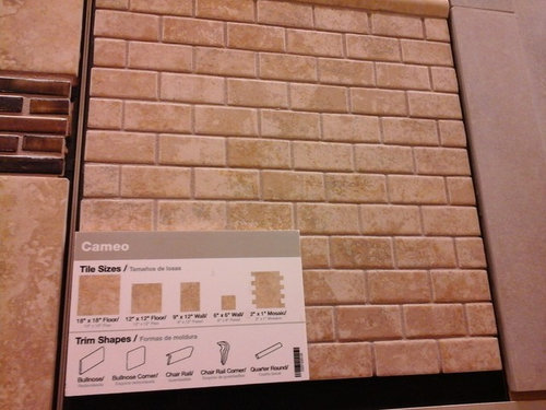
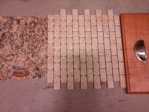
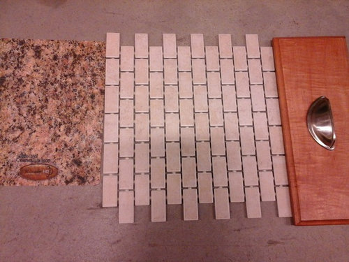
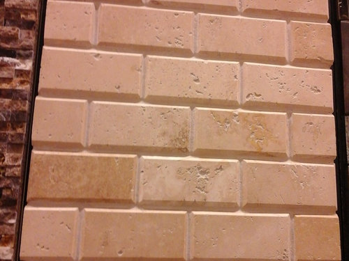
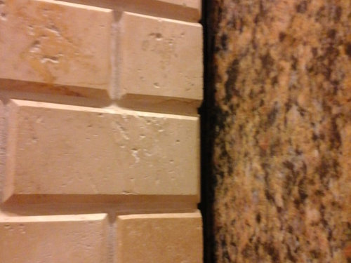
Part II: Are these tiles too busy?
CJ Mac
8 years ago
Sort by:Oldest
Comments (2)
Related Stories
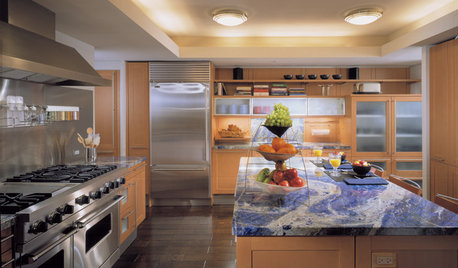
KITCHEN DESIGNAlternatives to Granite Countertops, Part II
Still looking for a new kind of countertop? Try sodalite, zinc, limestone, onyx and more
Full Story
KITCHEN DESIGNNew Year's Resolutions for Your Kitchen, Part II
Here's how to make your new kitchen more functional and fabulous this year
Full Story
LOFTSHouzz Tour: A Bachelor Pad’s Part II
A designer has a hand in two phases of this movie director’s life and his loft in a landmark Art Deco building in L.A.
Full Story
TRANSITIONAL HOMESHouzz Tour: Part Traditional, Part Modern and All Family Friendly
With clean lines, vintage touches and durable surfaces everywhere, this Los Angeles home balances tastes and needs beautifully
Full Story

LIFETime Travel to Houzzers' Childhood Homes, Part 3
See postwar homes built by family members, rural farmsteads, cold-water flats and much more
Full Story
KITCHEN DESIGNKitchen of the Week: Classic Style Creates Calm for a Busy Family
Fresh take on traditional lightens up a kitchen in a large, open space
Full Story
KITCHEN DESIGNAlternatives to Granite Countertops, Part III
9 more reasons to rethink the granite kitchen counter
Full Story
HOUSEKEEPINGWhy Cleaning Window Screens Should Be Part of Your Winter Strategy
Dirty mesh blocks light, heat and views. Learn how to keep screens looking good and if they should be put away until spring
Full Story
HOUSEKEEPINGCan-Do Cleaning Strategies for Busy People
While you dream of having a maid (to go with the cook and chauffer), this simplified cleaning routine can keep your real-world home tidy
Full Story
CJ MacOriginal Author
CJ MacOriginal Author
Related Professionals
Arkansas Interior Designers & Decorators · Ashwaubenon Interior Designers & Decorators · Albany Kitchen & Bathroom Designers · New Castle Kitchen & Bathroom Designers · Portland Kitchen & Bathroom Designers · Redmond Kitchen & Bathroom Designers · Wesley Chapel Kitchen & Bathroom Designers · Bridgeport Furniture & Accessories · Tucson Furniture & Accessories · Delhi General Contractors · Dover General Contractors · Havelock General Contractors · Kettering General Contractors · Mount Prospect General Contractors · Universal City General Contractors