


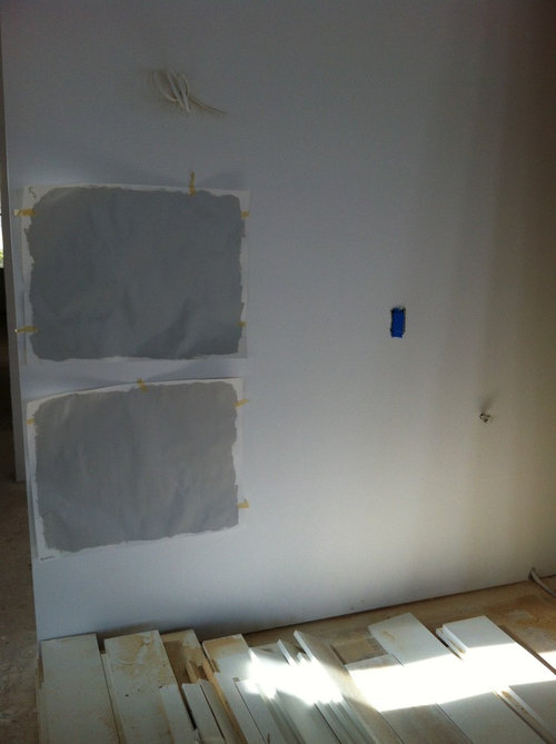
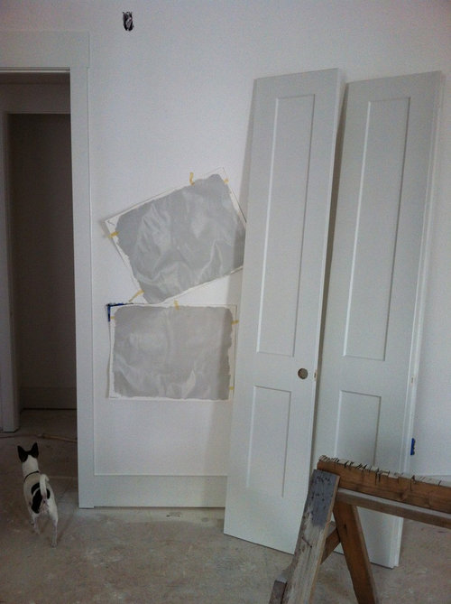
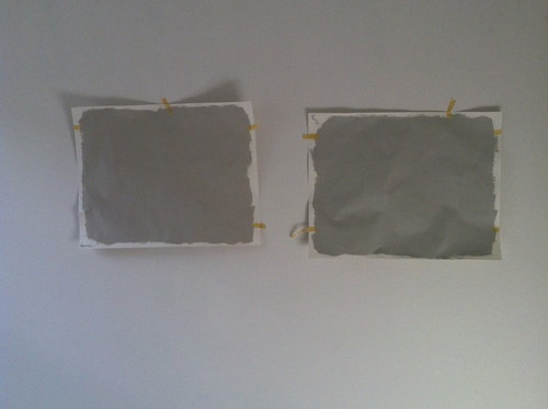
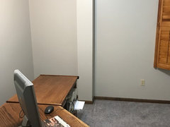
Repose Gray is a lot darker than what I was expecting...help!
kimmer69
7 years ago
Featured Answer
Sort by:Oldest
Comments (29)
Related Professionals
Allen Painters · Durham Painters · Rolling Meadows Painters · Homewood Painters · Avocado Heights Cabinets & Cabinetry · Glendale Heights Cabinets & Cabinetry · Beaumont Flooring Contractors · Cedarburg Flooring Contractors · Freeport Flooring Contractors · Goodyear Flooring Contractors · Indian Trail Flooring Contractors · Lodi Flooring Contractors · Mesa Flooring Contractors · Slidell Flooring Contractors · St. Louis Flooring Contractors
kimmer69
7 years ago
prairiemom61
7 years agokimmer69
7 years agosahai6
7 years agolast modified: 7 years agoprairiemom61
7 years agolast modified: 7 years agosahai6
7 years ago
romy718
7 years agoromy718
7 years ago
Lenny Davis
6 years agolast modified: 6 years ago PRO
PROLori A. Sawaya
6 years agoromy718
6 years agopandang81
6 years agoromy718
6 years agojtascam
6 years agolast modified: 6 years agoKatherine
5 years agoMark
5 years agoKatherine
5 years agoadriennestitt
5 years agobethl316
5 years agoAmby924 BY
5 years ago
Holly Stockley
5 years agoHU-159430695
4 years agodjmcmom
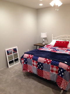
last year


Related Stories

EXTERIORSHelp! What Color Should I Paint My House Exterior?
Real homeowners get real help in choosing paint palettes. Bonus: 3 tips for everyone on picking exterior colors
Full Story
ENTRYWAYSHelp! What Color Should I Paint My Front Door?
We come to the rescue of three Houzzers, offering color palette options for the front door, trim and siding
Full Story
MOST POPULAR50 Shades of Gray
Gray is hotter than ever, thanks to a hit novel full of risks and dark secrets. Tell us: Which paint shade possesses you?
Full Story
GRAYDesigners Share Their Favorite Light Gray Paints
These versatile neutrals can help create a range of moods in any room
Full Story
FOLIAGEGet a Cool Garden Look With Gray and Blue Plants
Looking for plants that calm with color in the heat of summer? Look no further than these 14 soothing beauties
Full Story
KITCHEN DESIGNSubway Tile Picks Up Gray Grout
Heading into darker territory, subway tile offers a graphic new look for kitchens, bathrooms and more
Full Story
MOST POPULARWhat’s Your Neutral: Beige or Gray?
A designer shares 10 tips for using the neutral shade that works best for you
Full Story
DECORATING GUIDESColor Guide: How to Work With Charcoal Gray
The most modern neutral, charcoal gray looks great in dining rooms, living rooms and even nurseries. Here's how to use it best
Full Story
COLORHow to Layer Tones of Gray for Depth and Harmony
Use texture, pattern, contrast and more to create a subtle, sophisticated look with this popular color
Full Story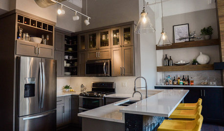
KITCHEN DESIGNGray Cabinets and a Wood-Wrapped Fireplace Update a Downtown Loft
The kitchen peninsula is jazzed up with custom wallpaper made using a photo from the homeowners’ Amsterdam honeymoon
Full StoryMore Discussions


Anglophilia