


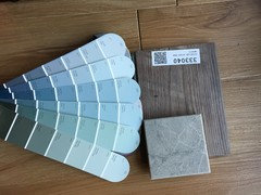
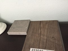
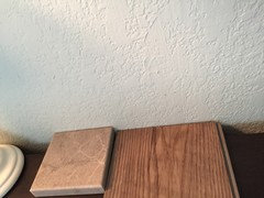
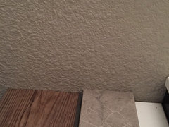
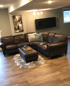
Please help - need paint color today
Tmnca
6 years ago

Featured Answer
Sort by:Oldest
Comments (27)

suzanne_sl
6 years agoRelated Professionals
Lafayette Kitchen & Bathroom Designers · Palm Harbor Kitchen & Bathroom Designers · Verona Kitchen & Bathroom Designers · Alpine Kitchen & Bathroom Remodelers · Elk Grove Kitchen & Bathroom Remodelers · Lakeside Kitchen & Bathroom Remodelers · Omaha Kitchen & Bathroom Remodelers · Payson Kitchen & Bathroom Remodelers · Walnut Creek Kitchen & Bathroom Remodelers · Dover Cabinets & Cabinetry · South Gate Cabinets & Cabinetry · Universal City Cabinets & Cabinetry · Whitney Cabinets & Cabinetry · Fayetteville Tile and Stone Contractors · Turlock Tile and Stone Contractors
Tmnca
6 years agolast modified: 6 years ago
tinybluesparkles
6 years ago
MaWizz
6 years agoTmnca
6 years agolast modified: 6 years agoMaWizz
6 years agolast modified: 6 years ago
ravencajun Zone 8b TX
6 years agoCaroline Hamilton
6 years agoTmnca
6 years agoMaWizz
6 years ago
prairiemom61
6 years agoherbflavor
6 years agoTmnca
6 years agoMaWizz
6 years agoTmnca
6 years agoMaWizz
6 years agorantontoo
6 years agoMaWizz
6 years ago
Kim L
6 years agoTmnca
6 years agolast modified: 6 years agoKim L
6 years agoTmnca
6 years agoKim L
6 years agolast modified: 6 years agoKim L
6 years agoTmnca
6 years agokimbramer
4 years ago


Related Stories
MOST POPULARCrowd-Pleasing Paint Colors for Staging Your Home
Ignore the instinct to go with white. These colors can show your house in the best possible light
Full Story
COLORPick-a-Paint Help: How to Quit Procrastinating on Color Choice
If you're up to your ears in paint chips but no further to pinning down a hue, our new 3-part series is for you
Full Story
EXTERIORSHelp! What Color Should I Paint My House Exterior?
Real homeowners get real help in choosing paint palettes. Bonus: 3 tips for everyone on picking exterior colors
Full Story
COLORPick-a-Paint Help: How to Create a Whole-House Color Palette
Don't be daunted. With these strategies, building a cohesive palette for your entire home is less difficult than it seems
Full Story
COLORPaint-Picking Help and Secrets From a Color Expert
Advice for wall and trim colors, what to always do before committing and the one paint feature you should completely ignore
Full Story
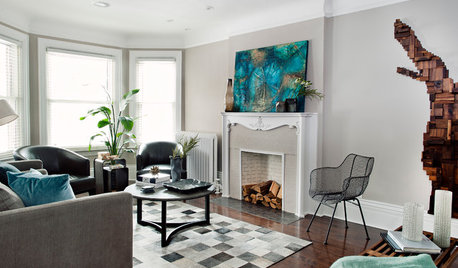
DECORATING GUIDESSlow Design: Today's 'Wabi-Sabi' Helps Us Savor the Moment
Learn about the design movement that's aiming to satisfy our real needs, leaving materialism in the past
Full Story
ENTRYWAYSHelp! What Color Should I Paint My Front Door?
We come to the rescue of three Houzzers, offering color palette options for the front door, trim and siding
Full Story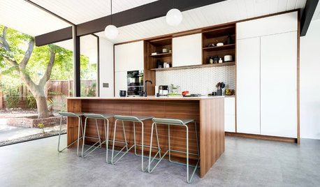
KITCHEN DESIGNKitchen of the Week: Classic Eichler Updated for Today’s Needs
A designer helps a couple honor their midcentury home’s design while creating a kitchen that works for their lifestyle
Full Story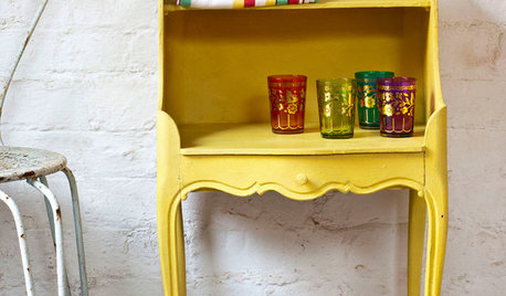
PAINTINGWhat to Know About Milk Paint and Chalk Paint — and How to Use Them
Learn the pros, cons, cost and more for these two easy-to-use paints that are great for giving furniture a vintage look
Full Story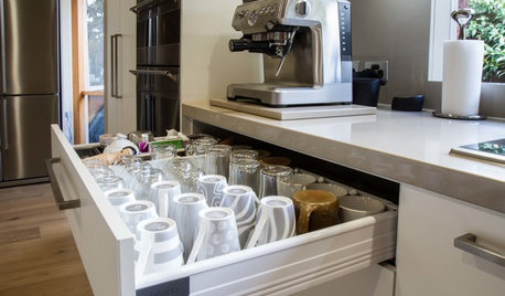
KITCHEN DESIGNToday’s Coffee Stations Have All Kinds of Perks
Some of these features are so over the top that they will give you a jolt
Full StoryMore Discussions

pamghatten