


SW Repose grey- too dark and gloomy for a small room?
waltonglade
6 years ago
last modified: 6 years ago
Featured Answer
Sort by:Oldest
Comments (10)

K Laurence
6 years agoRelated Professionals
Ardmore Painters · Franklin Park Painters · Hercules Painters · Round Lake Beach Painters · Vero Beach Painters · East Moline Cabinets & Cabinetry · Farmers Branch Cabinets & Cabinetry · Kendall West Flooring Contractors · Liberty Township Interior Designers & Decorators · Yorba Linda Kitchen & Bathroom Designers · San Juan Capistrano Furniture & Accessories · Coronado General Contractors · Duncanville General Contractors · Hanford General Contractors · La Grange Park General Contractors- PRO
Barbara Griffith Designs
6 years ago waltonglade
6 years ago
prairiemom61
6 years agowaltonglade
6 years agoprairiemom61
6 years agowaltonglade
6 years ago PRO
PROLori A. Sawaya
6 years agowaltonglade
6 years ago


Related Stories
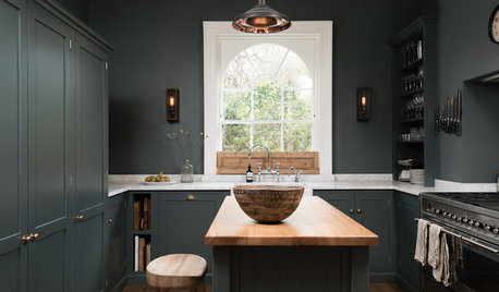
KITCHEN OF THE WEEKDark Gray Sophistication in a Shaker-Style Kitchen
Rich paint used throughout this compact London space helps create a kitchen that’s contemporary and inviting
Full Story
DINING ROOMSColor Feast: When to Use Gray in the Dining Room
The right shade of gray pairs nicely with whites and woods to serve up elegance and sophistication
Full Story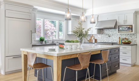
ROOM OF THE DAYRoom of the Day: Soothing Gray Cabinets Update a Modern Kitchen
Custom storage, light woods and a cool palette create an easygoing space for a California family
Full Story

CRAFTSMAN DESIGN7 Small Bungalows With Room to Spare
These renovated bungalows are modest in size — 1,400 square feet or less — but big enough to fit their owners’ needs
Full Story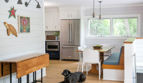
FARMHOUSESCottage Kitchen Goes From Dark and Gloomy to Light and Bright
Shiplap walls and light countertops replace dark wallpaper and avocado green countertops in this Wisconsin kitchen
Full Story
DECORATING GUIDESColor Guide: How to Work With Charcoal Gray
The most modern neutral, charcoal gray looks great in dining rooms, living rooms and even nurseries. Here's how to use it best
Full Story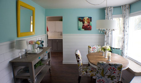
ROOM OF THE DAYRoom of the Day: A DIY Dining Room Full of Cheer
Seeking an uplifting spot during gray days in Washington state, this couple brightened their space with turquoise paint and DIY spirit
Full Story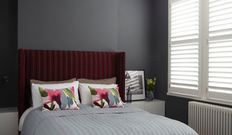
COLORDreaming in Color: 8 Gorgeous Gray Bedrooms
With this versatile hue, you can go dark and bold or slip into something more soothing
Full Story
DECORATING GUIDESColor of the Week: Decorating With Warm Gray
Tired of tan? Getting gloomy from cool gray? Make warm gray your new go-to neutral
Full Story

Geneviève