


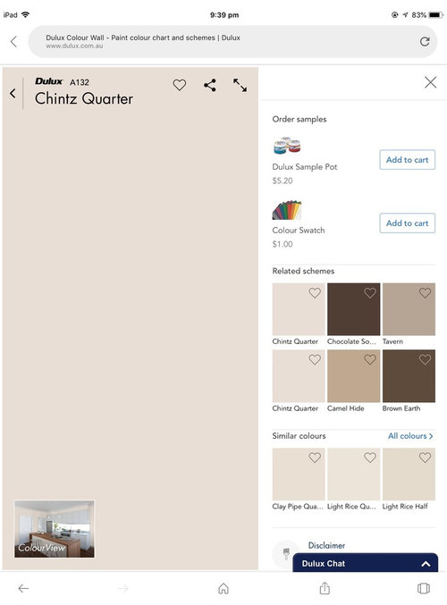
Colour advice needed please
Jan Dobson
5 years ago
last modified: 5 years ago


Featured Answer
Sort by:Oldest
Comments (14)

Irene Morresey
5 years ago PRO
PROBayside Extensions
5 years agoRelated Professionals
Lafayette Kitchen & Bathroom Designers · Palm Harbor Kitchen & Bathroom Designers · Sweetwater Kitchen & Bathroom Remodelers · Toledo Kitchen & Bathroom Remodelers · Browns Mills General Contractors · Seguin General Contractors · Troutdale General Contractors · Avocado Heights General Contractors · Jupiter Furniture & Accessories · Port Charlotte Furniture & Accessories · Indian Creek Furniture & Accessories · Manalapan General Contractors · Middletown General Contractors · Spanaway General Contractors · Spartanburg Furniture & Accessories
Jan Dobson
5 years ago
Audrey1967!
5 years agoJan Dobson
5 years agoAudrey1967!
5 years agoJan Dobson
5 years ago
Bernadette Staal
5 years agoKath
5 years ago
Jo M
5 years agoUser
5 years agovicki Lavender
5 years ago
Wendy Gilchrist
5 years ago
Related Stories
MOST POPULARCrowd-Pleasing Paint Colors for Staging Your Home
Ignore the instinct to go with white. These colors can show your house in the best possible light
Full Story
DECORATING GUIDESNeed Peace and Quiet? Muted Colors Tone Things Down
Subtle hues can be perfect for large rooms and to balance out bolder colors in a home
Full Story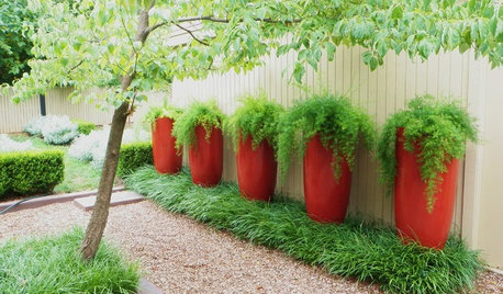
CONTAINER GARDENSTry This Shortcut to Garden Color Where You Need It
Brighten your balcony, patio or deck with planters that are as splendid as their contents
Full Story
EXTERIOR COLORChoosing Color: 1 Home Has Fun With 5 Different Color Schemes
See a home’s potential for transformation with several new hues. Do you have a favorite?
Full Story
COLORColors of the Year: Look Back and Ahead for New Color Inspiration
See which color trends from 2014 are sticking, which ones struck out and which colors we’ll be watching for next year
Full Story
COLORColor Feast: 6 Deliciously Uncommon Dining Room Color Combos
Give your mealtime space a generous helping of hues paired in a most refreshing way
Full Story
COLORHow to Add Color if You’re Color Shy
Here’s how to break into the world of color without breaking a sweat
Full Story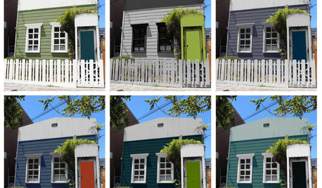
EXTERIOR COLORChoosing Color: 1 Cottage, 6 Striking New Color Schemes
See 6 color palettes for this sweet San Francisco home, vote for your favorite and then find out which one was chosen
Full Story
DECORATING GUIDESGreat Color Palettes: 8 Hot Bedroom Color Schemes
Go spicy, mild or a mix of both with warm and cozy hues in your bedroom
Full Story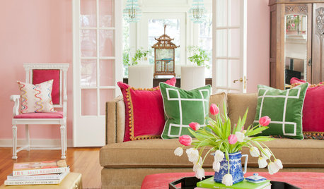
COLORColor Commitment Issues? Just Throw In a Pillow
You don't need to go big or permanent to go bold with color in your rooms; you only need to master the easy art of the toss
Full Story


Dr Retro House Calls