


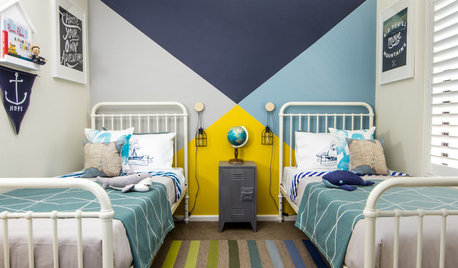
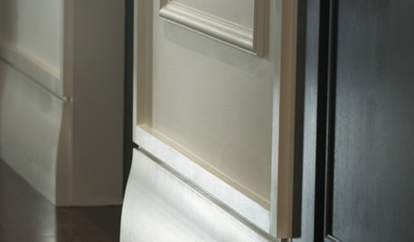
Darker Trim Color Than Walls
Donna Esnard
5 years ago
last modified: 5 years ago
Featured Answer
Sort by:Oldest
Comments (25)
Related Professionals
Northglenn Painters · Pleasant Hill Painters · Fishers Flooring Contractors · Surprise Flooring Contractors · Bronx Furniture & Accessories · Ives Estates Furniture & Accessories · Lake Arrowhead Furniture & Accessories · Green Bay Lighting · Walker Lighting · North Versailles Kitchen & Bathroom Designers · Chaska Furniture & Accessories · Ashburn General Contractors · Nashua General Contractors · Norristown General Contractors · Ravenna General Contractors
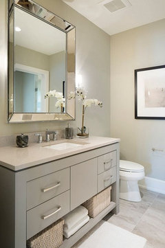
Donna Esnard
5 years agoDonna Esnard
5 years ago PRO
PROJAN MOYER
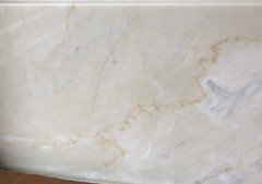
5 years agolast modified: 5 years agoDonna Esnard
5 years ago PRO
PRODiana Bier Interiors, LLC
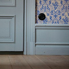
5 years agoDonna Esnard
5 years agoDonna Esnard
5 years ago PRO
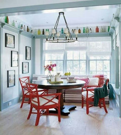
PROFlo Mangan
5 years agoDonna Esnard
5 years ago- PRO
Diana Bier Interiors, LLC
5 years ago 
kendog2
last yearlast modified: last year


Related Stories
COLORWhy You Should Paint Your Walls More Than One Color
Using multiple colors can define zones, highlight features or just add that special something
Full Story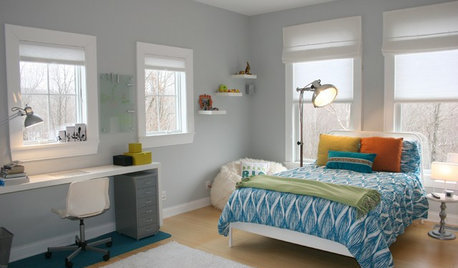
TRIMTrim Color Tips: Get Your White Trim Right
Set off wood tones, highlight architectural features, go minimalist ... white trim is anything but standard when you know how to use it
Full Story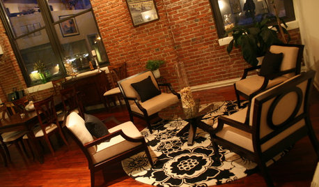
TRIMInterior Trim: 8 Must-Know Elements
Softening transitions and creating a finished look, interior trim for walls, windows and doors comes in many more options than you may know
Full Story
DECORATING GUIDES10 Reasons to Embrace White Walls
Do they strike you as even more boring than watching white paint dry? Consider what makes them the darling of so many
Full StoryDECORATING GUIDESThe Case for the Anti-Accent Wall
Go ahead, paint everything the same color (even the trim)
Full Story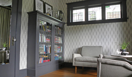
WALL TREATMENTSPack a Punch by Pairing Your Wallpaper and Trim
Get the most out of your wallcovering by choosing the right color for your baseboards, crown moldings and window trim
Full Story
DECORATING GUIDES8 Reasons to Blur the Trim Lines
See what happens when you let your wall color cover doors and moldings too
Full Story
TILEA Finishing Touch for Your Tile Walls and Floors
See how tile-edging trim adds graphic style to five bathrooms and kitchens
Full Story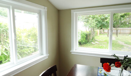
WINDOWSHow to Replace Window Trim
For finishing new windows or freshening the old, window trim gives a polished look with less effort than you may think
Full StoryMore Discussions


Holly Stockley