


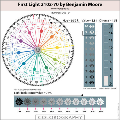
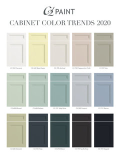
2020 Color of the Year from Benjamin Moore
Lori A. Sawaya
4 years ago

Featured Answer
Sort by:Oldest
Comments (49)

K R
4 years ago
Abby Mac
4 years agoRelated Professionals
Winston-Salem Painters · Hampton Bays Painters · Tucker Painters · Crestview Cabinets & Cabinetry · Bellwood Cabinets & Cabinetry · Carlisle Flooring Contractors · Edmonds Flooring Contractors · Smyrna Flooring Contractors · Stevens Point Flooring Contractors · Temecula Flooring Contractors · Westlake Flooring Contractors · Sweetwater Interior Designers & Decorators · Roselle Kitchen & Bathroom Designers · Chicago Furniture & Accessories · Port Washington General Contractors
cat_ky
4 years ago
morz8 - Washington Coast
4 years agoJason S.
4 years agoUser
4 years ago
SapphireStitch
4 years ago- PRO
User
4 years agolast modified: 4 years ago hollybar
4 years agoKim Mac
4 years agoLinda
4 years agohoussaon
4 years agocalidesign
4 years ago
pink_peony
4 years ago PRO
PROLori A. Sawaya
4 years agolast modified: 4 years agoLinda
4 years ago
Holly Stockley
4 years agoHolly Stockley
4 years agopink_peony
4 years agoHolly Stockley
4 years agopink_peony
4 years ago- PRO
redesign
4 years ago Holly Stockley
4 years agoHolly Stockley
4 years agofunctionthenlook
4 years ago- PRO
Patricia Colwell Consulting
4 years ago Holly Stockley
4 years agohollybar
4 years agochiflipper
4 years agoChessie
4 years ago PRO
PROBeth H. :
4 years agoSapphireStitch
4 years agoChessie
4 years agolast modified: 4 years ago
jillybean103
4 years ago
Buzz Solo in northeast MI
4 years agoHolly Stockley
4 years agojillybean103
4 years agohollybar
4 years agolast modified: 4 years agoHolly Stockley
4 years ago- PRO
Lori A. Sawaya
4 years agolast modified: 4 years ago Chessie
4 years ago- PRO
Patricia Colwell Consulting
4 years ago chocolatebunny123
4 years ago
Cocotini Hartman
4 years ago
Linda
4 years agomjkjrobinson
4 years ago PRO
PROJAN MOYER
4 years agolast modified: 4 years ago
J Williams
4 years ago


Related Stories

COLORBenjamin Moore Floats Breath of Fresh Air as Its Color of 2014
Touted as a new neutral, this baby blue can stand on its own or support bolder colors. Here's how to use it
Full Story
COLORS OF THE YEAR10 Ways to Use Classic Blue, Pantone’s 2020 Color of the Year
This calming hue, pulled from the sky at dusk, is meant to reassure in a tumultuous time
Full Story
TRENDING NOW7 Winning Color Palettes From Spring 2020’s Top Kitchens
Looking for the right mix of paint and materials? Consider these combos from popular recent kitchen photos on Houzz
Full Story
TRENDING NOW8 Beautiful Blue Powder Rooms From Spring 2020’s Top Photos
See how this classic color can add style, surprise and serenity in various ways to a small space
Full Story
TRENDING NOW7 Ideas for Headboard Walls From Spring 2020 Bedrooms
Boost the wall behind your bed with one of these clever and stylish designs from popular recent bedroom photos
Full Story
HOUZZ CALLTell Us Your New Year’s Resolutions for Your Home
Share your plans and dreams for your house this year — whether they involve organizing, remodeling or redecorating
Full Story
TRENDING NOWThe 10 Most Popular Entryways and Mudrooms of 2020
Get ideas for adding storage, style and welcoming vibes to your entry from these most-saved photos of the year
Full Story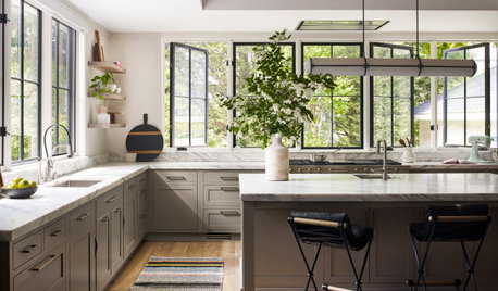
TRENDING NOWThe 10 Most Popular Kitchen Photos of 2020
Multitasking islands, clever storage solutions and gorgeous materials star in this year’s top kitchens
Full Story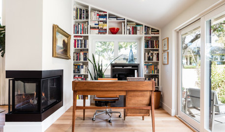
TRENDING NOWThe 10 Most Popular Home Offices So Far in 2020
See how soothing colors, hardworking built-ins and lots of style create inviting, modern work-from-home spaces
Full Story
COLORS OF THE YEARWill These 9 Paint Colors Take Over Homes in 2020?
Major paint companies choose colors of the year that are fresh, upbeat and mostly on the cool side
Full Story


einportlandor