


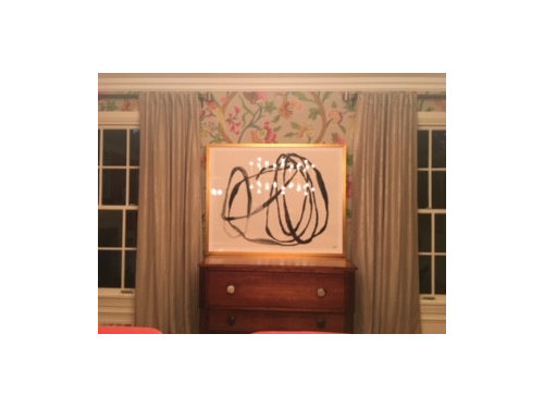
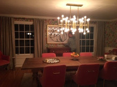
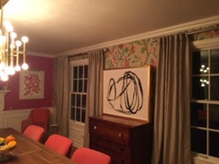
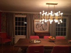
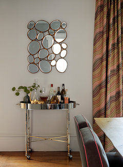
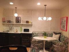
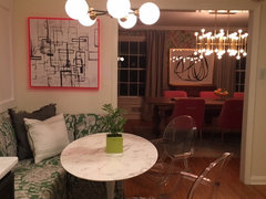
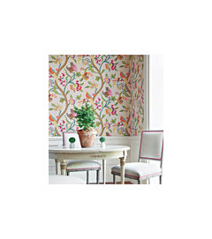
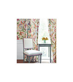
Does the scale and color of this print work in my Dining room?
avalonnj
4 years ago
Featured Answer
Sort by:Oldest
Comments (38)

avalonnj
4 years agolast modified: 4 years agoRelated Professionals
Van Nuys Furniture & Accessories · Fremont Window Treatments · Palos Verdes Estates Architects & Building Designers · Cuyahoga Falls Kitchen & Bathroom Designers · Evanston Furniture & Accessories · Fountainebleau Furniture & Accessories · Potomac Furniture & Accessories · Annandale General Contractors · Auburn General Contractors · Bryan General Contractors · Enfield General Contractors · Flint General Contractors · Merritt Island General Contractors · Milton General Contractors · Westmont General Contractorsnjmomma
4 years agoGcubed
4 years agokristinhallett
4 years agokristinhallett
4 years ago
IdaClaire
4 years ago
Zalco/bring back Sophie!
4 years agoavalonnj
4 years agotatts
4 years agoavalonnj
4 years agoIdaClaire
4 years ago
Angel 18432
4 years ago PRO
PROCDR Design, LLC
4 years agomountie
4 years agokristinhallett
4 years agoavalonnj
4 years agoavalonnj
4 years agoavalonnj
4 years agonjmomma
4 years ago
suzyq53
4 years agokristinhallett
4 years ago- PRO
Patricia Colwell Consulting
4 years ago avalonnj
4 years ago

Related Stories
KIDS’ SPACESWho Says a Dining Room Has to Be a Dining Room?
Chucking the builder’s floor plan, a family reassigns rooms to work better for their needs
Full Story
DECORATING GUIDESRoom of the Day: Warhol Rocks a 19th-Century Dining Room
Stellar modern art brings new energy to a dining room in an 1896 mansion with traditional bones
Full Story
DECORATING GUIDESRoom of the Day: A Dreamy Dining Room in the Hamptons
Tradition gets a pleasing new twist with mixed patterns, pulled together by soft blue and heavenly white
Full Story
DECORATING GUIDESRoom of the Day: Romancing a Maine Dining Room
Glossy paint and country-style furnishings make a 19th-century interior an affair to remember
Full Story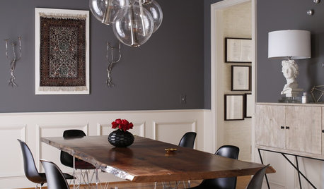
DINING ROOMSRoom of the Day: An Elegant North Carolina Dining Room
Sophistication meets durability and easy-to-clean surfaces in a dramatic style-mixing space
Full Story
ROOM OF THE DAYRoom of the Day: Patience Pays Off in a Midcentury Living-Dining Room
Prioritizing lighting and a bookcase, and then taking time to select furnishings, yields a thoughtfully put-together space
Full Story
DINING ROOMSRoom of the Day: Putting the Dining Room to Work
With a table for meals and a desk for bringing home the bacon, this dining room earns its keep
Full Story
SMALL HOMESRoom of the Day: Living-Dining Room Redo Helps a Client Begin to Heal
After a tragic loss, a woman sets out on the road to recovery by improving her condo
Full Story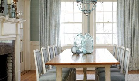
REMODELING GUIDESRoom of the Day: Antiques Help a Dining Room Grow Up
Artfully distressed pieces and elegant colors take a formerly child-focused space into sophisticated territory
Full StoryDINING ROOMSRoom of the Day: Grown-Up Style in a Family Dining Room
Easy-care fabrics, a lighter color palette and a great furniture save help a Boston-area family get the transitional look they were after
Full Story


ci_lantro