


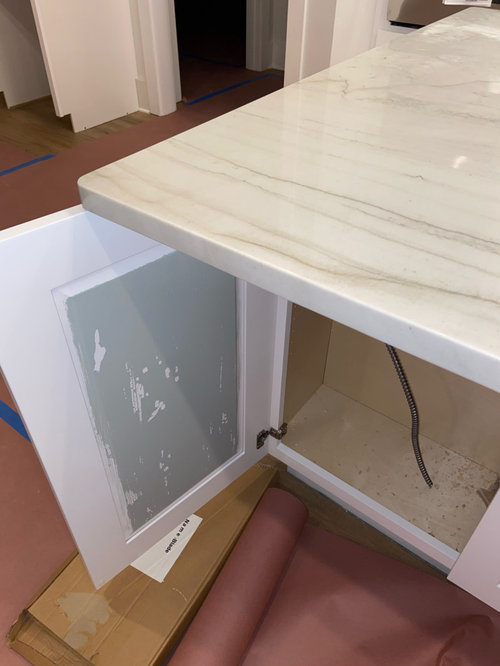
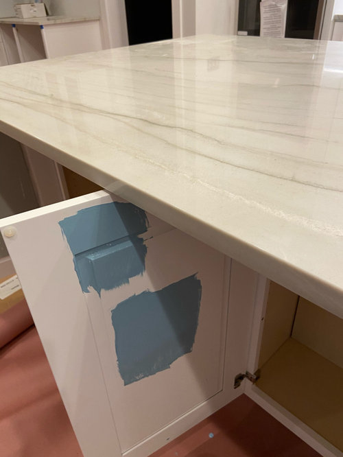
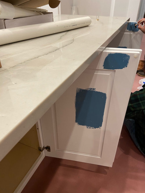
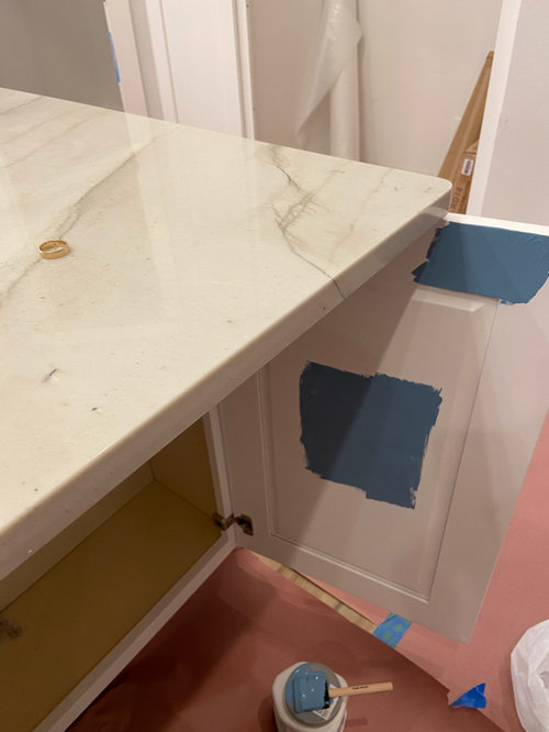
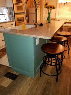
Need help picking a color for kitchen island
Erin W
4 years ago
Featured Answer
Sort by:Oldest
Comments (24)
 PRO
PROJudyG Designs
4 years agolast modified: 4 years ago
Erin W
4 years agoRelated Professionals
La Verne Kitchen & Bathroom Designers · Palmetto Estates Kitchen & Bathroom Designers · Galena Park Kitchen & Bathroom Remodelers · New Port Richey East Kitchen & Bathroom Remodelers · Tulsa Kitchen & Bathroom Remodelers · Daly City Cabinets & Cabinetry · Jefferson Valley-Yorktown Cabinets & Cabinetry · Universal City Cabinets & Cabinetry · Roxbury Crossing Tile and Stone Contractors · Murray Furniture & Accessories · San Jose Window Treatments · Fairfax Painters · Oakley Painters · Homewood Painters · Wesley Chapel Flooring Contractors
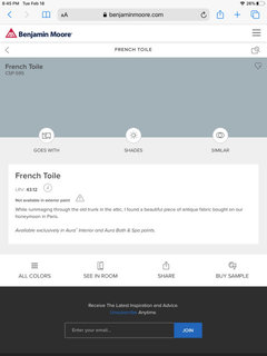
cawaps
4 years agoErin W
4 years agocawaps
4 years ago
mark_rachel
4 years agomegs1030
4 years agoalways1stepbehind
4 years agocawaps
4 years ago
sprtphntc7a
4 years ago PRO
PROColor Designs
4 years agoLynn G
4 years agohsmeghan
4 years agoherbflavor
4 years agolast modified: 4 years ago
Yayagal
4 years agodory50ish
4 years ago
Lizzy L.
4 years ago PRO
PROMichelle Triplett Design
4 years ago
junco East Georgia zone 8a
4 years agoequinekdc
4 years ago
Elizabeth Werhel
4 years agogigi7
4 years ago
Theresa Powell
3 years ago

Related Stories
PRODUCT PICKSGuest Picks: Dashing Lighting for Over the Kitchen Island
These single-connection pendants and chandeliers will cover your island lighting needs no matter what your kitchen’s style
Full Story
KITCHEN DESIGNPick the Right Pendant for Your Kitchen Island
Don't settle for bland builder-grade pendant lights when you can have your pick of colors and kinds to match your kitchen's style
Full Story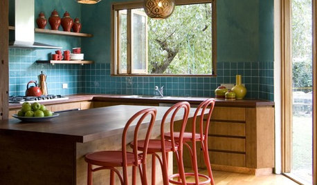
KITCHEN DESIGNKitchen Workbook: Tools to Pick Kitchen Stools
There's more to choosing a kitchen stool than you may think. These guidelines help remove the guesswork when you're picking a perch
Full Story
INSIDE HOUZZWhat’s Popular for Kitchen Islands in Remodeled Kitchens
Contrasting colors, cabinets and countertops are among the special touches, the U.S. Houzz Kitchen Trends Study shows
Full Story
KITCHEN DESIGNKitchen Design Fix: How to Fit an Island Into a Small Kitchen
Maximize your cooking prep area and storage even if your kitchen isn't huge with an island sized and styled to fit
Full Story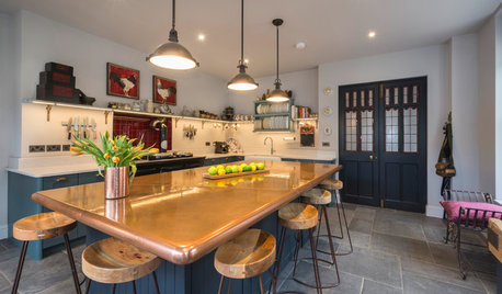
KITCHEN ISLANDSA Kitchen’s Copper Island Makes a Fabulous Focal Point
Industrial elements bring lived-in character to this new kitchen in a historical English house
Full Story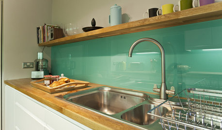
KITCHEN DESIGNHow to Pick a Kitchen Backsplash That Wows
Design your ideal backsplash with help from these Houzz guides and inspiring ideas for every kitchen style
Full Story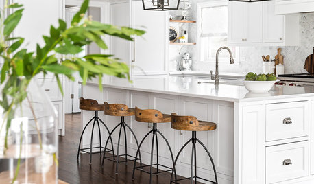
KITCHEN DESIGNKitchen of the Week: White Cabinets With a Big Island, Please!
Designers help a growing Chicago-area family put together a simple, clean and high-functioning space
Full Story
PRODUCT PICKSGuest Picks: Freestanding Kitchen Storage and Prep Spaces
Get on a roll organizing your kitchen with movable islands, carts and racks
Full Story
PRODUCT PICKSGuest Picks: In the Kitchen With Kids
Whether you're making cookies or stirring up cocoa, these kitchen finds can help put family togetherness on tap
Full StorySponsored
Custom Craftsmanship & Construction Solutions in Franklin County
More Discussions


Blueberry Abode