


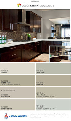
What are some good paint colors to go with an abundance of maple trim?
skub4
3 years ago
Featured Answer
Sort by:Oldest
Comments (15)

Sammie J
3 years agoRelated Professionals
Glassmanor Painters · Montclair Painters · Holt Cabinets & Cabinetry · Norfolk Cabinets & Cabinetry · Dracut Flooring Contractors · Lacey Flooring Contractors · Rosaryville Interior Designers & Decorators · Baltimore Kitchen & Bathroom Designers · Hemet Kitchen & Bathroom Designers · Barrington General Contractors · Green Bay General Contractors · Jefferson Valley-Yorktown General Contractors · Mount Holly General Contractors · Ravenna General Contractors · Rossmoor General Contractorsskub4
3 years ago
Susan Davis
3 years ago- PRO
Patricia Colwell Consulting
3 years ago skub4
3 years agolast modified: 3 years agoskub4
3 years agoskub4
3 years agoskub4
3 years agocalidesign
3 years ago


Related Stories
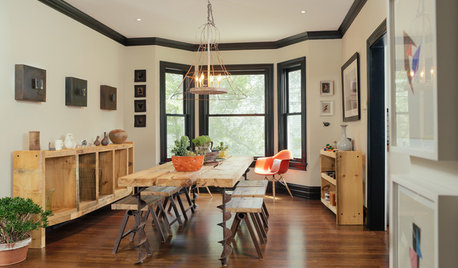
TRIMWhat Color Should You Paint Your Trim?
Learn the benefits of painting your trim white, black, neutral, a bold color and more
Full Story
TRIMTrim Color Tips: Get Your White Trim Right
Set off wood tones, highlight architectural features, go minimalist ... white trim is anything but standard when you know how to use it
Full Story
COLORPaint-Picking Help and Secrets From a Color Expert
Advice for wall and trim colors, what to always do before committing and the one paint feature you should completely ignore
Full Story
DECORATING GUIDESChoose an Unexpected Color for Your Trim
Go Beyond Glossy White Molding for a Room With Distinction
Full Story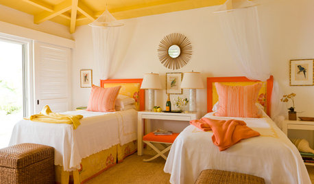
DECORATING GUIDESPaint Color Ideas: 7 Bright Ways With Yellow and Orange
Go with the glow. These sample palettes and room examples show you how to work with two of the happiest hues around
Full Story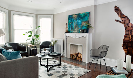
MOST POPULARCrowd-Pleasing Paint Colors for Staging Your Home
Ignore the instinct to go with white. These colors can show your house in the best possible light
Full Story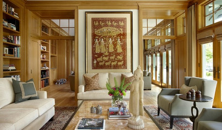
COLOR11 Terrific Paint Color Matches for Wood Details
Pair your wood trim and cabinets with the right shade of wall paint to bring out the beauty in both
Full Story
ENTRYWAYSHelp! What Color Should I Paint My Front Door?
We come to the rescue of three Houzzers, offering color palette options for the front door, trim and siding
Full Story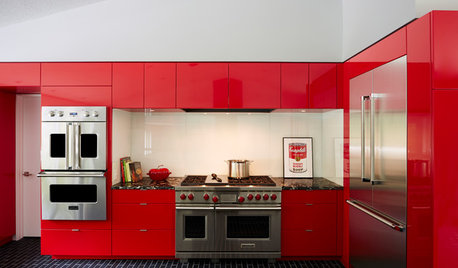
COLORFUL KITCHENSCabinet Paint Colors That Are Anything but Neutral
Craving some color for your kitchen? Consider these bright choices for your cabinetry
Full Story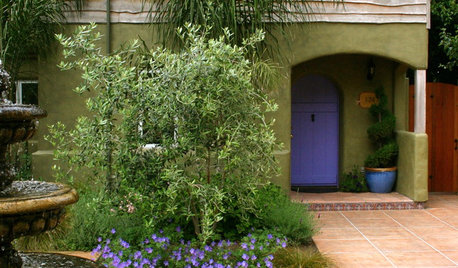
CURB APPEALColors and Plants That Go Best With a Bright Front Door
Find out what paint hues and plantings will work best with your attention-getting shade
Full Story


JudyG Designs