


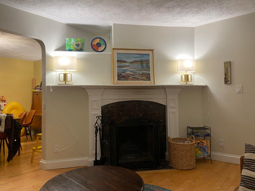
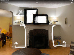
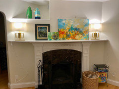
Another wacky wall
robo (z6a)
last year
last modified: last year
Featured Answer
Sort by:Oldest
Comments (42)

robo (z6a)
last yearlast modified: last year
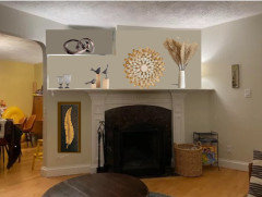
1929Spanish-GW
last yearlast modified: last yearRelated Professionals
Kearny Furniture & Accessories · Kirkland Furniture & Accessories · Wilmington Furniture & Accessories · Mundelein Furniture & Accessories · Charleston Interior Designers & Decorators · North Bellport Home Builders · Broadlands Home Builders · Castaic Home Builders · Converse Home Builders · Odenton Home Builders · Seymour Home Builders · Dallas Professional Organizers · Louisville Professional Organizers · Miami Professional Organizers · Skokie Professional Organizers
nicole___
last yearlast modified: last year
blfenton
last yearrobo (z6a)
last yearrobo (z6a)
last yearnicole___
last year
Jilly
last yearlast modified: last year PRO
PROHome Interiors with Ease
last yearrobo (z6a)
last yearlast modified: last year- PRO
Home Interiors with Ease
last year 
mtnrdredux_gw
last yearJilly
last yearlast modified: last yearrobo (z6a)
last yearlast modified: last yearJilly
last yearmtnrdredux_gw
last yearrobo (z6a)
last year- PRO
Home Interiors with Ease
last year Jilly
last yearlast modified: last yearrobo (z6a)
last yearrobo (z6a)
last yearrobo (z6a)
last year
Annie Deighnaugh
last year
Eileen
last yearblfenton
last yearmtnrdredux_gw
last yearyeonassky
last yearlast modified: last year
amykath
last year- PRO
Home Interiors with Ease
last year 
3katz4me
last year
terezosa / terriks
last year
Arapaho-Rd
last yearrobo (z6a)
last yearJilly
last year
ilikefriday
last year


Related Stories
BATHROOM DESIGNTake Your Bathroom Walls Into Another Realm
Being practical spaces, bathrooms sometimes can be bland. Here are imaginative wall treatments that add personality
Full Story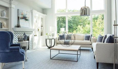
REMODELING GUIDES11 Reasons to Love Wall-to-Wall Carpeting Again
Is it time to kick the hard stuff? Your feet, wallet and downstairs neighbors may be nodding
Full Story
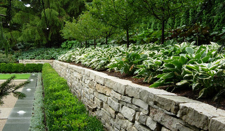
LANDSCAPE DESIGNGarden Walls: Dry-Stacked Stone Walls Keep Their Place in the Garden
See an ancient building technique that’s held stone walls together without mortar for centuries
Full Story
CEILINGSCeilings Worth Another Look
Wood, Pattern, Metal and Light Make Your Fifth Wall Shine
Full Story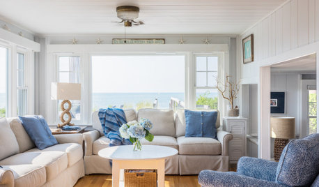
WHITEWhat to Know Before You Paint Your Walls White
A coat of white paint can do wonders in one room and wreak havoc in another. Here are tips for using the popular hue
Full Story
DECORATING GUIDESLacquered Walls Rise and Shine
Gleaming and glamorous, lacquered walls add irresistible polish, light and energy to interior designs
Full Story
WALL TREATMENTS10 Fresh Designs for a Reclaimed-Wood Wall
Choose different woods and colors to create a style that’s all your own
Full Story
LIGHTING10 Ways With Wall Lights That Don’t Need to Be Wired In
Learn how to add illumination to your home without carving into the walls
Full Story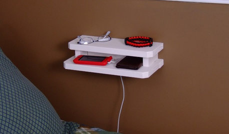
DIY PROJECTSNeat Little Project: Make a Mini Wooden Wall Console
Use this handy holder by a bed or desk for eyeglasses or jewelry, or as a convenient charging station
Full StoryMore Discussions

ilikefriday