


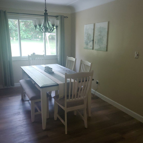
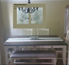
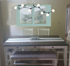
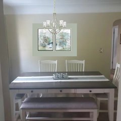
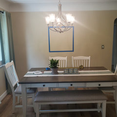
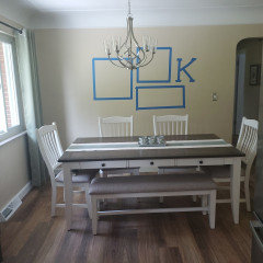
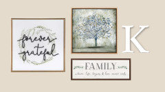
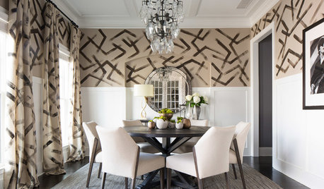
Wall art and chandelier placement in casual dining room
Sheila Kelly
11 months ago
last modified: 11 months ago


Featured Answer
Sort by:Oldest
Comments (38)

auntthelma
11 months ago
KW PNW Z8
11 months agolast modified: 11 months agoRelated Professionals
Wilmington Furniture & Accessories · Hoboken Furniture & Accessories · Carson Furniture & Accessories · Seal Beach Custom Artists · Walker Lighting · East Setauket Window Treatments · Placerville Window Treatments · Rosaryville Interior Designers & Decorators · Frisco Architects & Building Designers · Martinsburg Kitchen & Bathroom Designers · Rockville Furniture & Accessories · Wakefield Furniture & Accessories · Catonsville General Contractors · Nampa General Contractors · Vincennes General Contractors
Sheila Kelly
11 months agoKW PNW Z8
11 months agolast modified: 11 months agoSheila Kelly
11 months ago PRO
PROSabrina Alfin Interiors
11 months agoKW PNW Z8
11 months agoSheila Kelly
11 months ago
ffpalms
11 months agoffpalms
11 months agoffpalms
11 months agoSheila Kelly
11 months ago PRO
PROFlo Mangan
11 months agoffpalms
11 months ago
Kelly Jones
11 months agoSheila Kelly
9 months ago
HU-227031627
9 months agoSheila Kelly
9 months agoSheila Kelly
9 months agolast modified: 9 months agoffpalms
9 months agoSheila Kelly
9 months agoSheila Kelly
9 months agoKW PNW Z8
9 months agoSheila Kelly
9 months agoKW PNW Z8
9 months ago
R Joy
9 months agoSheila Kelly
9 months agoSheila Kelly
9 months agonjmomma
9 months agoKW PNW Z8
9 months agoSheila Kelly
9 months agoKW PNW Z8
9 months agoSheila Kelly
9 months agoKW PNW Z8
9 months agoSheila Kelly
2 months agoKW PNW Z8
2 months agoSheila Kelly
2 months ago


Related Stories
DINING ROOMSRoom of the Day: Hand-Painted Walls Set This Dining Room Apart
A bold design and small accents make this square room the perfect place to have fun
Full Story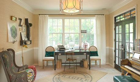
KIDS’ SPACESWho Says a Dining Room Has to Be a Dining Room?
Chucking the builder’s floor plan, a family reassigns rooms to work better for their needs
Full Story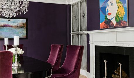
DINING ROOMSAubergine Walls and a Silver Leaf Ceiling Create Dining Room Chic
High drama and glam are the order of the day for this dining room in an otherwise kid-friendly Boston home
Full Story
DECORATING GUIDESCasual Wall Art Arrangements Show Deliberate Style
No time or desire to carefully plot a wall-art arrangement? Grab a hammer and throw tradition to the wind
Full Story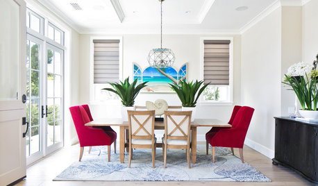
DINING ROOMSNew This Week: 4 Casual-Meets-Formal Modern Dining Rooms
These spaces bridge the gap between laid-back family meals and elegant occasions
Full Story
DINING ROOMSGraceful Decorations for Traditional Dining Room Walls
Let the elegant artistry of oil paintings, classic prints and wallpaper enhance your dining room — and your entire dining experience
Full Story
LIGHTING20 Dining Rooms With Chic Chandeliers and Pendant Lights
Whether sleek and modern or dripping with crystals, lighting is the special ingredient in any dazzling dining room
Full Story
DECORATING GUIDESHow to Create a Great Dining Room Wall
Shelves, candles, stonework, wallpaper and chalkboard paint make dramatic backdrops for feasts
Full Story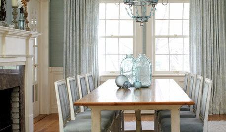
REMODELING GUIDESRoom of the Day: Antiques Help a Dining Room Grow Up
Artfully distressed pieces and elegant colors take a formerly child-focused space into sophisticated territory
Full Story
DECORATING GUIDESRoom of the Day: Warhol Rocks a 19th-Century Dining Room
Stellar modern art brings new energy to a dining room in an 1896 mansion with traditional bones
Full StorySponsored
Custom Craftsmanship & Construction Solutions in Franklin County
More Discussions


ffpalms