


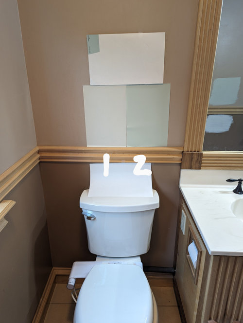
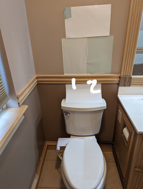
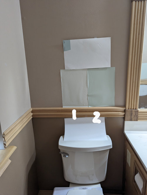
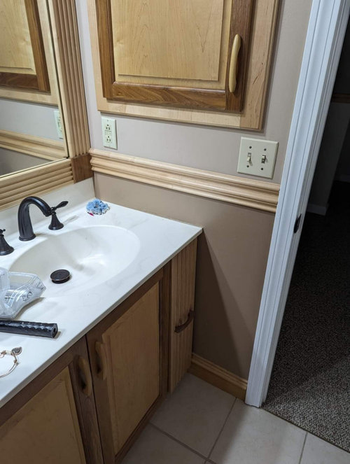
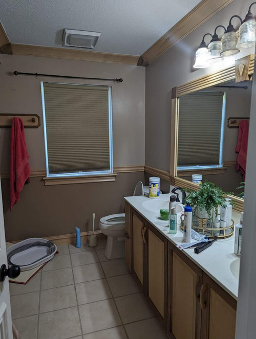
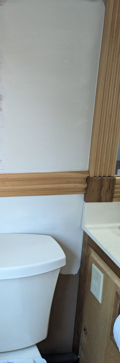
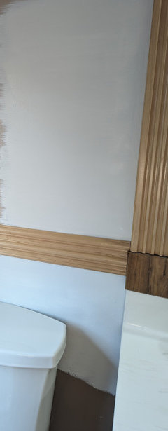
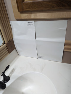
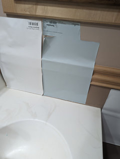
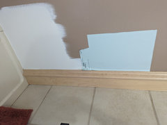
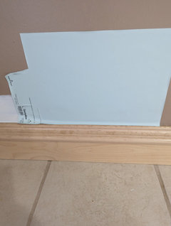
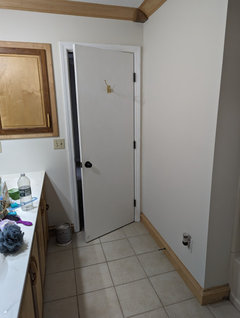
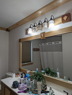
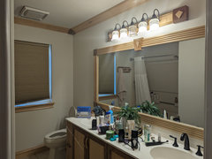
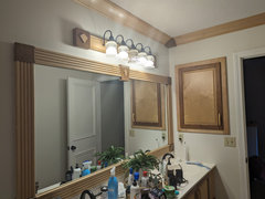
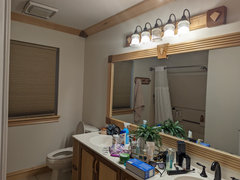
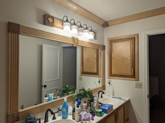
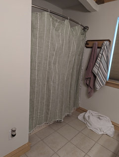
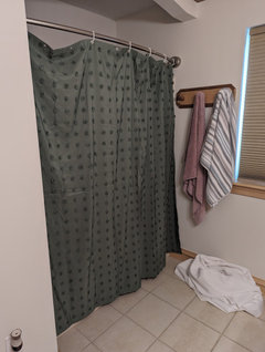
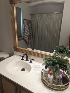
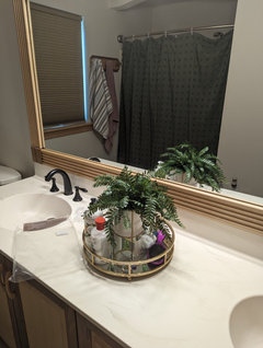
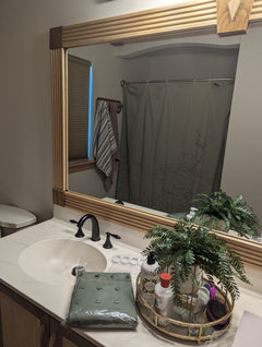
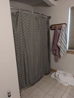
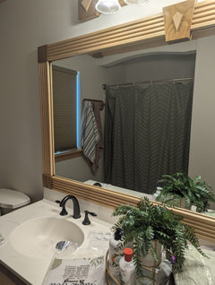
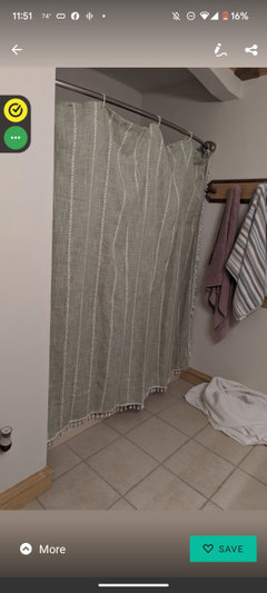
Final paint colour choices for bathroom
Angela Wilcox
9 months ago
Featured Answer
Sort by:Oldest
Comments (59)

Angela Wilcox
9 months agoAngela Wilcox
9 months agoRelated Professionals
Burien Painters · Darien Painters · Savannah Painters · Hanover Park Cabinets & Cabinetry · Murray Cabinets & Cabinetry · Land O' Lakes Flooring Contractors · Orlando Flooring Contractors · Tanque Verde Flooring Contractors · Centreville Lighting · Baytown Window Treatments · Piedmont Kitchen & Bathroom Designers · League City Kitchen & Bathroom Remodelers · Turlock Kitchen & Bathroom Remodelers · Eufaula Kitchen & Bathroom Remodelers · Culpeper Glass & Shower Door Dealers
texmax13
9 months agolast modified: 9 months agomxk3 z5b_MI
9 months agoAngela Wilcox
8 months agotexmax13
8 months agoAngela Wilcox
8 months agotexmax13
8 months agoAngela Wilcox
8 months agotexmax13
8 months agolast modified: 8 months agoAngela Wilcox
8 months agoAngela Wilcox
8 months agotexmax13
8 months agolast modified: 8 months agotexmax13
8 months agotexmax13
8 months agoAngela Wilcox
8 months agotexmax13
8 months ago PRO
PRODecorafy
8 months agoAngela Wilcox
8 months agoAngela Wilcox
8 months agotexmax13
8 months agolast modified: 8 months agoAngela Wilcox
8 months agoAngela Wilcox
8 months agotexmax13
8 months agoAngela Wilcox
8 months agoAngela Wilcox
8 months agotexmax13
8 months agoAngela Wilcox
8 months agoAngela Wilcox
8 months agotexmax13
8 months agolast modified: 8 months agoAngela Wilcox
8 months agotexmax13
8 months agoAngela Wilcox
8 months agoAngela Wilcox
8 months agotexmax13
8 months agolast modified: 8 months agoAngela Wilcox
8 months agocat_ky
8 months agoAngela Wilcox
8 months agotexmax13
8 months agoAngela Wilcox
8 months agoAngela Wilcox
8 months agotexmax13
8 months agoAngela Wilcox
8 months agoAngela Wilcox
8 months agotexmax13
8 months agoAngela Wilcox
8 months agoAngela Wilcox
7 months agotexmax13
7 months agoAngela Wilcox
7 months ago


Related Stories

COLORPick-a-Paint Help: How to Quit Procrastinating on Color Choice
If you're up to your ears in paint chips but no further to pinning down a hue, our new 3-part series is for you
Full Story
COLOR PALETTES7 Beautiful Blue Paint Colors for Bathrooms
Whether it’s soothing or sophisticated, you really can’t go wrong with a blue hue in the bath
Full Story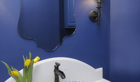
BATHROOM DESIGN8 Bold Paint Colors for Your Powder Room
Turn your powder room into a exclamation point with a bold shot of red, raspberry, hyacinth, rich brown or stormy blue
Full Story
KITCHEN CABINETSKitchen Cabinet Color: Should You Paint or Stain?
Learn about durability, looks, cost and more for wooden cabinet finishes to make the right choice for your kitchen
Full Story
COLORS OF THE YEARGreen Is the Top Paint Color for 2022
Major paint companies reach a rare consensus, anointing various shades of green as their 2022 color of the year choices
Full Story
BATHROOM MAKEOVERSBefore and After: Cheerful Color in a Farmhouse Bathroom
Colorful wallpaper and a painted bathtub refresh a Michigan family’s first-floor bathroom
Full Story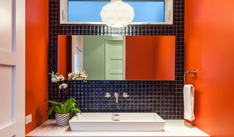
BATHROOM DESIGN7 Striking Paint Colors for Your Powder Room
Whether you opt for a little or a lot, see why the petite bathroom is the perfect place for a fun hue
Full Story
COLOR PALETTESWill These Soothing and Rich Paint Colors Define 2021?
Paint companies released their 2021 Color of the Year choices. See if soft teal, elegant brown or other shades suit you
Full Story
COLORFUL KITCHENSCabinet Paint Colors That Are Anything but Neutral
Craving some color for your kitchen? Consider these bright choices for your cabinetry
Full Story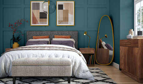
HOUZZ PRODUCT NEWS7 Paint Colors Set to Be Big in 2023
See the soft neutrals, warm pinks and deep blue-greens defining major paint companies’ 2023 Color of the Year choices
Full Story


Angela WilcoxOriginal Author