


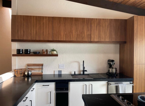
STILL need a backsplash… HELP!!
Carly
5 months ago


Featured Answer
Sort by:Oldest
Comments (59)
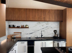
 PRO
PRONorwood Architects
5 months ago
Carly
5 months agoRelated Professionals
Dunkirk General Contractors · Security-Widefield General Contractors · Camp Verde Flooring Contractors · Danvers Flooring Contractors · Elgin Flooring Contractors · New Bern Flooring Contractors · Palm Springs Flooring Contractors · Tucson Flooring Contractors · Hammond Kitchen & Bathroom Designers · Pooler General Contractors · Davidson General Contractors · Olney General Contractors · Andover Kitchen & Bathroom Remodelers · Phoenix Kitchen & Bathroom Remodelers · Soledad Tile and Stone ContractorsCarly
5 months ago
Jenny
5 months ago PRO
PROSabrina Alfin Interiors
5 months agoKendrah
5 months ago
acm
5 months agoCarly
5 months agoCarly
5 months agoShasta
5 months agoCarly
5 months ago PRO
PROHomeScapes Home Staging San Diego
5 months ago PRO
PRODiana Bier Interiors, LLC
5 months agoCarly
5 months agoPaul F.
5 months agolast modified: 5 months agoCarly
5 months agoNN Swaby
5 months agoJenny
5 months agoIluvdark kychns
5 months ago
rebunky
5 months agolast modified: 5 months agokl23
5 months agoPaul F.
5 months agoCarly
5 months agoPaul F.
5 months agolast modified: 5 months agoIsaac
5 months agoCarly
5 months agoCarly
5 months agoCarly
5 months agoPaul F.
5 months agoCarly
5 months agoPaul F.
5 months agoCarly
5 months agorebunky
5 months ago
RedRyder
5 months agoRedRyder
5 months agoRedRyder
5 months agoCarly
5 months agoPaul F.
5 months ago
Ally
5 months agoCarly
5 months ago- PRO
Diana Bier Interiors, LLC
5 months ago palimpsest
5 months agoCarly
5 months agoCarly
5 months ago
WalnutCreek Zone 7b/8a
5 months ago- PRO
Diana Bier Interiors, LLC
5 months ago Carly
5 months ago- PRO
Diana Bier Interiors, LLC
5 months ago


Related Stories

KITCHEN DESIGNHouzz Quiz: Which Kitchen Backsplash Material Is Right for You?
With so many options available, see if we can help you narrow down the selection
Full Story
KITCHEN DESIGNHow to Pick a Kitchen Backsplash That Wows
Design your ideal backsplash with help from these Houzz guides and inspiring ideas for every kitchen style
Full Story
KITCHEN MAKEOVERSKitchen of the Week: White, Wood, Gray and a Backsplash Surprise
A Maine couple with three young daughters ask a designer to help them create a clean space with custom style
Full Story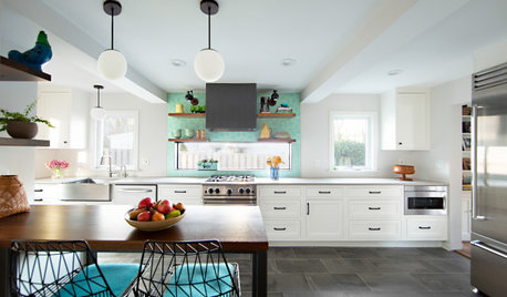
KITCHEN MAKEOVERSKitchen of the Week: Light and Airy With a Bright Backsplash
A designer helps a couple update the kitchen with an efficient layout and custom details like a walnut-topped peninsula
Full Story
KITCHEN BACKSPLASHES8 Clever Ways to Put Your Backsplash to Work
Leave art for art's sake to another spot. Hardworking cooks deserve a kitchen backsplash that helps them do their job
Full Story
TILE5 Head-Turning Tile Styles for Backsplashes and More
If plain subway tile would derail your bold decorating vision, these dashing tiles can help you arrive at a brilliant solution
Full Story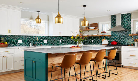
KITCHEN MAKEOVERSKitchen of the Week: Backsplash Dazzles in Green Geometric Tile
A designer helps a growing family function better at home with a new kitchen, mudroom and dining room bar
Full Story
REMODELING GUIDESHome Styles: Why Postmodernism Still Matters
Playful mix of history and irony helped pave the way for today's headline-making buildings
Full Story
KITCHEN DESIGNTry a Shorter Kitchen Backsplash for Budget-Friendly Style
Shave costs on a kitchen remodel with a pared-down backsplash in one of these great materials
Full Story
KITCHEN DESIGNHow to Add a Kitchen Backsplash
Great project: Install glass, tile or another decorative material for a gorgeous and protective backsplash
Full StorySponsored
Columbus Area's Luxury Design Build Firm | 17x Best of Houzz Winner!
More Discussions


Paul F.